Data Preprocessing
The following analysis is of the diamonds dataset downloaded from the tidyverse/ggplot2 Github repository. The data is in a .csv file. The purpose of the analysis is to explore the data and perform data exploration, cleaning, and preprocessing needed for modeling. Data cleaning and preprocessing involves checking for missing records, removing missing data, imputing missing data, converting categorical variables with one-hot encoding or dummy variables, scaling data, normalizing data. The majority of code is not the focus of this analysis but rest assured, and there are close to 700 lines written for the graphing presented in this article.
The tidyverse package is the primary tool used in R for this analysis in addition to a few other R packages.
library(tidyverse)Import the Data
The data imports into the diamonds tibble, also specify the data type for each data column as factors (categorical), doubles (digits), and an integer.
diamonds <- read_csv("https://github.com/tidyverse/ggplot2/raw/master/data-raw/diamonds.csv", col_types = "dfffddiddd")Data Summary
R’s summary methods are summary from base R and glimpse from the tidyverse. The data has 53,940 records and ten columns of data. There are three categorical data types: cut, color, and clarity, while the remaining variables carat, depth, table, x, y, & z are digits and price (integers). Within the categorical variables of cut, color, and clarity, there is an imbalance and noted if using machine learning algorithms in modeling the data. The min and max values of x, y, z standout in the numeric data. As shown later, x, y, z are measurements, and a zero measurement would not be possible. The price variable has an $18,497 range. The median is $2401, indicating the possibility of outlier values, and the carat range from 0.2 to 5.0, with a median of 0.7 carats. And overall, there are no missing values or NA’s in this data.
tibble::glimpse(diamonds)## Rows: 53,940
## Columns: 10
## $ carat <dbl> 0.23, 0.21, 0.23, 0.29, 0.31, 0.24, 0.24, 0.26, 0.22, 0.23,...
## $ cut <fct> Ideal, Premium, Good, Premium, Good, Very Good, Very Good, ...
## $ color <fct> E, E, E, I, J, J, I, H, E, H, J, J, F, J, E, E, I, J, J, J,...
## $ clarity <fct> SI2, SI1, VS1, VS2, SI2, VVS2, VVS1, SI1, VS2, VS1, SI1, VS...
## $ depth <dbl> 61.5, 59.8, 56.9, 62.4, 63.3, 62.8, 62.3, 61.9, 65.1, 59.4,...
## $ table <dbl> 55, 61, 65, 58, 58, 57, 57, 55, 61, 61, 55, 56, 61, 54, 62,...
## $ price <int> 326, 326, 327, 334, 335, 336, 336, 337, 337, 338, 339, 340,...
## $ x <dbl> 3.95, 3.89, 4.05, 4.20, 4.34, 3.94, 3.95, 4.07, 3.87, 4.00,...
## $ y <dbl> 3.98, 3.84, 4.07, 4.23, 4.35, 3.96, 3.98, 4.11, 3.78, 4.05,...
## $ z <dbl> 2.43, 2.31, 2.31, 2.63, 2.75, 2.48, 2.47, 2.53, 2.49, 2.39,...summary(diamonds)## carat cut color clarity depth
## Min. :0.2000 Ideal :21551 E: 9797 SI1 :13065 Min. :43.00
## 1st Qu.:0.4000 Premium :13791 I: 5422 VS2 :12258 1st Qu.:61.00
## Median :0.7000 Good : 4906 J: 2808 SI2 : 9194 Median :61.80
## Mean :0.7979 Very Good:12082 H: 8304 VS1 : 8171 Mean :61.75
## 3rd Qu.:1.0400 Fair : 1610 F: 9542 VVS2 : 5066 3rd Qu.:62.50
## Max. :5.0100 G:11292 VVS1 : 3655 Max. :79.00
## D: 6775 (Other): 2531
## table price x y
## Min. :43.00 Min. : 326 Min. : 0.000 Min. : 0.000
## 1st Qu.:56.00 1st Qu.: 950 1st Qu.: 4.710 1st Qu.: 4.720
## Median :57.00 Median : 2401 Median : 5.700 Median : 5.710
## Mean :57.46 Mean : 3933 Mean : 5.731 Mean : 5.735
## 3rd Qu.:59.00 3rd Qu.: 5324 3rd Qu.: 6.540 3rd Qu.: 6.540
## Max. :95.00 Max. :18823 Max. :10.740 Max. :58.900
##
## z
## Min. : 0.000
## 1st Qu.: 2.910
## Median : 3.530
## Mean : 3.539
## 3rd Qu.: 4.040
## Max. :31.800
## Identify the Zero Values in x, y, z
The summary table above lists the x, y, and z variables having a minimum value of 0. The minimum value of zero would not be possible. Table 1 lists out all the instances of x, y, z == 0, and there are twenty observations total. These rows are removed from the data because the sample is low and won’t impact the analysis or modeling later. Table 2 below shows that the values are removed and correctly display the lowest x, y , z values in the data.
xyzZero = filter(diamonds, x == 0 | y == 0 | z == 0)| carat | cut | color | clarity | depth | table | price | x | y | z |
|---|---|---|---|---|---|---|---|---|---|
| 1 | Premium | G | SI2 | 59 | 59 | 3142 | 7 | 6 | 0 |
| 1 | Premium | H | I1 | 58 | 59 | 3167 | 7 | 7 | 0 |
| 1 | Premium | G | SI2 | 63 | 59 | 3696 | 6 | 6 | 0 |
| 1 | Premium | F | SI2 | 59 | 58 | 3837 | 6 | 6 | 0 |
| 2 | Good | G | I1 | 64 | 61 | 4731 | 7 | 7 | 0 |
| 1 | Ideal | F | SI2 | 62 | 56 | 4954 | 0 | 7 | 0 |
| 1 | Very Good | H | VS2 | 63 | 53 | 5139 | 0 | 0 | 0 |
| 1 | Ideal | G | VS2 | 59 | 56 | 5564 | 7 | 7 | 0 |
| 1 | Fair | G | VS1 | 58 | 67 | 6381 | 0 | 0 | 0 |
| 2 | Premium | H | SI2 | 59 | 61 | 12631 | 8 | 8 | 0 |
| 2 | Ideal | G | VS2 | 62 | 54 | 12800 | 0 | 0 | 0 |
| 2 | Premium | I | SI1 | 61 | 58 | 15397 | 9 | 8 | 0 |
| 1 | Premium | D | VVS1 | 62 | 59 | 15686 | 0 | 0 | 0 |
| 2 | Premium | H | SI1 | 61 | 59 | 17265 | 8 | 8 | 0 |
| 2 | Premium | H | SI2 | 63 | 59 | 18034 | 0 | 0 | 0 |
| 2 | Premium | H | VS2 | 63 | 53 | 18207 | 8 | 8 | 0 |
| 3 | Good | G | SI2 | 64 | 58 | 18788 | 9 | 9 | 0 |
| 1 | Good | F | SI2 | 64 | 60 | 2130 | 0 | 0 | 0 |
| 1 | Good | F | SI2 | 64 | 60 | 2130 | 0 | 0 | 0 |
| 1 | Premium | G | I1 | 60 | 59 | 2383 | 7 | 7 | 0 |
Remove all x, y, z equal to zero rows from data. A total of 20 rows will be removed.
| carat | cut | color | clarity | depth | table | price | x | y | z |
|---|---|---|---|---|---|---|---|---|---|
| 0.23 | Ideal | E | SI2 | 61.5 | 55 | 326 | 3.95 | 3.98 | 2.43 |
| 0.21 | Premium | E | SI1 | 59.8 | 61 | 326 | 3.89 | 3.84 | 2.31 |
| 0.23 | Good | E | VS1 | 56.9 | 65 | 327 | 4.05 | 4.07 | 2.31 |
| 0.29 | Premium | I | VS2 | 62.4 | 58 | 334 | 4.20 | 4.23 | 2.63 |
| 0.31 | Good | J | SI2 | 63.3 | 58 | 335 | 4.34 | 4.35 | 2.75 |
Categorical Variables - (Cut, Color, Clarity)
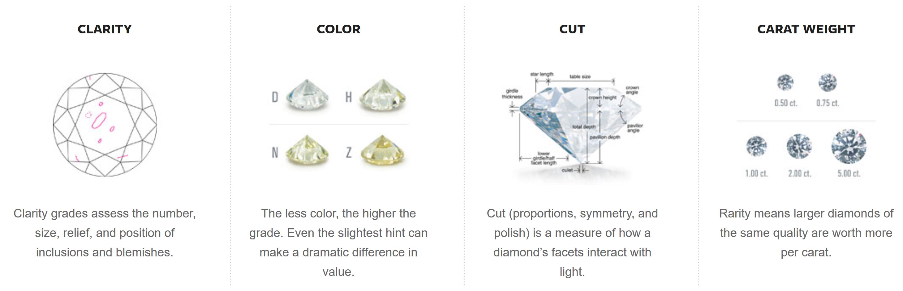
Figure 1: Diamond Metrics for Quality. Four of the ways diamonds are factored and rated. Clarity, Color, Cut, and Carat. From Gemological Appraisal Industry. (2018). Diamond Education. Retrieved from: https://gailab.org/content/diamond-education
Figure 1 depicts the four primary classifications of diamond quality and is proportional to value according to the Gemological Appraisal Industry (2018a), an independent company that does gemstone appraisals and services. Clarity describes the type and amount of blemishing in the diamond stone. Color is the lightness of the diamond. Cut is the dimensions of the stone. Carat is the weight and proportional to the size of the stone. In the data, cut is a grading while depth, table, x, y, z are the measurements leading to the cut proportions.
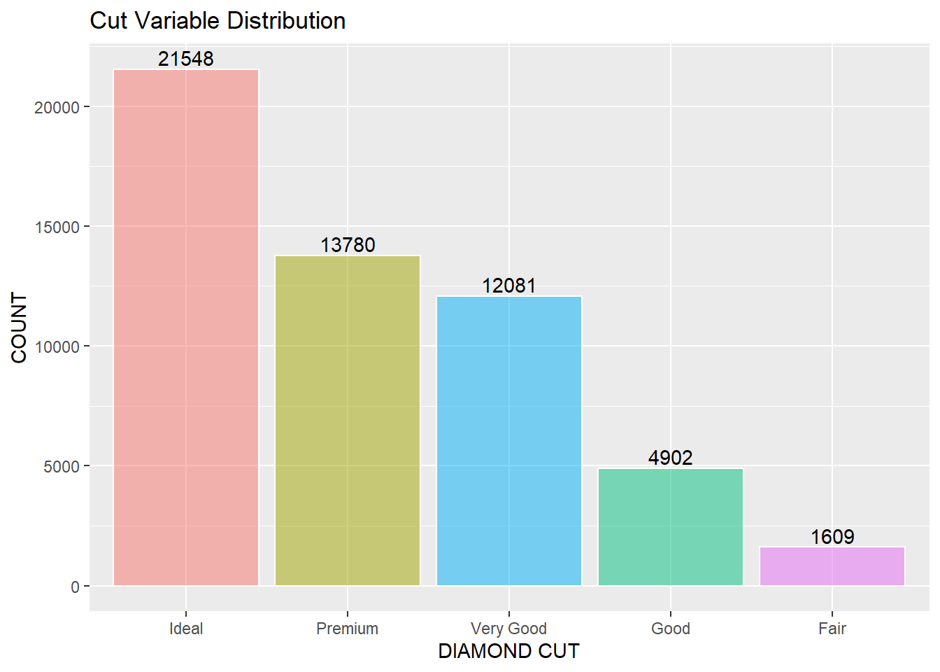
Diamonds Cut Variable
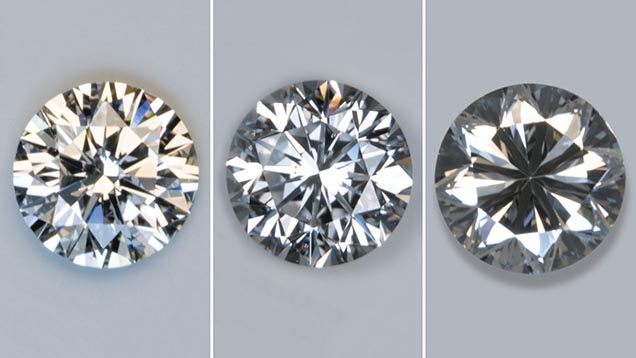
Figure 2: Diamond Cut. The data contains the cut variable labeled Fair, Good, Very Good, & Ideal. Cut is a grade assigned describing the quality of refracted light. Three optical effects: brightness, fire, scintillation, describe the way light appears inside of the stone, from the Gemological Institute of America Inc. (2018a). Diamond Quality Factors. https://www.gia.edu/diamond-quality-factor
The graph below is the categorical variable cut and the distribution of records within the dataset. Ideal, Premium, Very Good, Good, and Fair make up the cut category. 21,548 or 40% of the data is an Ideal cut. 1,609 or 3% of the dataset is Fair cut. Thus an imbalance within the cut variable.
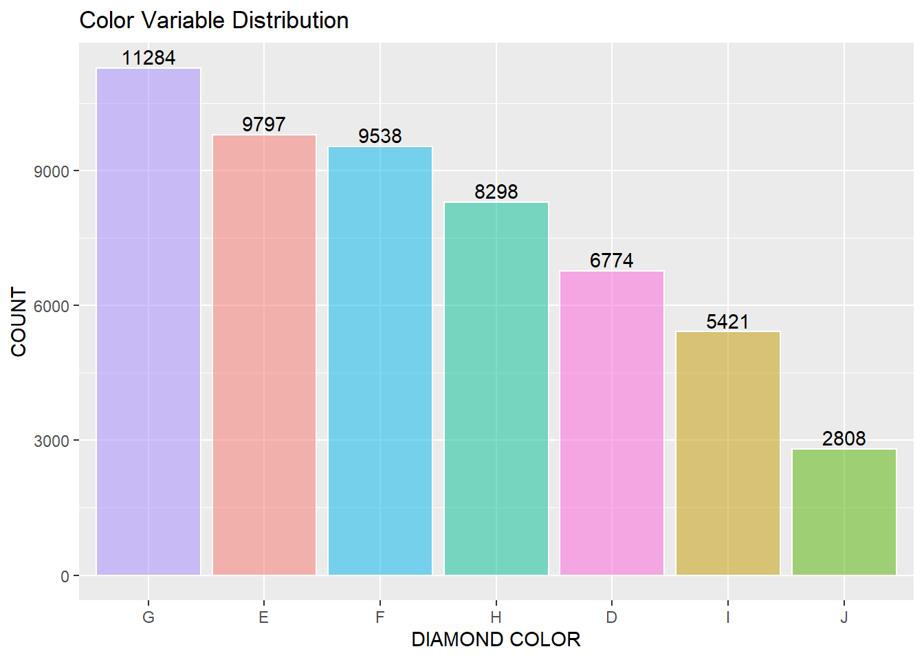
Diamonds Color Variable
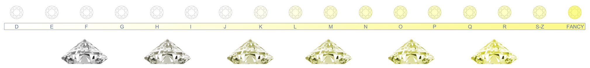
Figure 3: Detail of Diamond Color Grades. The data contains seven color grades from light to colorless: D, E, F, G, H, I, J. From the Gemological Institute of America Inc. (2018a). Diamond Quality Factors. https://www.gia.edu/diamond-quality-factor
The data contains the color categorical variable and has seven classes: D, E, F, G, H, I, J in order from colorless to light yellow. The G color class makes up 11,284 or 21% of the total data, and the J color class makes up 2,808 or 5% of the total data. There is an imbalance of the classes in color.
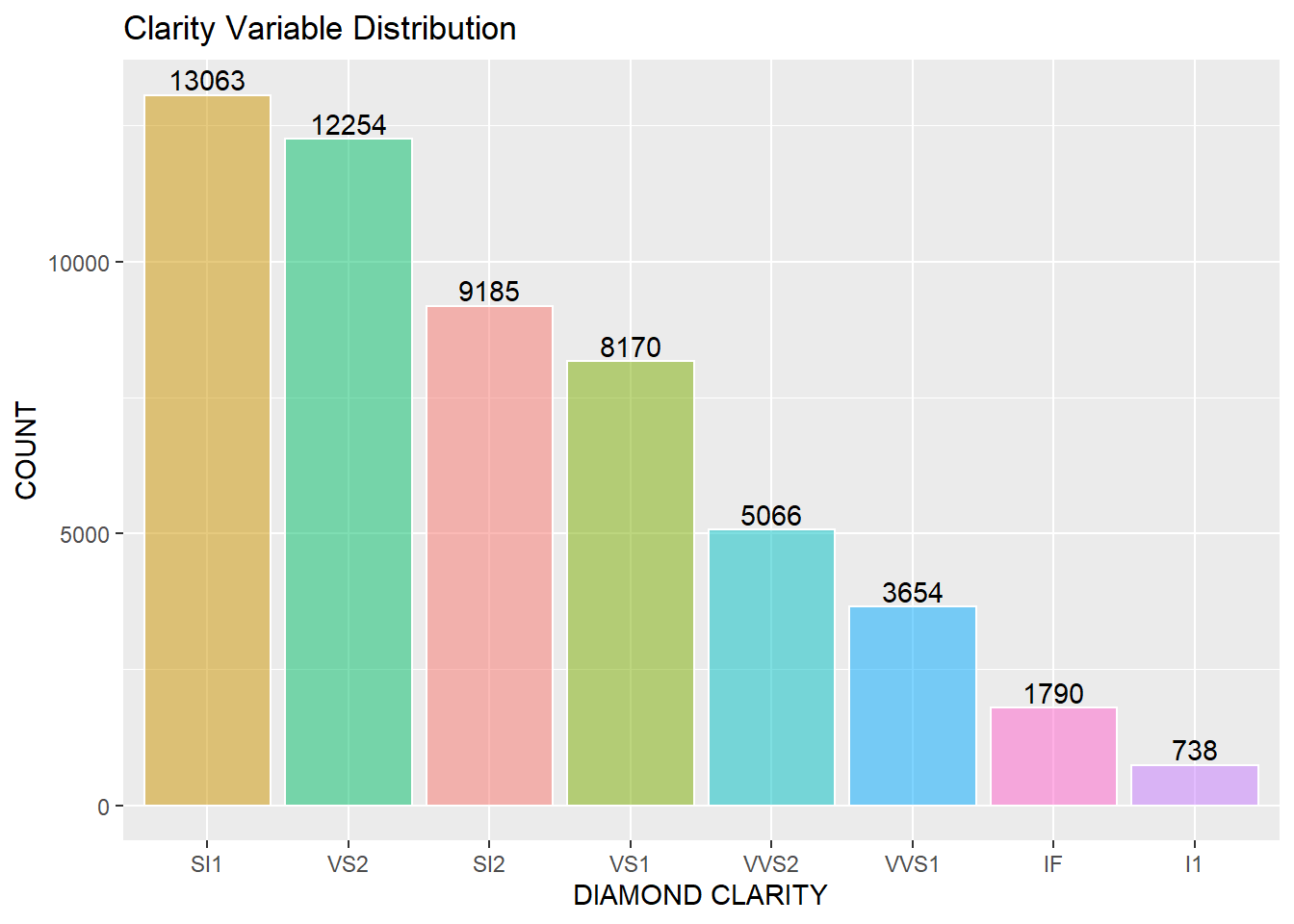
Diamonds Clarity Variable
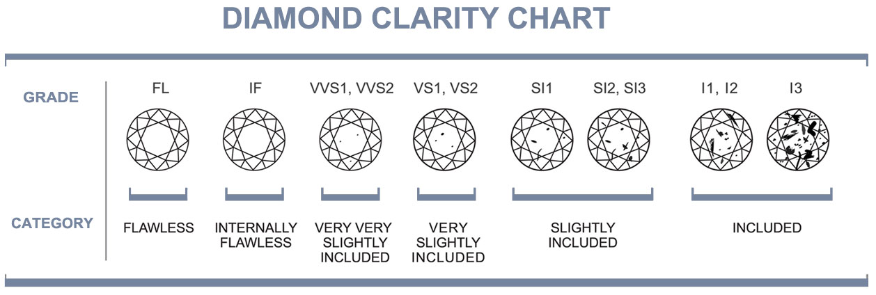
Figure 4: Detail of Diamond Clarity Grades. The data contains eight clarity ratings from low to high: I1, SI1, SI2, VS1, VS2, VVS1, VVS2, IF. The diamond has inclusions and surface blemishes or irregularities, or lack thereof. Clarity is related to the size, number, position, nature, and color of the diamond, from the Gemological Appraisal Industry, (2018). Diamond Education. Retrieved from: https://gailab.org/content/diamond-education
The data has a third categorical variable clarity and contains eight classes: IF, VVS1, VVS2, VS1, VS2, SI1, SI2, I1 grades in descending order of clarity in the stone. The lower grade SI1 is 13,063 or 24% of the total data, while the highest grade I1 is 738 or 1.2% of the total data. There is an imbalance in the ‘clarity’ classes.
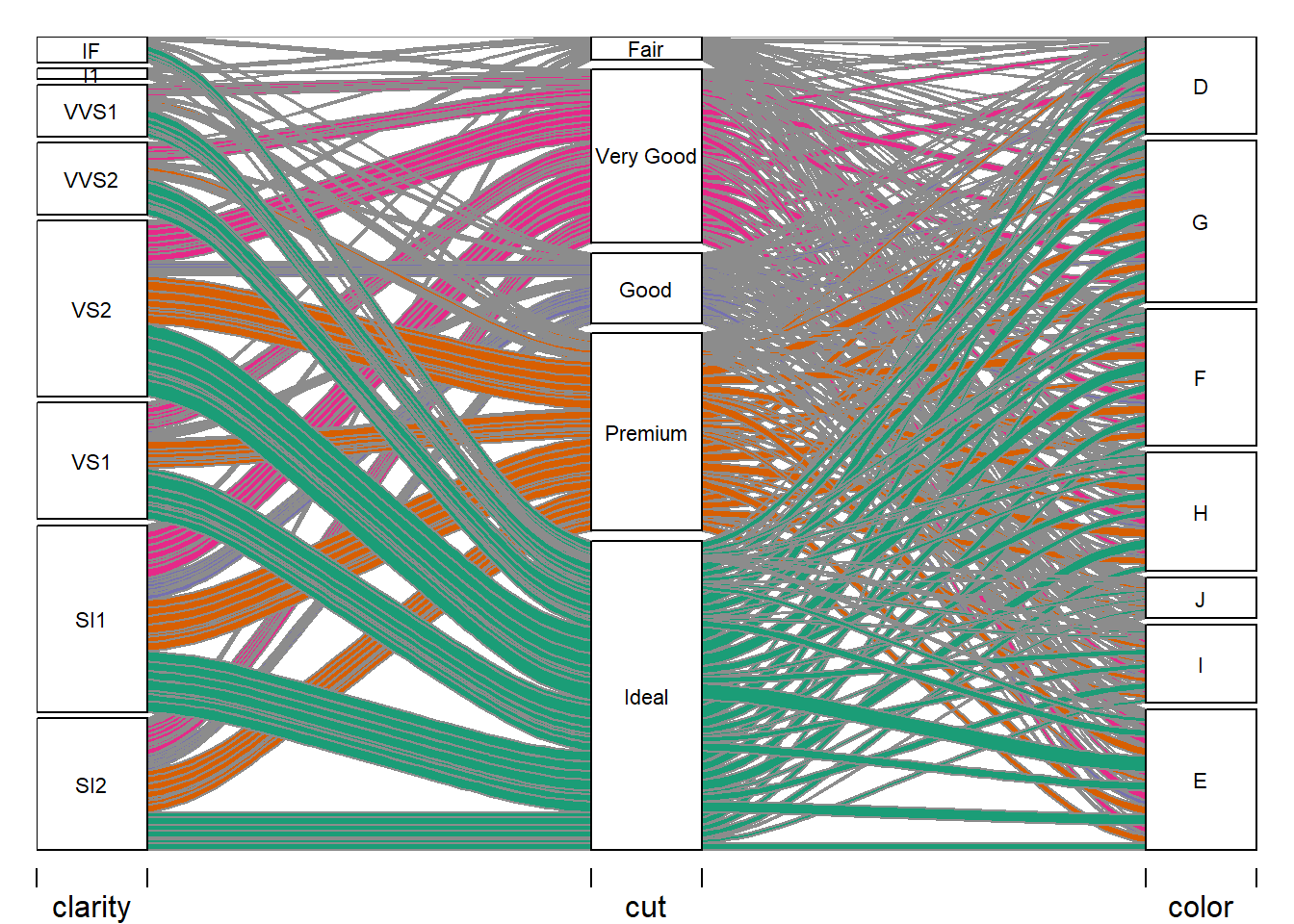
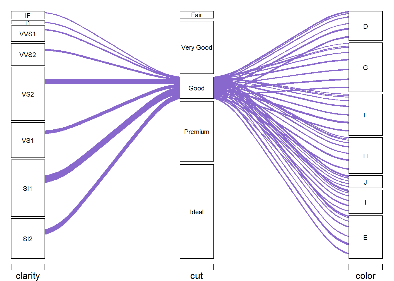
Alluvial Plot - Color
The following section is the categorical variables plotted using the alluvial plot method suitable for categorical variables. The alluvial plot will help see the relationship between these three complex categorical variables with multiple classes per variable.
library(alluvial)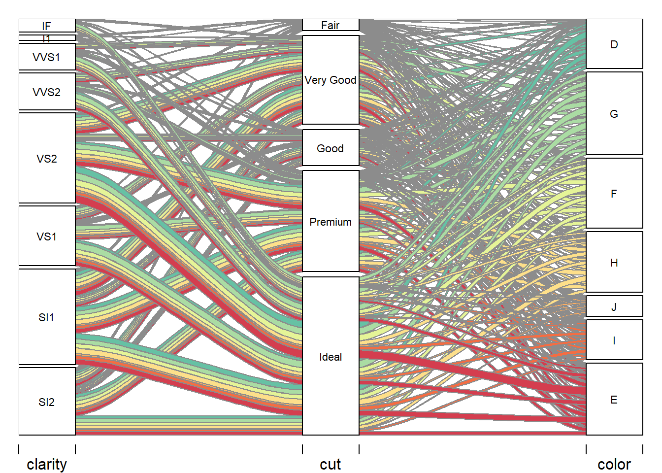
The above diagram highlights where the color classes on the right spread out through the cut classes and then into the clarity classes. Yes, this is a complicated-looking pattern of lines; however, there are patterns in the E class moving into the Ideal class and from the Ideal class spanning out into SI2, SI1, VS1, VS2 with fewer occurrences into VVS1, VVS2, I1, & IF.
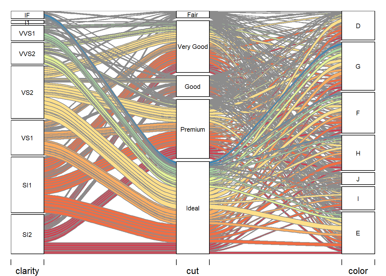
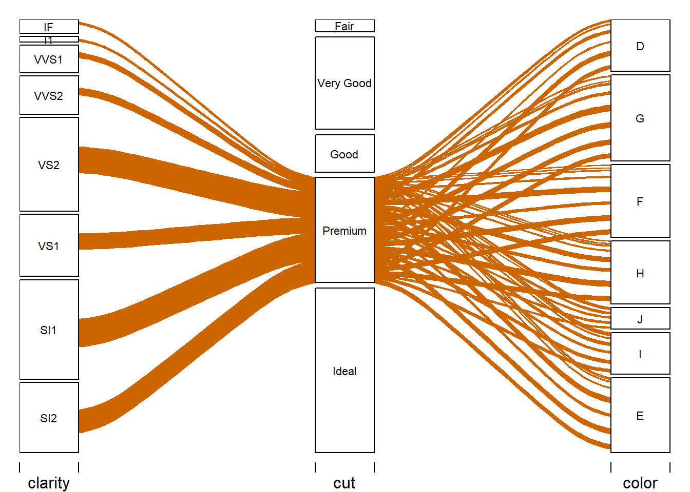
Alluvial Plot - Cut
The Alluvial plot above gives a focus on the cut variable classes. The Ideal class has green lines moving left into a clear direction into the majority of SI2, SI1, VS1, & VS2. On the right side, Idea moves into all the classes of color; however, a strong move into class E of color variable. Patterns can be observed in orange from the Premium class and magenta Very Good class. Further down is the itemization of these cut classes out into the clarity and color classes.
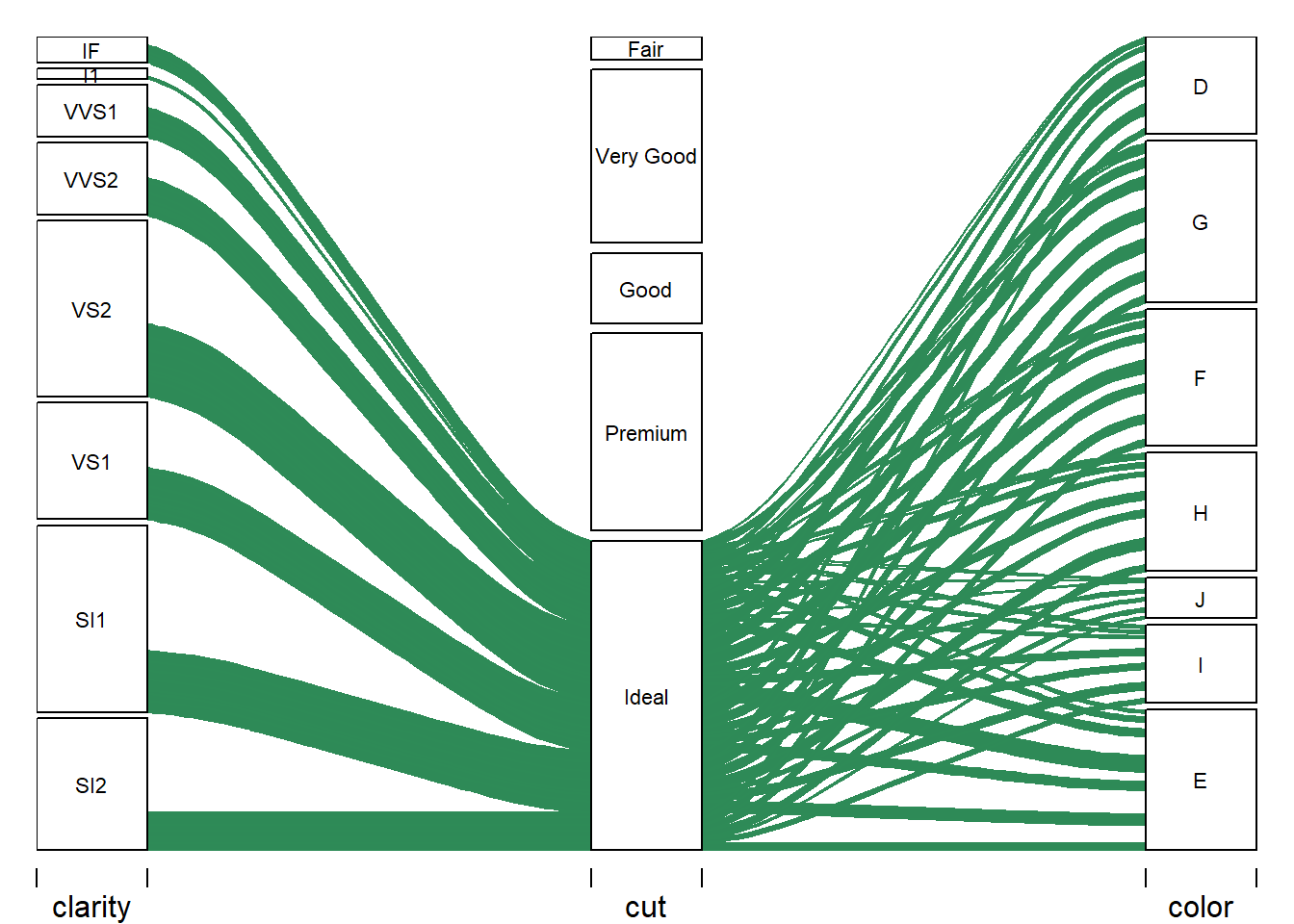
Alluvial Plot - Clarity
The alluvial plot above describes the movement of clarity through cut and into color. The relationships are discernable, and the relationship that all classes of clarity and cut span out into the color classes.
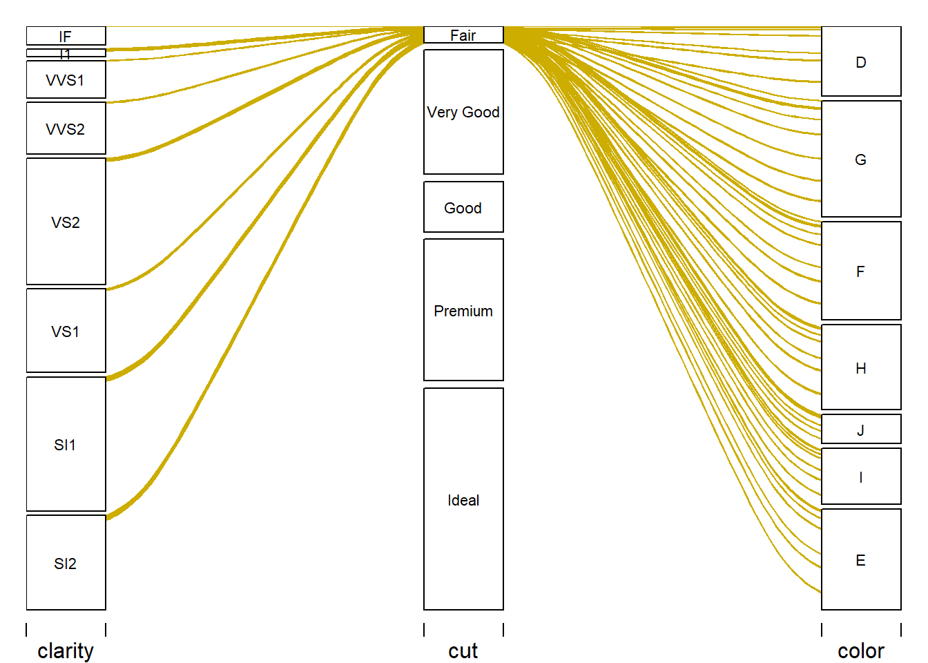
Alluvial Plot - Fair
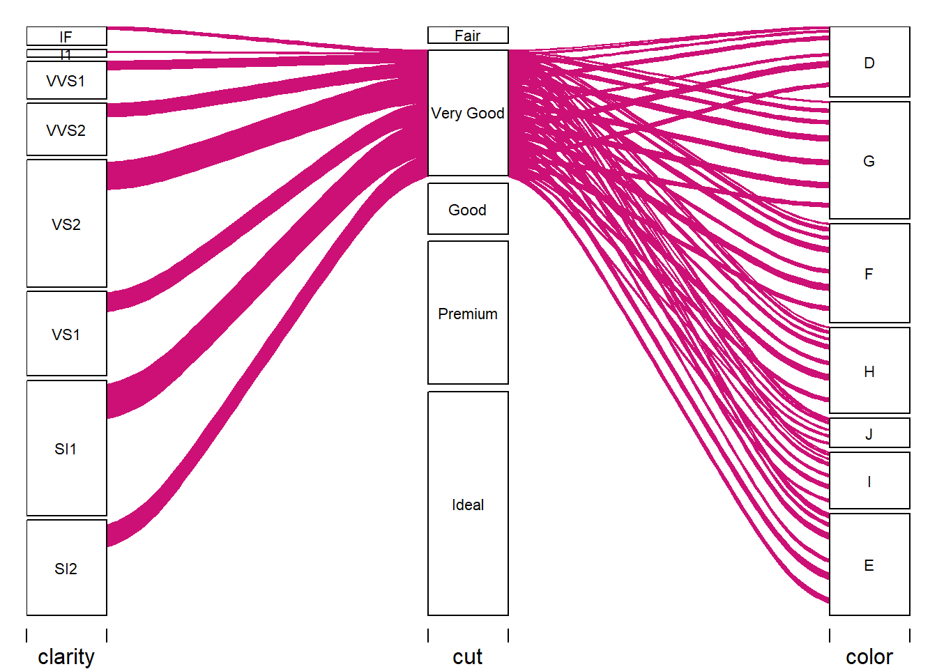
The next five alluvial plots make the variable relationship clearer showing the relationship of cut and its classes to clarity and color. The patterns become much clearer in this format.
Alluvial Plot - Very Good
Alluvial Plot - Good
Alluvial Plot - Premium
Alluvial Plot - Ideal
Correlation Matrix Analysis
Before going further with the individual numeric variables, this section will present the correlation between the numeric variables. Table 3 is the correlation matrix, and Spearman’s Rank Correlation Heat Map is below. One of the better robust measures of correlation is Spearman’s. The data shows skewness with long tails and many outliers; thus, using a robust correlation method. I did look at Pearson’s, and there were minor differences in this analysis, which may not be the case with other datasets.
| carat | depth | table | price | x | y | z | |
|---|---|---|---|---|---|---|---|
| carat | 1 | 0.03 | 0.19 | 0.96 | 1.00 | 1.00 | 0.99 |
| depth | NA | 1.00 | -0.25 | 0.01 | -0.02 | -0.03 | 0.10 |
| table | NA | NA | 1.00 | 0.17 | 0.20 | 0.20 | 0.16 |
| price | NA | NA | NA | 1.00 | 0.96 | 0.96 | 0.96 |
| x | NA | NA | NA | NA | 1.00 | 1.00 | 0.99 |
| y | NA | NA | NA | NA | NA | 1.00 | 0.99 |
| z | NA | NA | NA | NA | NA | NA | 1.00 |
Spearman’s Correlation Matrix
Purple shows the highest positive correlation between variables, and the lighter gold color shows no linear correlation between variables. Close to a coefficient of 0 indicates no linear relationship between variables. We consider any value below 0.3 or -0.3 as a weak correlation between variables, while a strong positive/negative linear relationship is any value 0.7 to -0.7.
The carat variable displays a strong positive uphill relationship of 1 - 0.99 to the x, y, & z variables. See Figure 5 below that demonstrates where the x, y, z measurements are taken on the diamond stone. Larger measurements certainly mean a larger stone, equating to a higher carat weight. Note the relationship in caratwt to the x, y, z in Table 4 below. And as we will see, the price and carat are strongly correlated. Oddly the depth shows practically no linear relationship to z, and table shows a weak linear relationship to x. However, Figure 5 indicates depth and table derived from z & x.
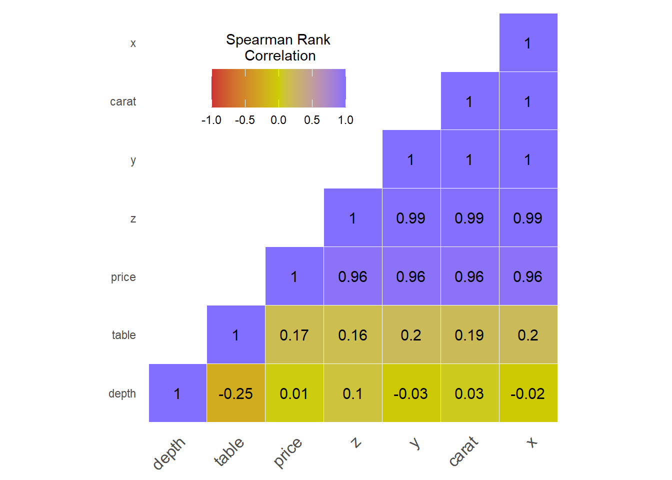
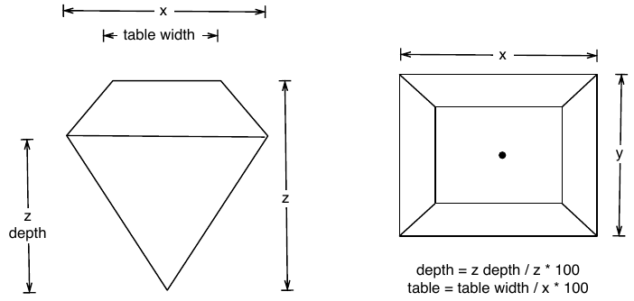
Figure 5: Diamond Cut Dimensional Chart. The data contains five cut dimensions: depth, table, x, y, and z that describe the dimensions in (mm) of the diamond. From Wickham, H.(2016).ggplot2 Elegant Graphics for Data Analysis. 2nd ed, pg. 65 Springer. doi:10.1007/978-3-319-24277-4
Note the relationship in carat wt to the x, y, z in Table 4. The smaller sizes are smaller carats, while the larger sizes are higher carats. Dimensions are proportional to the carat weight.
| carat | x | y | z | |
|---|---|---|---|---|
| Min. :0.2000 | Min. : 3.730 | Min. : 3.680 | Min. : 1.07 | |
| 1st Qu.:0.4000 | 1st Qu.: 4.710 | 1st Qu.: 4.720 | 1st Qu.: 2.91 | |
| Median :0.7000 | Median : 5.700 | Median : 5.710 | Median : 3.53 | |
| Mean :0.7977 | Mean : 5.732 | Mean : 5.735 | Mean : 3.54 | |
| 3rd Qu.:1.0400 | 3rd Qu.: 6.540 | 3rd Qu.: 6.540 | 3rd Qu.: 4.04 | |
| Max. :5.0100 | Max. :10.740 | Max. :58.900 | Max. :31.80 |
Remove x, y, z Variables
The decision is to remove the x, y, and z variable from the dataset.
diamonds = select(diamonds, carat, cut, color, clarity, depth, table, price)Analysis of Numeric Variables - (Caret, Price, Depth, Table)
This next section explores the remaining numeric variables in the diamonds dataset. The variables: carat, depth, table, price are the remaining numeric variables in the dataset.
I will explore the population distribution, standard deviation, medians and quartiles, skew, outliers, and normal probability variables. There is a summary table for each variable, histogram with normal distribution curve imposed on it, showing how well the data fits a normal distribution. The normal probability plot for continuous variables determines if it from a normally distributed sample with a reference line to look for closest to a straight line. And finally, a boxplot to also describe the distribution of data. They show the whole range of the variable where the whiskers end—Left and right of the box in the 25th and 75th percentiles. The upper/lower whisker projects from the hinge 1.5 x the interquartile range (IQR). A solid black line through the box is the median, and the red circles are the outliers in the variable. The summary table summarizes the variable: min, 25%, mean, median, 75%, max, sd, and the lower and upper IQR and the number of outliers beyond the IQR* 1.5.
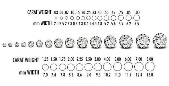
Figure 6: Diamond Carat Chart. The data contains carat sizes from 0.20ct to 5.01ct. The image above shows the carat and dimension in (mm). Carats are a diamond’s weight in metric carats (ct.). And the carat is proportional to the x dimension, which was removed from the data—this image from Tremonti Fine Gems & Jewellery. (2012). Buying diamonds safely - Why we won’t let you get caught out. http://tremontijewellery.blogspot.com/2012/07/buying-diamonds-safely-why-we-wont-let.html
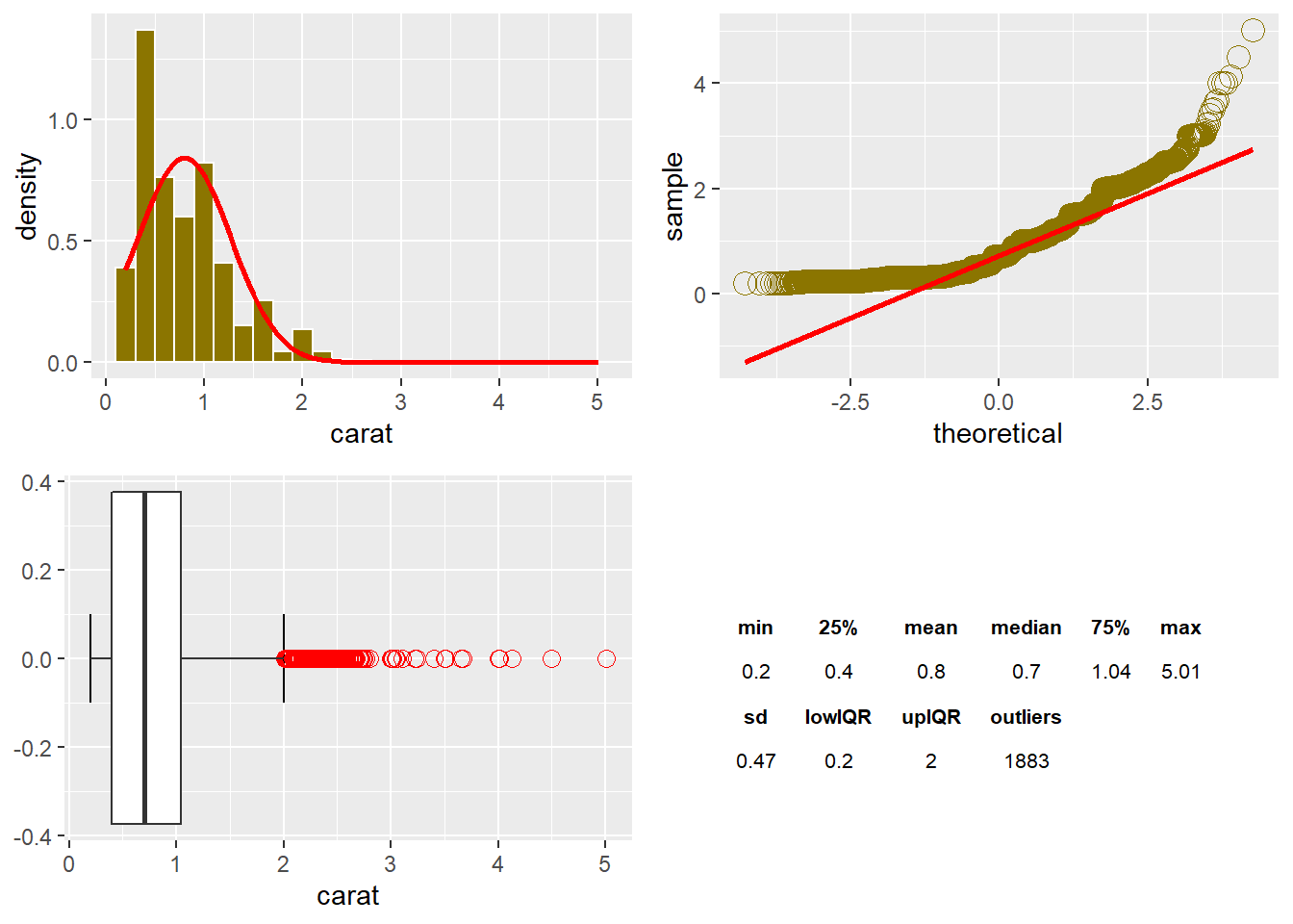
Carat
The range of carat size is 0.2ct. up to 5.01ct., and the median is 0.7ct, which is a robust estimate not influenced by the extreme outliers. The histogram shows the heavily grouped size between 0.25ct. and 0.5ct. However, a median of 0.7 and a standard deviation of 0.47 puts the bulk of data between 0.23ct and 1.17ct. The standard deviation (squared deviation) is not robust to the outliers that skewed the data. However, the majority of the data points are between 0.2ct. and 2ct. The interquartile range is 0.64. The data has a positive skew to the right indicated by the data points curving from above to below the line then back above it on the Q-Q plot. From the boxplot, the 1,883 outliers skew the variable to the right.
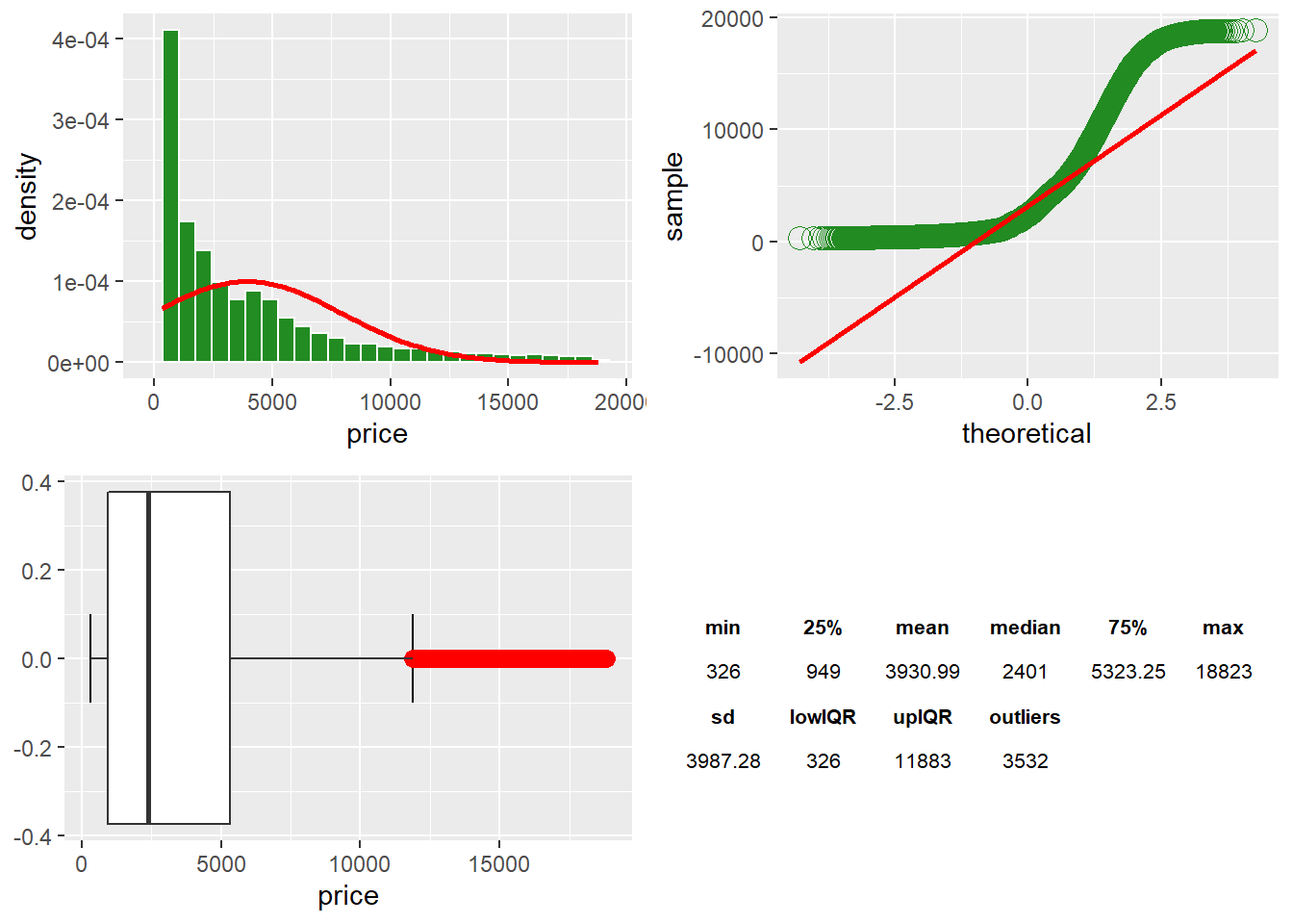
Price
The price histogram shows the distribution of data points with a majority in the lower price range. There is an $18,497 range in price across the data points. The median is $2,401, which is not influenced by the upper value of $18,823. We can see a skew from the median with a 75% percentile of $5,323. The $3,532 outliers affect the standard deviation above the IQR*1.5. The IQR range is $4,374. The data has a positive skew to the right, shown by the Q-Q Plot. The points curve from above the line to below the line and then back above the Q-Q Plotline. However, the upper points return closer to the line at the end. Price is not a normal distribution. However, price is the predictor variable at a future point.
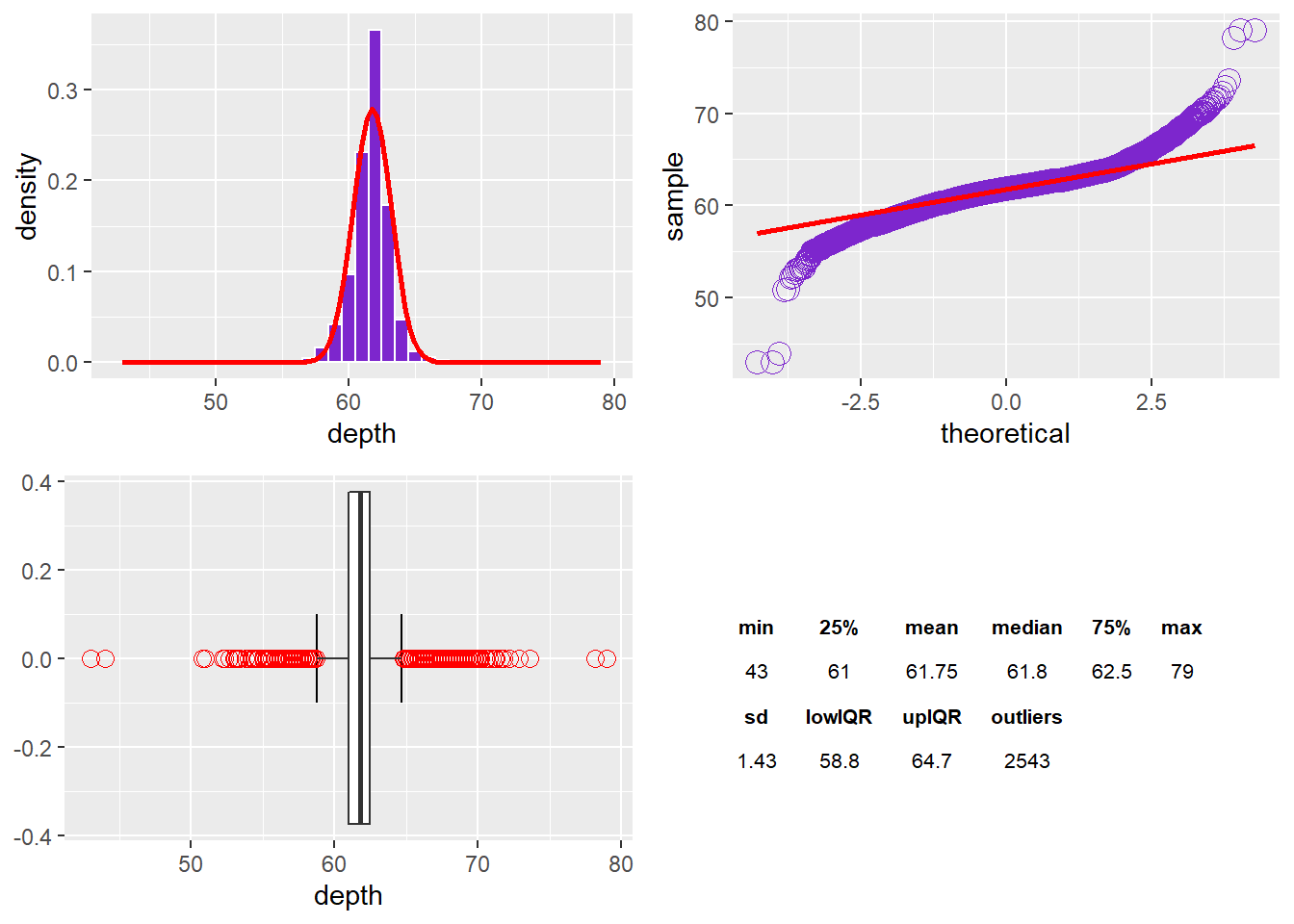
Depth
The depth variable displays a normal curve; however, there is a peak that increases kurtosis. There are long tails on either side of the 25% and 75% quartiles due to the 2,543 outliers. The standard deviation is 1.43 and is not too affected by outliers. There seems like an even distribution of outliers on either side of the IQR*1.5 whiskers. The Q-Q Plot has data points below the line and then at the red bar and finishing above it. The data indicates a normal distribution with a sharp peak and fatter tails relative to a normal distribution.
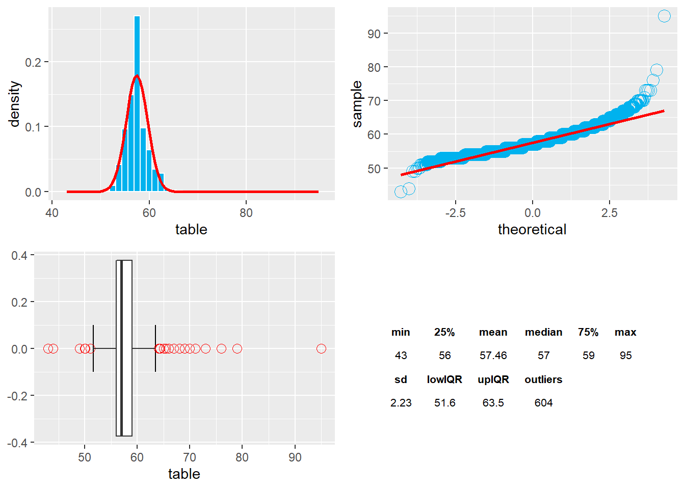
Table
Table produces and normal distribution with a sharp peak and more sweeping tails due to outliers. The median is 57 and tight between the 25th and 75th percentiles. The Q-Q plot shows some kurtosis but little skew. The standard deviation is 2.23 and seems high, given the normal-looking curve. Standard deviation is affected by the outliers again and may not be the best measure. There are 604 outliers in the table data points.
CARAT AND PRICE
We noticed a strong uphill correlation of 0.96 between the price and carat in the Spearman Matrix above. The plot below displays that correlated relationship to a point on the carat scale. However, we can see a large dispersion of prices for the same carat weight, which should happen based on the other factors that grade the diamond. The anomalous drop in price occurs at 2.25ct, and the loess smoothing curve dips in price to approximately 3.25ct and then resumes its climb, but doesn’t exceed in price until after 4ct. Thus 2.25ct to 4ct sees a drop in the linear price. Also, the data becomes very disperse after 2.5ct. According to the carat boxplot from earlier, the outliers start around 2ct. and above. On the graph, the blue line is climbing sharply and begins to stop climbing 1.75ct. as it approaches the 2.0ct mark.
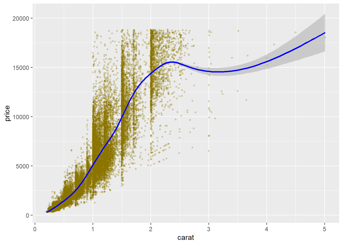
This graph takes a randomized sample and plots a scatterplot of the price and carat to help visualize where the loess curve begins to decline or deviate from its upward growth in price/carat relationship. Around 2ct, the data starts to ease up and at 2.25ct starts to fall in price. Not sure why this is happening; however, let’s look at some more data relationships.
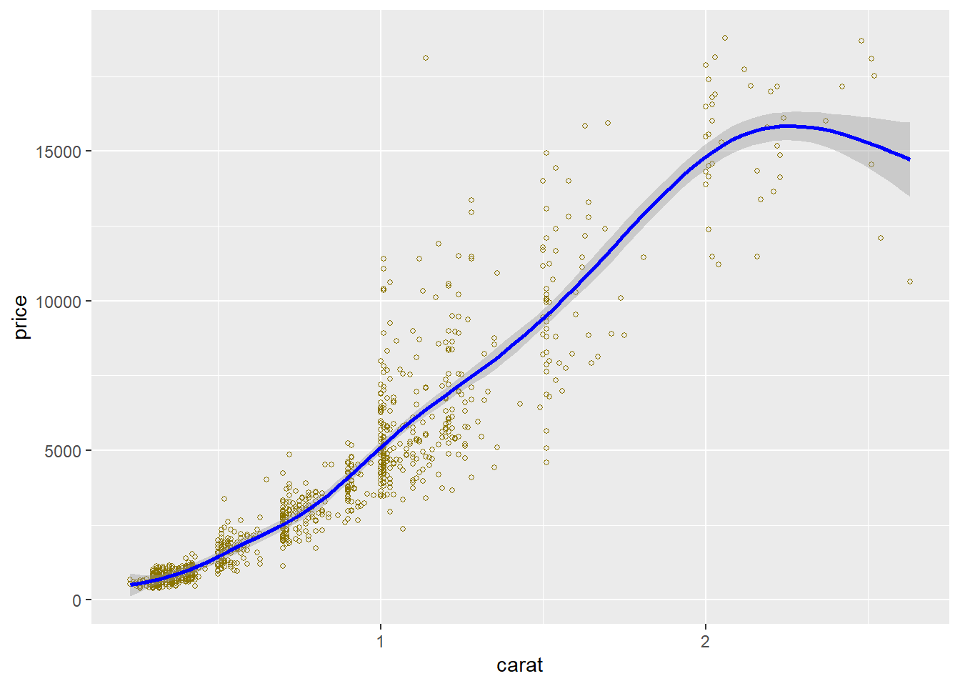
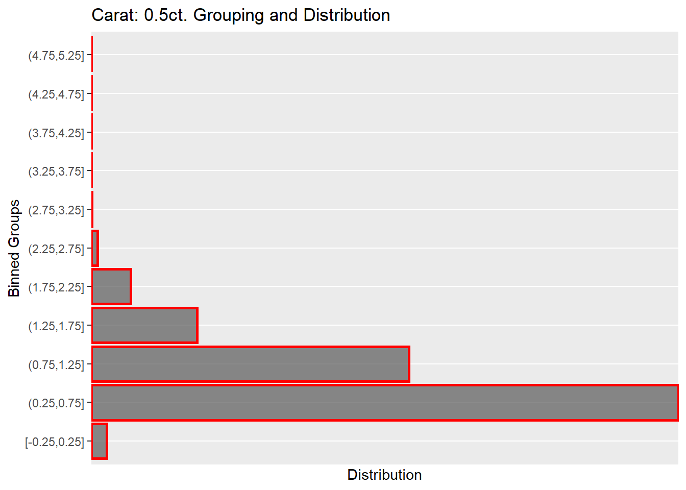
The price-carat boxplot is more telling but very similar to the scatterplot in a curve over carat weight and price. The boxplot was made by binning the carat sizes down from 5.25ct to 0.2ct in 0.5ct intervals. Grouping the carat helped organize the plots and better visualize 1ct and 1.25ct standout, showing a skew with many outliers and spanning the price range $2000/$2500 up to the $18,000 limit. Thus, other variables determine the price as not only the diamond’s carat weight. Note the sparseness of the data points after 3.5ct. The table is a summary of the grouping of carat into 0.5ct intervals. The table reiterates what is in the histogram plot from earlier. The majority of diamond data points are in the 0.25ct to 1.25ct range, with the most extensive grouping 0.25ct to 0.75ct. The sparse data points after 2.25ct jump out and will consider what to do with the data pre-modeling.

The grouping and distribution plot below shows the dispersion of carat weights binned into 0.5ct groups. 0.25ct to 0.75ct hold the most observations at 29,496, which is 54.7% of the total data, followed by the next size group 0.75ct to 1.25ct, which is 29.6% of the entire data. The question I have is there enough data after 2.75ct to 5ct to determine or predict diamond prices? More than likely, not, and maybe we remove this data.
COLOR AND PRICE
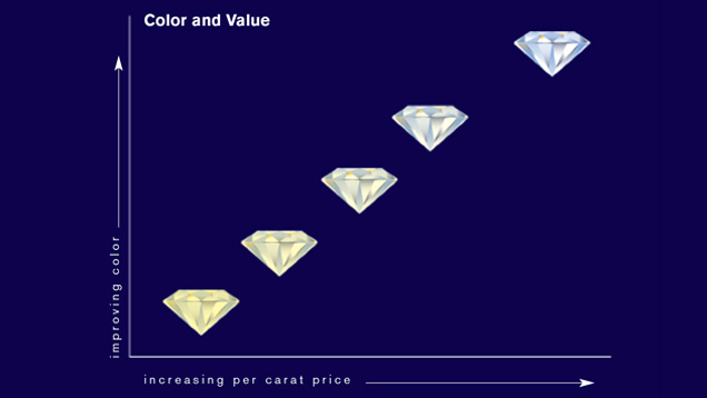
Figure 7: Color to Price Expectation. According to GIA, a diamond’s price can differ based on color only regardless of the clarity, carat, and cut. From Gemological Institute of America Inc. (2018a). Diamond Quality Factors. https://www.gia.edu/diamond-quality-factor
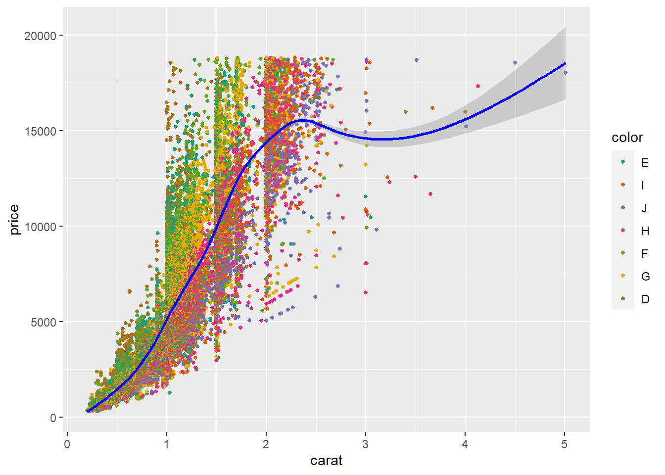
The scatter plot demonstrates the carat to price and introduces a diamond color grade. However, there is a trend; it’s the D, E, F considered higher grades that are colorless, which seem to be in the smaller carat weights and span across the entire price range. The outlier carat weights above 3ct are H, I, J, which have more color than the D, E, F, and assumes that there are few large carat colorless diamonds, certainly in this dataset.
The color and price boxplot shows low to high median value left to right and the outliers in red. Again H, I, & J all have higher prices, while D, E, & F have lower prices, but their outliers reach up into the higher cost diamonds. The number in the boxes gives the distribution of color numbers in the total dataset. G has the most observations, followed by E and F color grades.

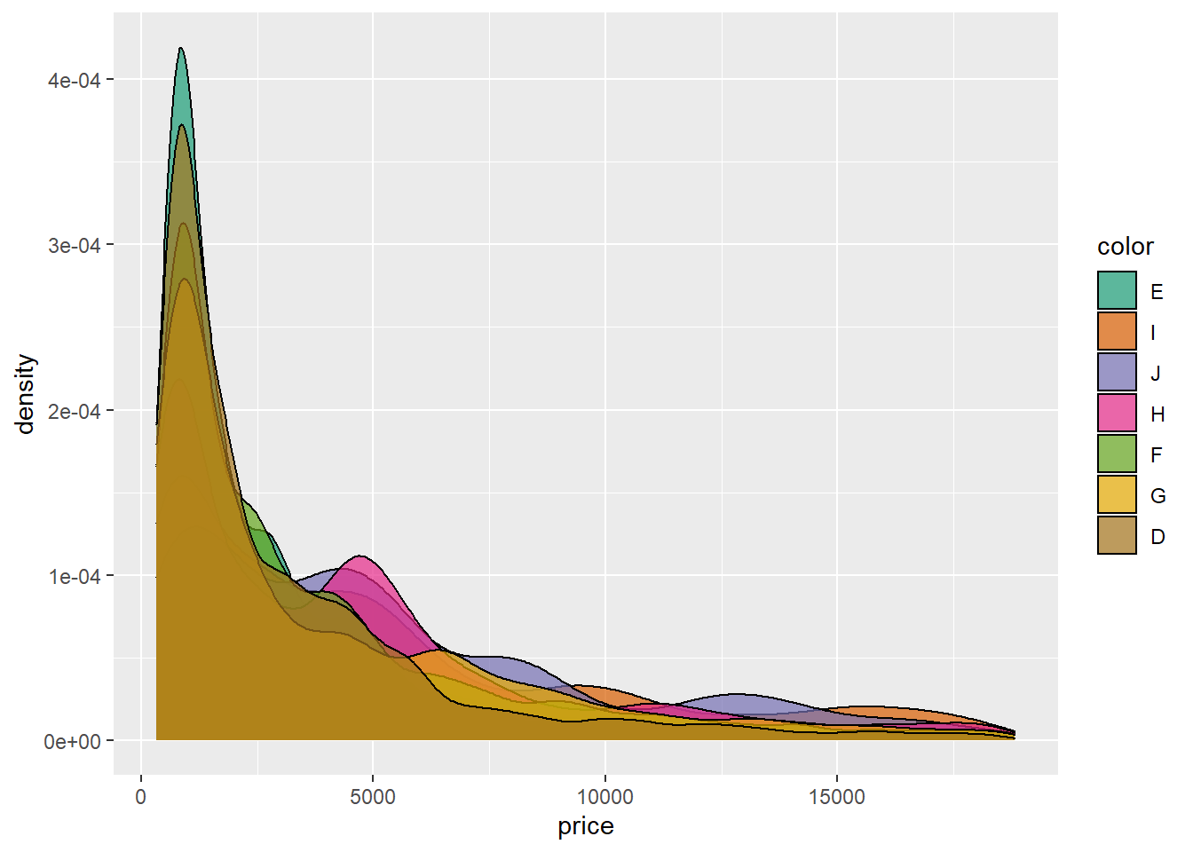
The density curve demonstrates the skewed color data to the right and the distribution of data points in the data. It’s another way to see what is happening with color and price.
The box plot above summarized the distribution of color, and here is each color grade that shows the skewness of each grading. Heavy skew to the right. Notice the increase of price in H, I, & J around the $4,500 to $5,000 mark.

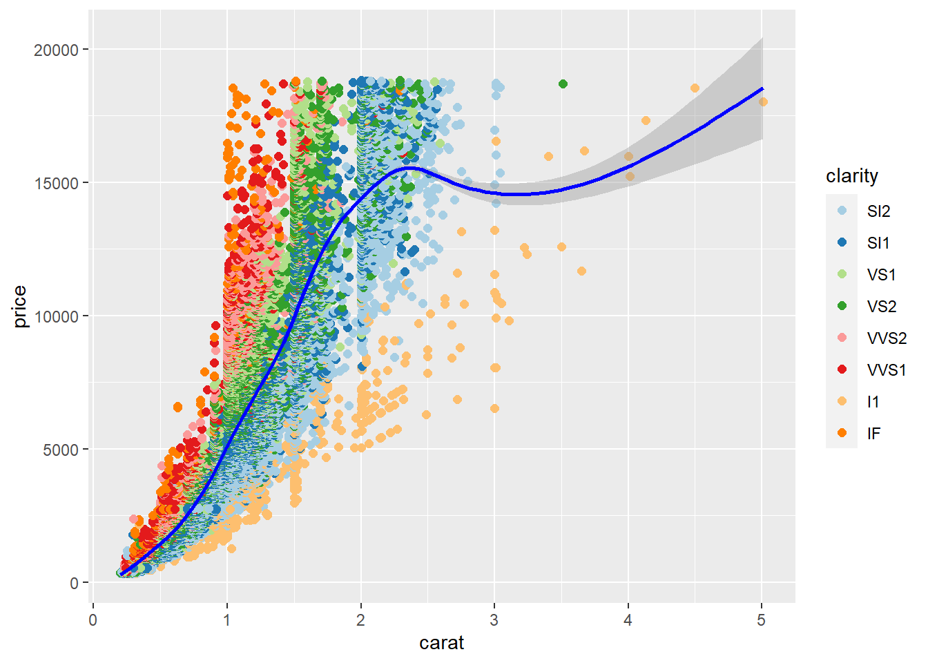
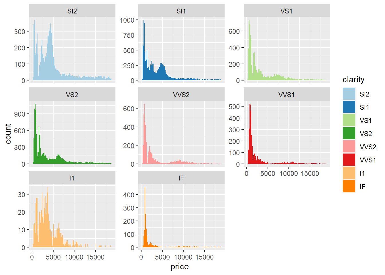
CLARITY AND PRICE
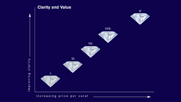
Figure 8: Clarity to Price Expectation. According to GIA, the clarity of a diamond is unique to each stone. Clarity can affect the price because the higher up the scale, the more rare the clarity. From Gemological Institute of America Inc. (2018a). Diamond Quality Factors. https://www.gia.edu/diamond-quality-factor
The plot below is for the price, carat, and & clarity. This graphic is a bit better because we can see the clear bands of color representing each of the clarity grades in proportion to price and carat weight. I1 is the “Included” rating and in the lowest clarity rating because it has more blemishes and irregularities compared to the IF (internally flawless). We find the I1 clarity in the higher carat wt diamonds, and there are outliers in the higher price range. With this scatterplot, it is clear that the clarity grades are following a curve and span a defined carat range but extent through all prices from lowest to highest price.
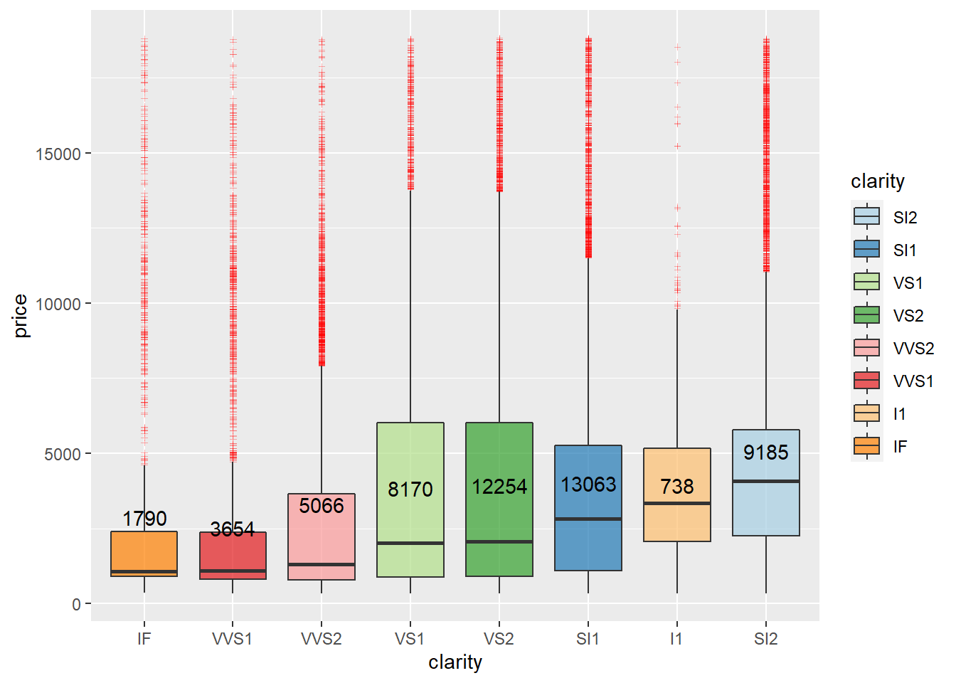
The price/clarity boxplot gives more insight into what is happening. All the clarity grades span the price range, but all of them are outliers at higher prices. SI1, VS1 & SI2 make up the majority of the data for clarity. The boxes are in ascending order of each median, and the lower quality clarity grades are higher in price than the top clarity grades IF, VVS1, & VVS2. Figure 8 does elude to higher the clarity the rarer the diamond, but in this data, IF is the second-lowest distribution above I1, but I1 isn’t considered rare it’s the least clear diamond, and the outliers are few however do reach the higher prices. The five clarity grades to the plots right all have a 75th percentile hovering around $5,000 in price.
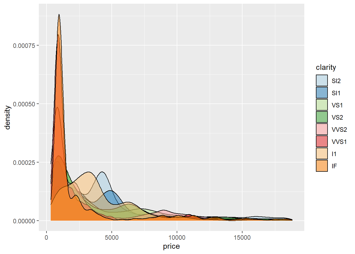
The density plot of price to clarity gets confusing because of the overlap in color and the low price. The IF clarity is in more of the lower-priced diamonds. And so is I1.
These histograms show the distribution of each clarity grade to price. We find a heavy skew right, and the graphs show the majority of clarity grades are in the lower cost diamonds. SI2 & I1 have a broader price range, with many costing up to $5,000. The two from the left edge are under $2,500 and are the highest clarity grade.
CUT AND PRICE
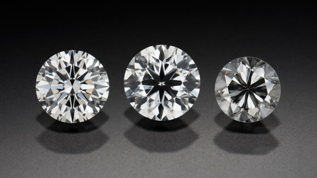
Figure 9: Cut to Price Expectation. Left to Right: Ideal, Good, Fair. The diamonds cut affects the way light refracts in the diamond. The brighter the diamond, the higher the cut grade. The cut is a combination of the proportionate dimensions to optimize the brilliance and fire of the stone. The GIA does not mention if cut affects the price. From Gemological Institute of America Inc. (2018c). Diamond Cut: The wow factor. https://www.gia.edu/diamond-cut/diamond-cut-basic-overview
The fair cut appears to follow the larger carat sizes similar to the I1 clarity grade above, and the fair cut is found on the biggest diamonds and at the highest prices. The Ideal cut in red spans the carat range densely from 0.2ct to approximately 1.5ct then becomes more dispersed in the higher carat ranges, yet the price is higher when the carat and Ideal grade are together.
The boxplot explains the cut distribution better. The Ideal cut is the largest proportion of the dataset, followed by Premium and Very Good, Premium is the grade with a 75th percentile over $5,000 in the price above Very Good and then Fair. All cut grades have outliers that reach the highest prices and possibly Ideal with the most outliers extending the price range. But statistically, the Premium grade extends the IQR*1.5 the highest in price.
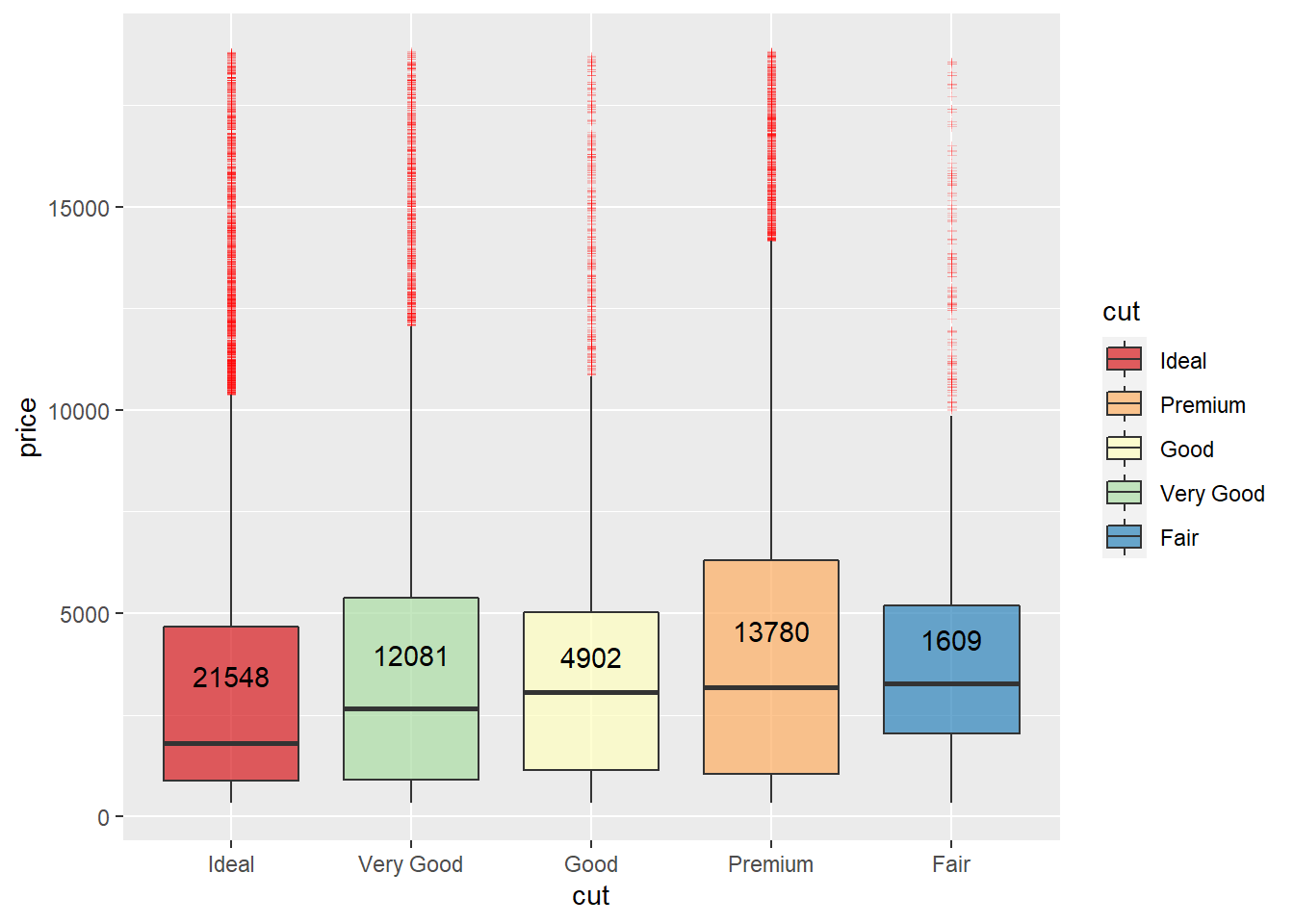
The density curve is more clear to read with fewer categories. We can see this in the boxplots, and here Ideal takes the majority of data points followed by Premium. The Fair grade has a narrow price range, as seen in the boxplot, with the lowest number of observations in the data.
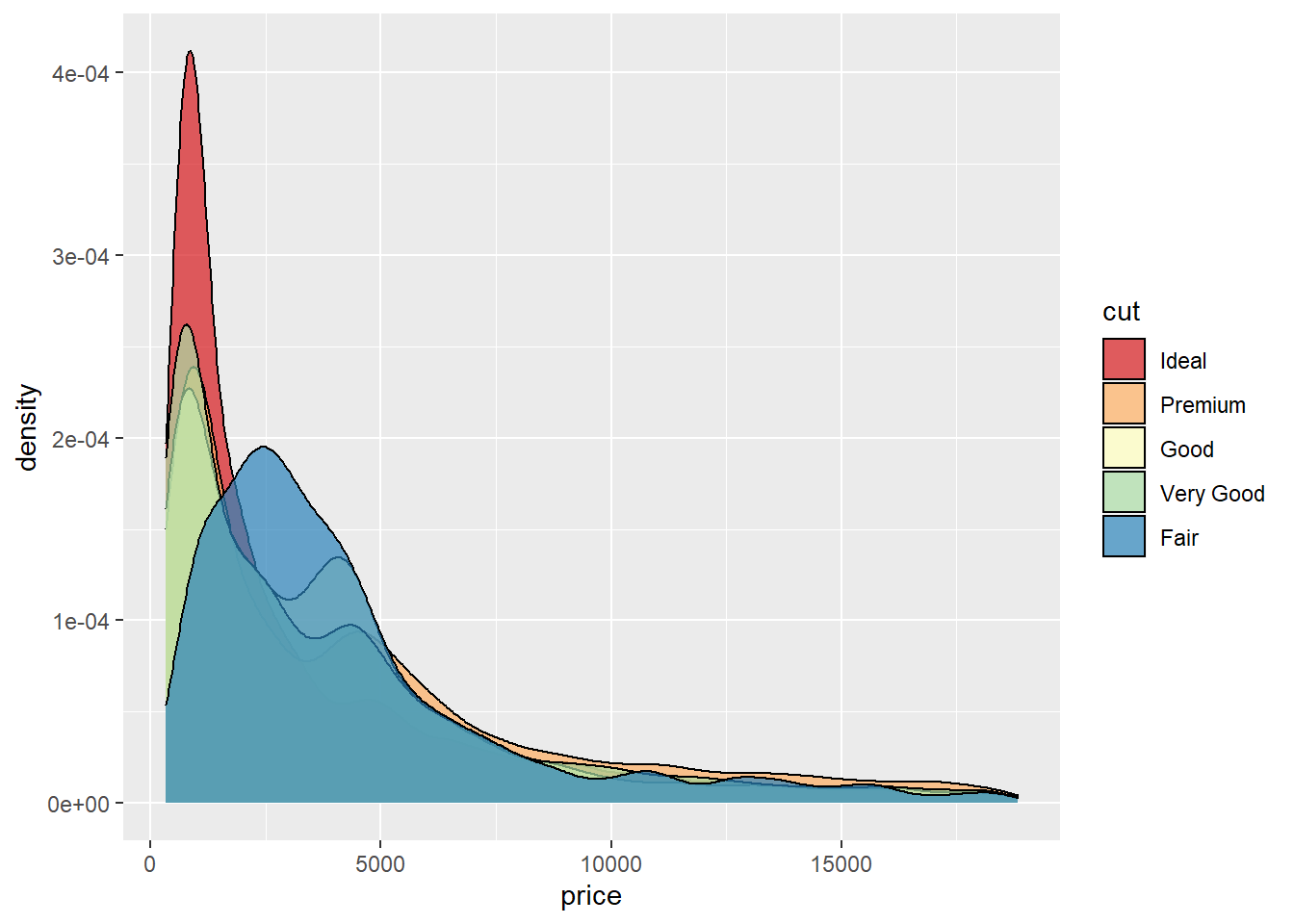
No big surprise at this point that the data is skewed right because of outliers. The histogram plots give some more view into how the cut dispersed in the data. The properties combined with the boxplot and density curve show that most of the data reside in the under $5,000 price range and under the 2.5ct weight range.

Conclusion
It is best to look at the outliers and decide if they should be taken out of the data or stay. For regression analysis, it recommends removing outliers and normalizing the data to represent a normal distribution. Also, scaling the data would help with the accuracy of the algorithm. If we wanted to use machine learning algorithms on this data, I would remove extreme outliers, normalize/scale the data and one-hot-encode all of the categorical variables. I am leaning toward using a decision tree classifier and may post up future analysis. I would like to continue this process in a future post when time is available.
References
Gemological Appraisal Industry. (2018). Diamond Education. Retrieved from: https://gailab.org/content/diamond-education
Gemological Institute of America Inc. (2018a). Diamond Quality Factors. Retrieved from: https://www.gia.edu/diamond-quality-factor
Gemological Institute of America Inc. (2018b). Diamonds - Overview. Retrieved from: https://www.gia.edu/diamond
Gemological Institute of America Inc. (2018c). Diamond Cut: The wow factor. Retrieved from: https://www.gia.edu/diamond-cut/diamond-cut-basic-overview
STHDA, Statistical tools for high-throughput data analysis. (2018). ggplot2: Quick correlation matrix heatmap - R software and data visualization. Retrieved from: (http://www.sthda.com/english/wiki/ggplot2-quick-correlation-matrix-heatmap-r-software-and-data-visualization
Tidyverse/ggplot2. (2018). diamonds.R. [Data file]. Retrieved from: https://github.com/tidyverse/ggplot2/tree/master/data-raw
Tremonti Fine Gems & Jewellery. (2012). Buying diamonds safely - Why we won’t let you get caught out. Retrieved from: http://tremontijewellery.blogspot.com/2012/07/buying-diamonds-safely-why-we-wont-let.html
Wickham, H.(2016).ggplot2 Elegant Graphics for Data Analysis. 2nd ed, pg. 65 Springer. doi:10.1007/978-3-319-24277-4