Exploratory Graphics in R
The focus of this analysis is on the ways to graph data set variables. The first section uses the EPA data set retrieved from: https://github.com/jtleek/modules/blob/master/04_ExploratoryAnalysis/exploratoryGraphs/data/avgpm25.csv the data was imported into a csv file and then used for this first section. Code notes for explaination.
The first part uses the RStudio base functionality to plot graphics then we use maps, lattice, and ggplot2 to compare and contrast. ggplot2 and lattice produce nice graphics quickly, while maps has state maps with county delineations among other options.
library(tidyverse)
library(maps) #load maps package
library(lattice) # load lattice package
library(MASS) #load MASS package for cats data
avgpm25 <- read.csv("https://raw.githubusercontent.com/jtleek/modules/master/04_ExploratoryAnalysis/exploratoryGraphs/data/avgpm25.csv", row.names=NULL) #load data
str(avgpm25) #view structure of the data## 'data.frame': 576 obs. of 5 variables:
## $ pm25 : num 9.77 9.99 10.69 11.34 12.12 ...
## $ fips : int 1003 1027 1033 1049 1055 1069 1073 1089 1097 1103 ...
## $ region : Factor w/ 2 levels "east","west": 1 1 1 1 1 1 1 1 1 1 ...
## $ longitude: num -87.7 -85.8 -87.7 -85.8 -86 ...
## $ latitude : num 30.6 33.3 34.7 34.5 34 ...avgpm25$fips <- as.character(avgpm25$fips) #change fips to a character variable.
str(avgpm25) #check again## 'data.frame': 576 obs. of 5 variables:
## $ pm25 : num 9.77 9.99 10.69 11.34 12.12 ...
## $ fips : chr "1003" "1027" "1033" "1049" ...
## $ region : Factor w/ 2 levels "east","west": 1 1 1 1 1 1 1 1 1 1 ...
## $ longitude: num -87.7 -85.8 -87.7 -85.8 -86 ...
## $ latitude : num 30.6 33.3 34.7 34.5 34 ...fivenum(avgpm25$pm25) #direct way to look at min, max, median, 1st & 3rd quartiles 25%/75%.## [1] 3.382626 8.547590 10.046697 11.356829 18.440731summary(avgpm25$pm25) #note same with addition of the mean## Min. 1st Qu. Median Mean 3rd Qu. Max.
## 3.383 8.549 10.047 9.836 11.356 18.441boxplot(avgpm25$pm25, col="gold3") 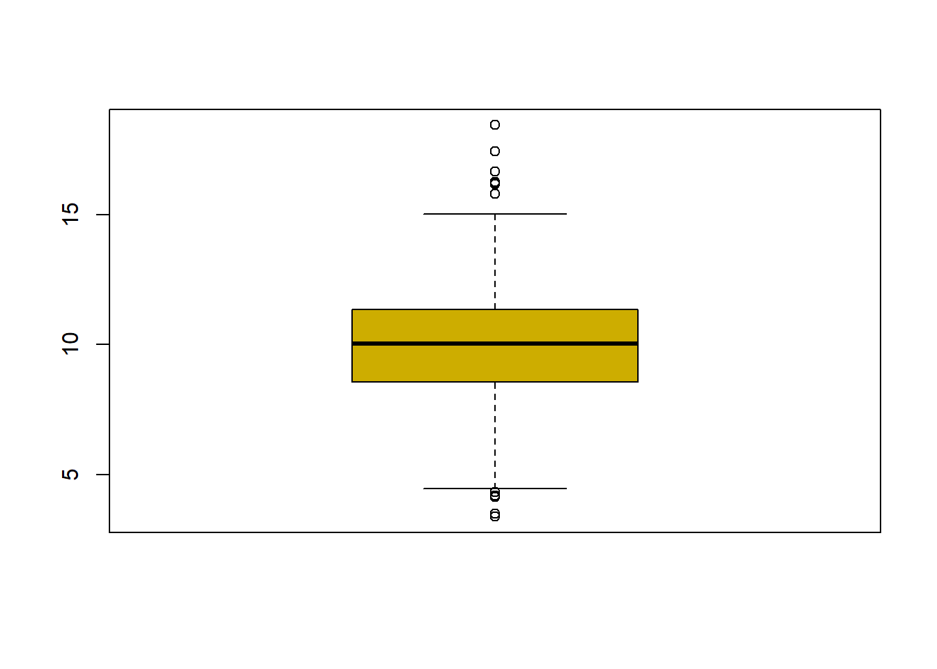
Dplyr to filter the data and then applied to the maps showing California and the counties where the readings are above 15.
#plot the five numbers from above and shows outlier dots
filter(avgpm25, pm25 > 15) #look at the points (dots) above 15
## pm25 fips region longitude latitude
## 1 16.19452 6019 west -119.9035 36.63837
## 2 15.80378 6029 west -118.6833 35.29602
## 3 18.44073 6031 west -119.8113 36.15514
## 4 16.66180 6037 west -118.2342 34.08851
## 5 15.01573 6047 west -120.6741 37.24578
## 6 17.42905 6065 west -116.8036 33.78331
## 7 16.25190 6099 west -120.9588 37.61380
## 8 16.18358 6107 west -119.1661 36.23465map("county", "California") #plot map of CA with county boundaries
with(filter(avgpm25, pm25 >15), points(longitude, latitude)) #location of the above 15 using lat/long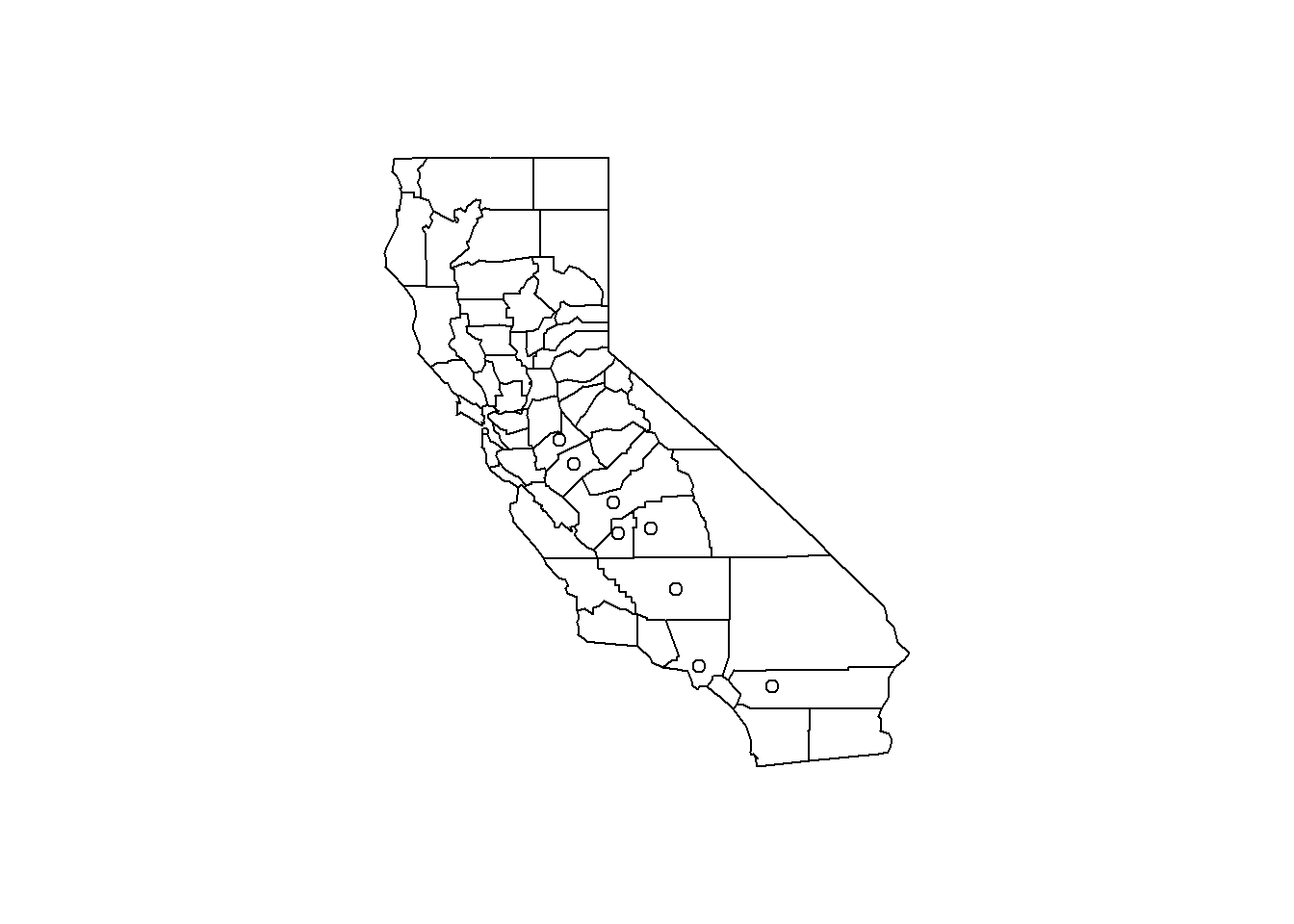
hist(avgpm25$pm25, col = "magenta")#look at distribution of the pm25 variable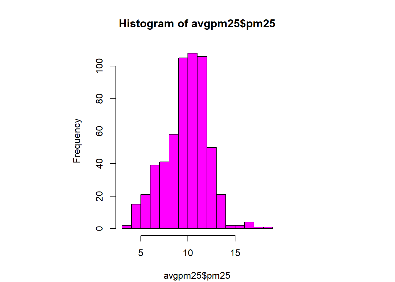
hist(avgpm25$pm25, col="orange") #different color, see outliers
rug(avgpm25$pm25) #shows the data points at the bottom of the graph, darker is more clustered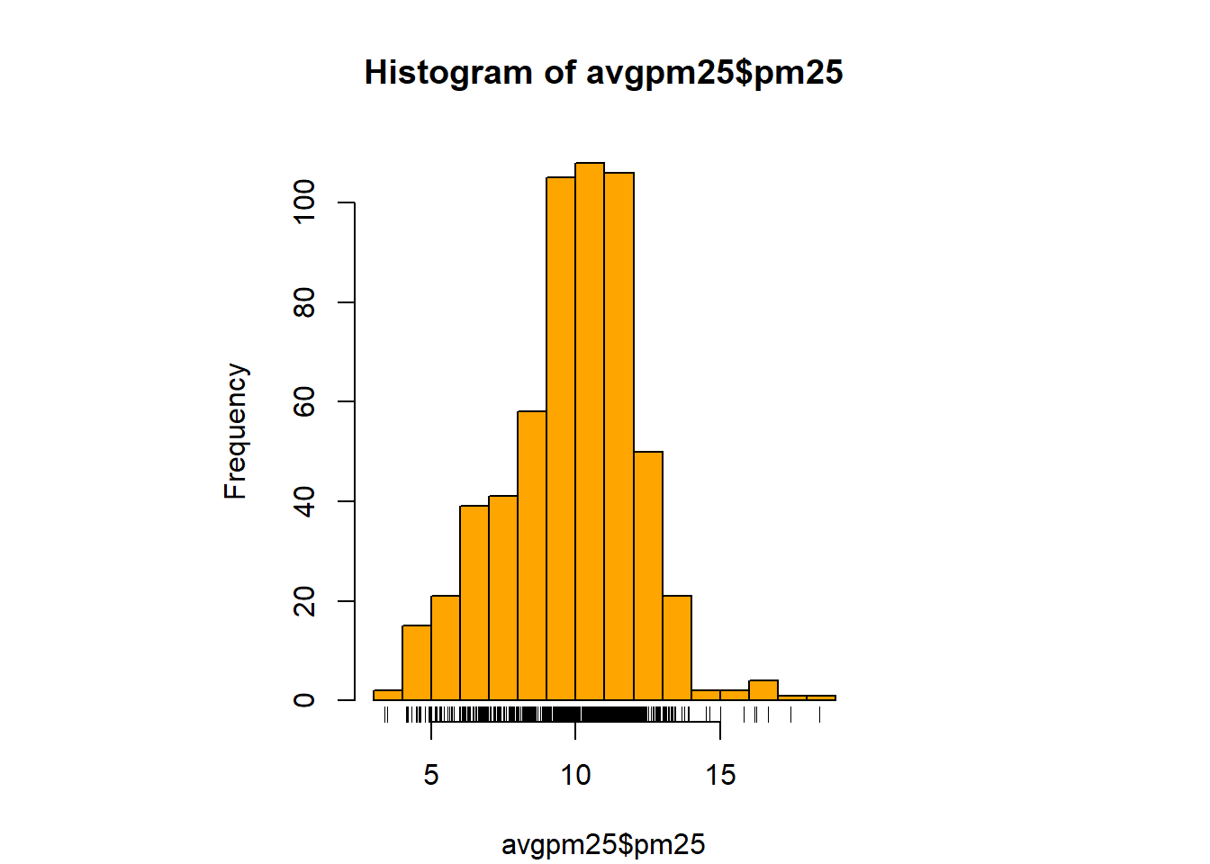
hist(avgpm25$pm25, col="yellow", breaks=100)#add more detail to the bars to show data
rug(avgpm25$pm25) # add the data points to the bottom. 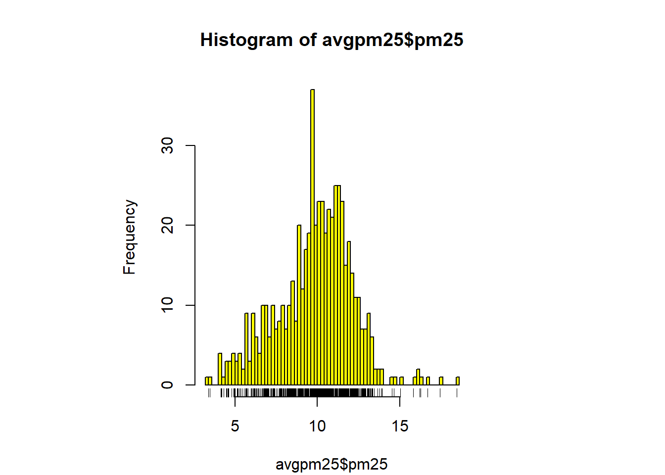
boxplot(avgpm25$pm25, col="red") #back to the box plot
abline(h=12, lwd=4) #add a line at 12 were the 3rd quartile ends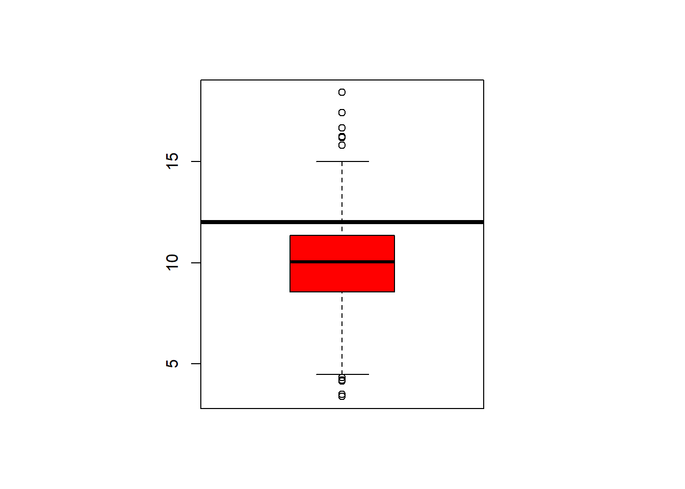
hist(avgpm25$pm25, col="grey")# same kind of thing with the histogram
abline(v=12, lwd=3) #dark line added to show the end of the 75%.
abline(v=median(avgpm25$pm25), col= "cyan", lwd=4) #lets see where the median is in relation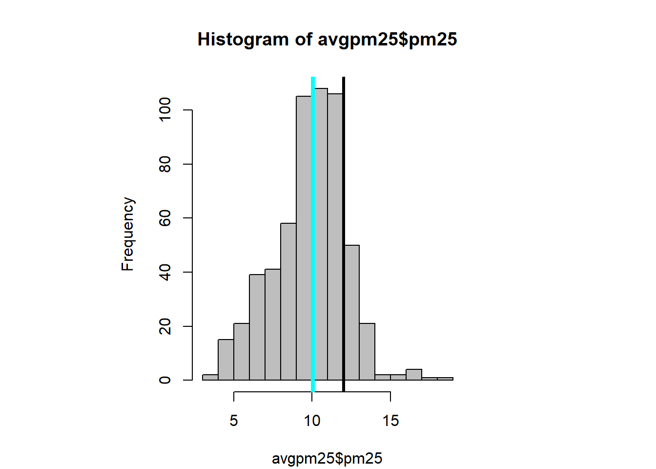
table(avgpm25$region) %>% #dplyr table with a new color showing the distribution between regions
  barplot(col= "wheat")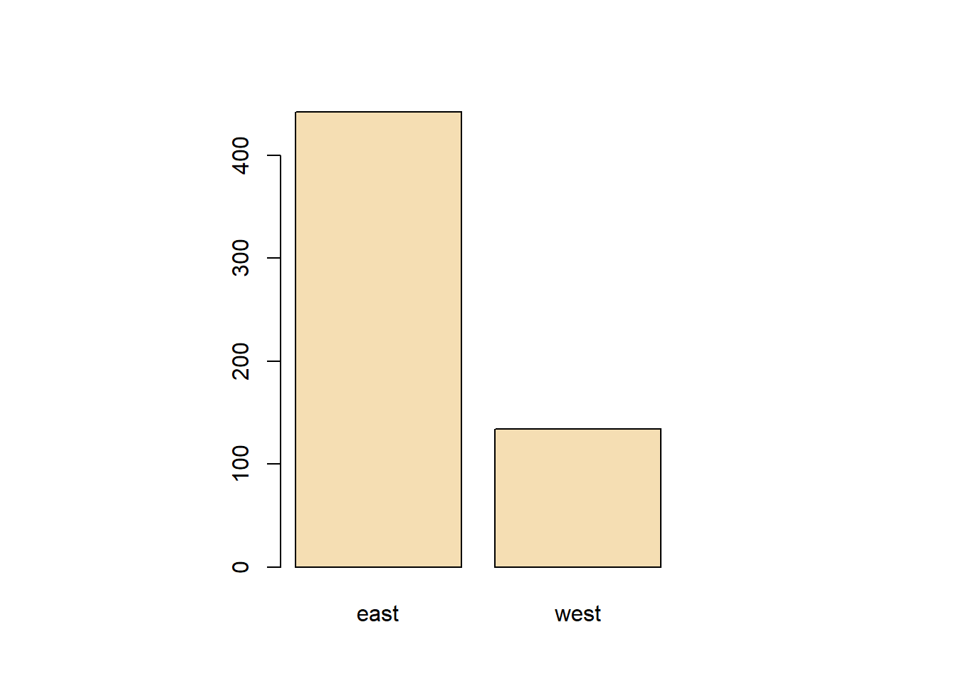
boxplot(pm25 ~ region, data=avgpm25, col="green") #looking at the 5 numbers for region, outliers seen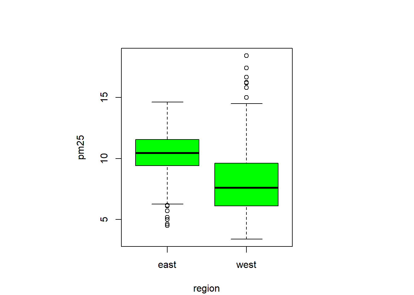
par(mfrow = c(2,1), mar = c(4,4,2,1)) #set to plot 1 columns 2 row of graphs.
hist(subset(avgpm25, region== "east")$pm25, col="orange") #first histogram
hist(subset(avgpm25, region== "west")$pm25, col="purple") #second histogram together similar to boxplots comparision, skewing and outliers.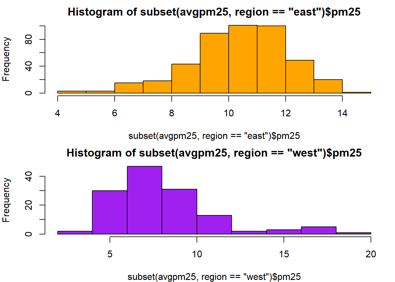
with(avgpm25, plot(latitude, pm25)) #basic scatterplot for latitude and pm25, shows group density and outliers
abline(h=12, lwd=2, lty=2) #adding the 12 for the end of 75% quartile
with(avgpm25, plot(latitude, pm25, col=region)) #color to contrast regions
abline(h=12, lwd=2,lty=2) #show where 12 is again.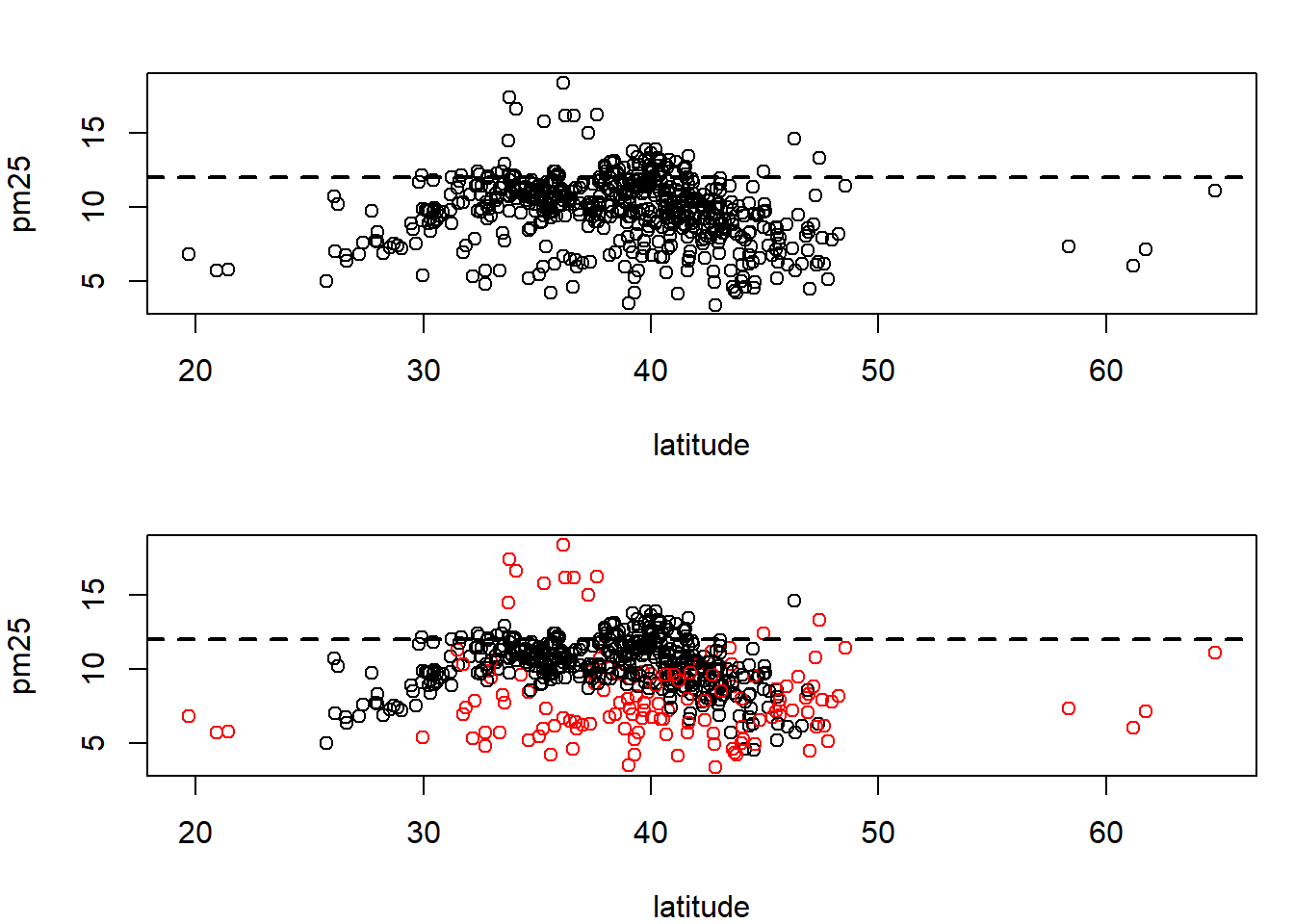
levels(avgpm25$region) #checking the region levels same as before## [1] "east" "west"table(avgpm25$region) #check the distribution in numeric form, maybe do this first before graphing.##
## east west
## 442 134par(mfrow=c(1,2), mar=c(5,4,2,1)) #setup plot format again differ margins
with(subset(avgpm25, region == "west"), plot(latitude, pm25, main="West"))
with(subset(avgpm25, region == "west"), plot(latitude, pm25, main="East")) #compare side by side scatter plots.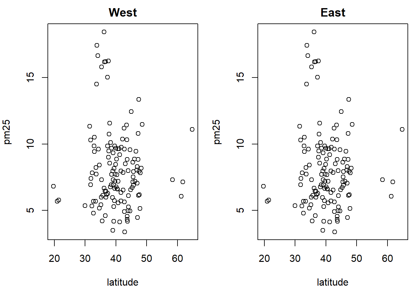
xyplot(pm25 ~ latitude | region, data=avgpm25) #very fast plot to compare Regions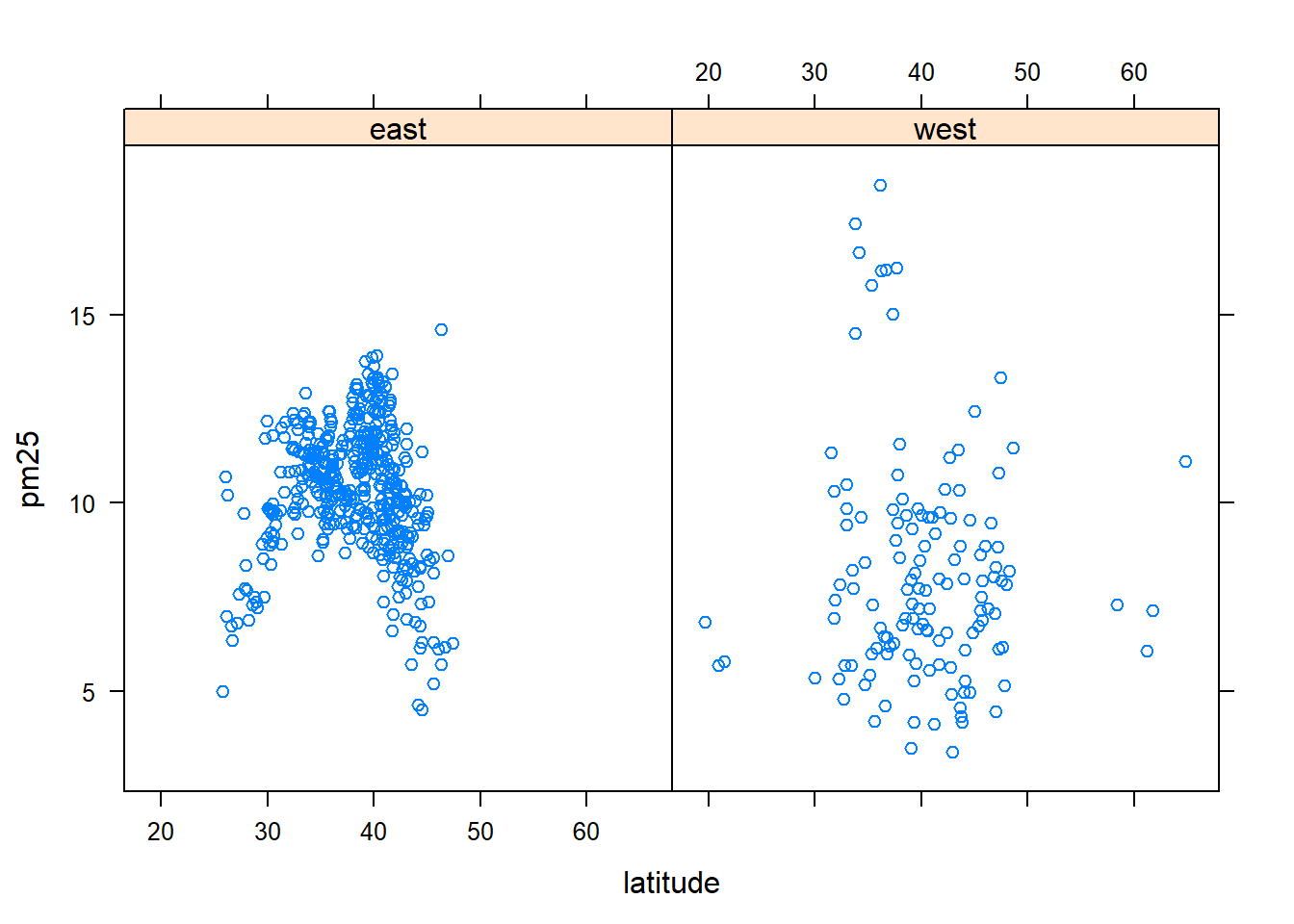
qplot(latitude, pm25, data=avgpm25, facets= .~ region)#a fast comparision plot of regions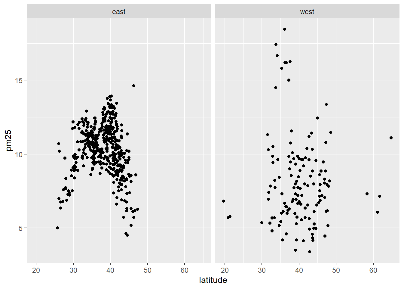
#dev.off() #reset par()
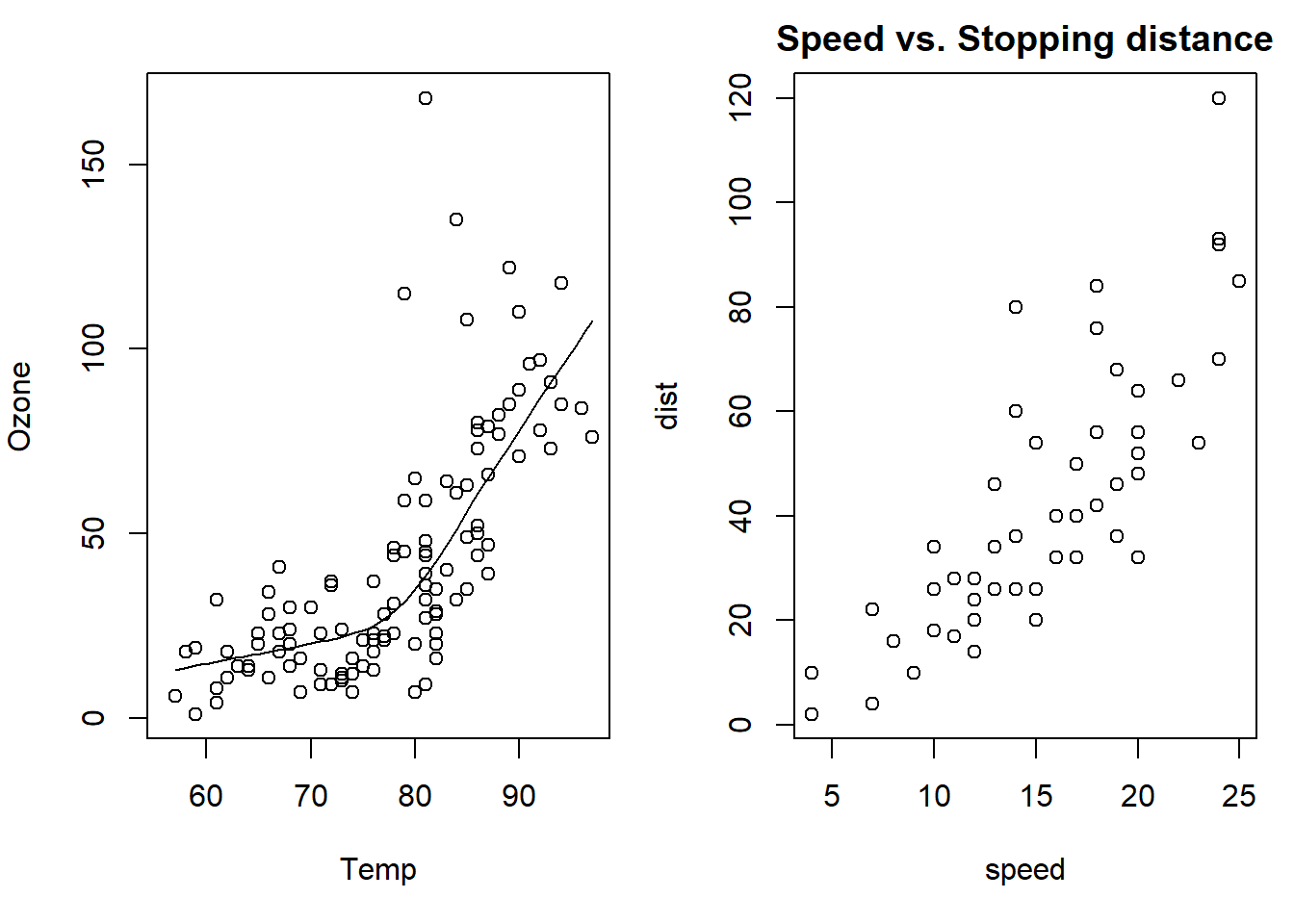
data("airquality")#load data
with(airquality, {plot(Temp, Ozone) #adds a trend line to the scatter plot for clarity
lines(loess.smooth(Temp, Ozone)) #temp to ozone correlation
})
data(cars) #load data
with(cars, {plot(speed, dist)
title("Speed vs. Stopping distance") #describe what the graph is about
})
state <- data.frame(state.x77, region=state.region) #create a data frame life expec to income broken down by region
xyplot(Life.Exp ~ Income | region, data=state, layout=c(4,1)) #using lattice package shows 4 categorical regions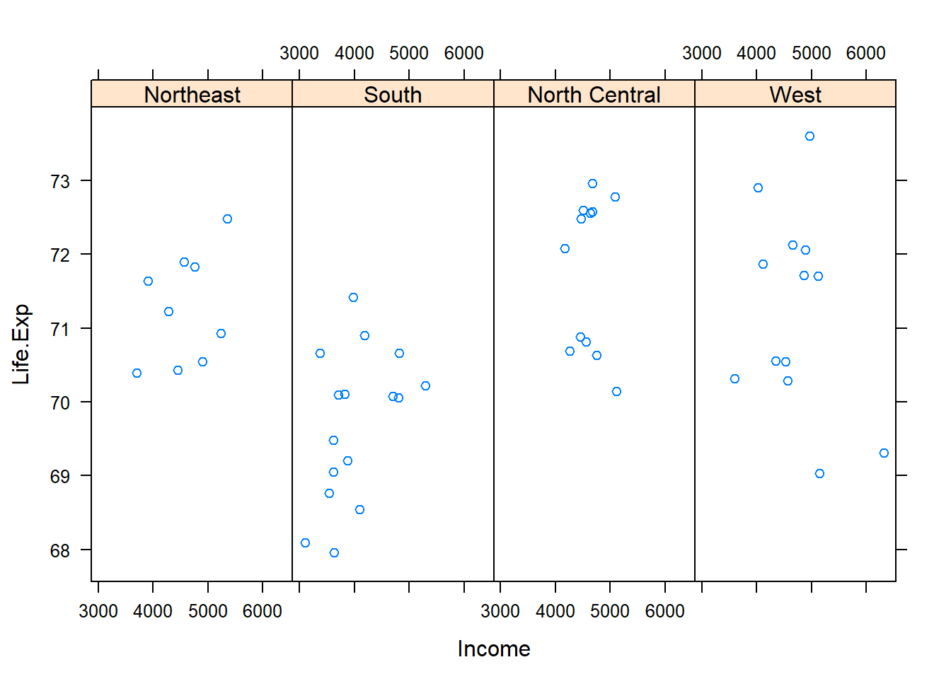
data(mpg) #load data
qplot(displ, hwy, data=mpg) #ggplot2, very fast plot of miles per gallon and engine displacement. 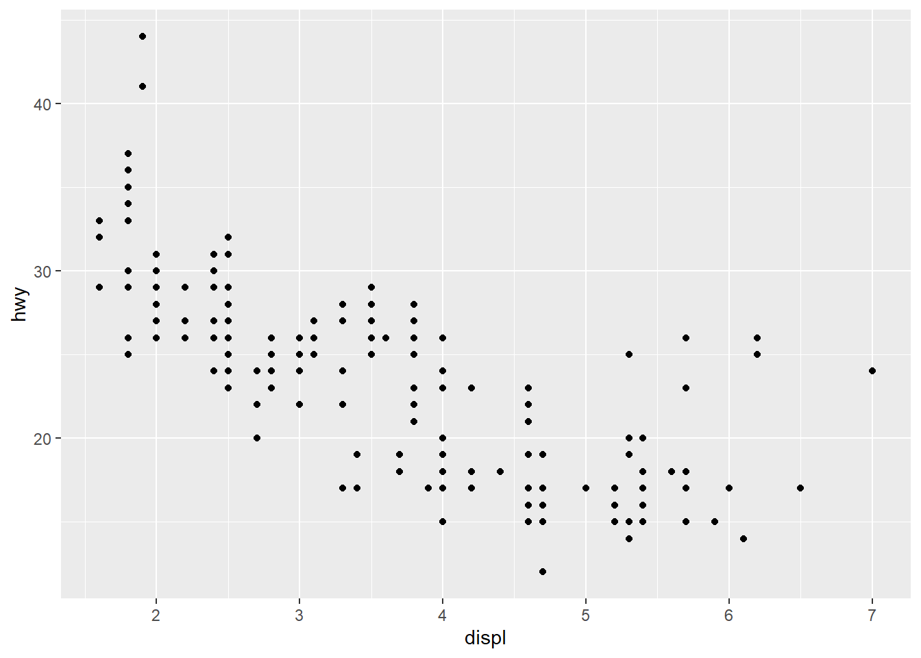
data(cats) #load data
head(cats) #view head of data
## Sex Bwt Hwt
## 1 F 2.0 7.0
## 2 F 2.0 7.4
## 3 F 2.0 9.5
## 4 F 2.1 7.2
## 5 F 2.1 7.3
## 6 F 2.1 7.6with(cats, {plot(Hwt~Bwt)
lines(lowess(Hwt ~ Bwt), col="blue", lwd=4)}) #plot data with the regression line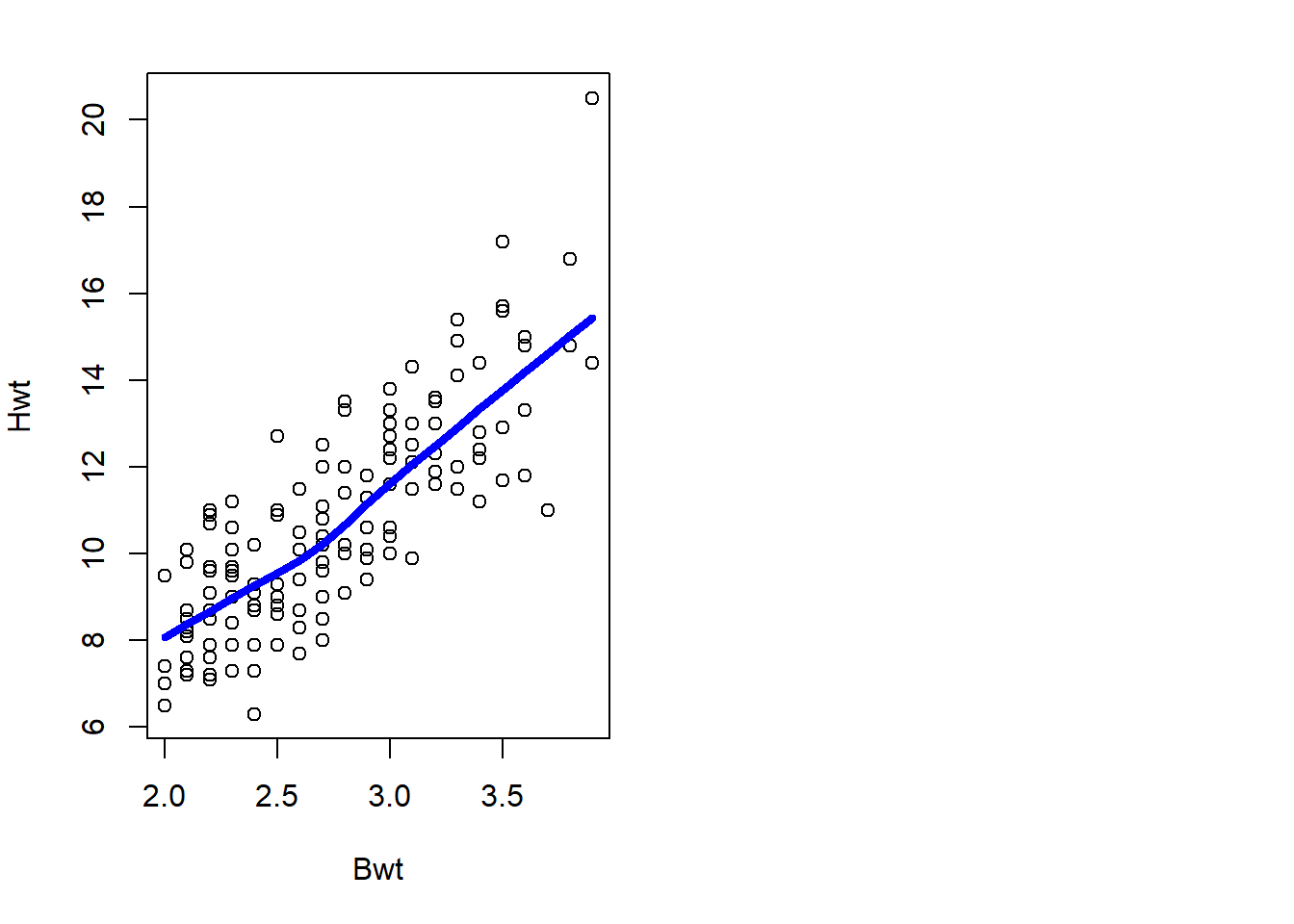
Iris Data Set
This was done after the other work was finished and shows same analysis to the iris data set that comes with RStudio.
data("iris")
str(iris) #view structure of the data
## 'data.frame': 150 obs. of 5 variables:
## $ Sepal.Length: num 5.1 4.9 4.7 4.6 5 5.4 4.6 5 4.4 4.9 ...
## $ Sepal.Width : num 3.5 3 3.2 3.1 3.6 3.9 3.4 3.4 2.9 3.1 ...
## $ Petal.Length: num 1.4 1.4 1.3 1.5 1.4 1.7 1.4 1.5 1.4 1.5 ...
## $ Petal.Width : num 0.2 0.2 0.2 0.2 0.2 0.4 0.3 0.2 0.2 0.1 ...
## $ Species : Factor w/ 3 levels "setosa","versicolor",..: 1 1 1 1 1 1 1 1 1 1 ...fivenum(iris$Sepal.Length) #direct way to look at min, max, median, 1st & 3rd quartiles 25%/75%.## [1] 4.3 5.1 5.8 6.4 7.9fivenum(iris$Sepal.Width) #direct way to look at min, max, median, 1st & 3rd quartiles 25%/75%.## [1] 2.0 2.8 3.0 3.3 4.4fivenum(iris$Petal.Length) #direct way to look at min, max, median, 1st & 3rd quartiles 25%/75%.## [1] 1.00 1.60 4.35 5.10 6.90fivenum(iris$Petal.Width) #direct way to look at min, max, median, 1st & 3rd quartiles 25%/75%.## [1] 0.1 0.3 1.3 1.8 2.5summary(iris) #note same with addition of the mean## Sepal.Length Sepal.Width Petal.Length Petal.Width
## Min. :4.300 Min. :2.000 Min. :1.000 Min. :0.100
## 1st Qu.:5.100 1st Qu.:2.800 1st Qu.:1.600 1st Qu.:0.300
## Median :5.800 Median :3.000 Median :4.350 Median :1.300
## Mean :5.843 Mean :3.057 Mean :3.758 Mean :1.199
## 3rd Qu.:6.400 3rd Qu.:3.300 3rd Qu.:5.100 3rd Qu.:1.800
## Max. :7.900 Max. :4.400 Max. :6.900 Max. :2.500
## Species
## setosa :50
## versicolor:50
## virginica :50
##
##
## boxplot(iris$Sepal.Length, col="magenta") 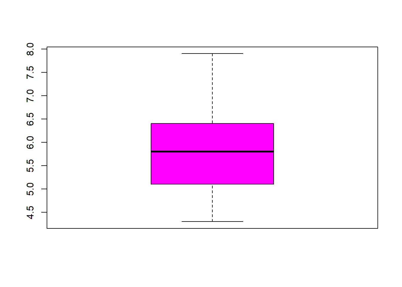
boxplot(iris$Sepal.Width, col="green") 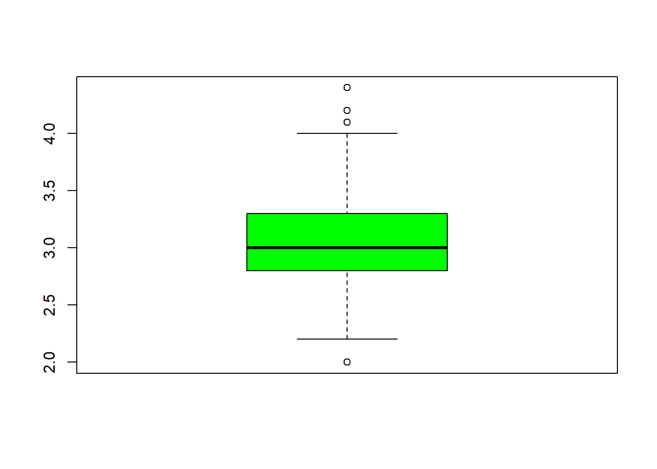
boxplot(iris$Petal.Length, col="orange") 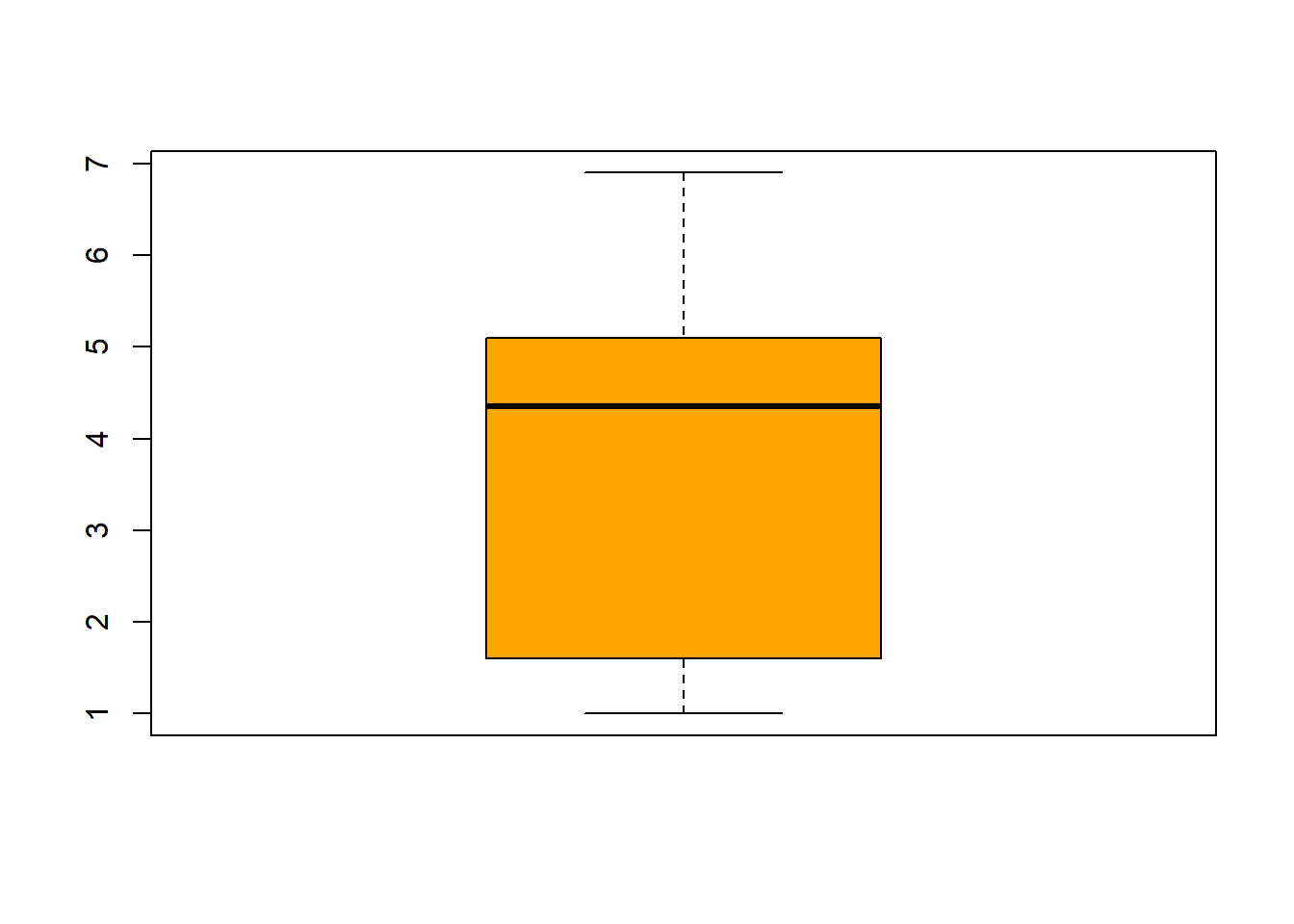
boxplot(iris$Petal.Width, col="blue") 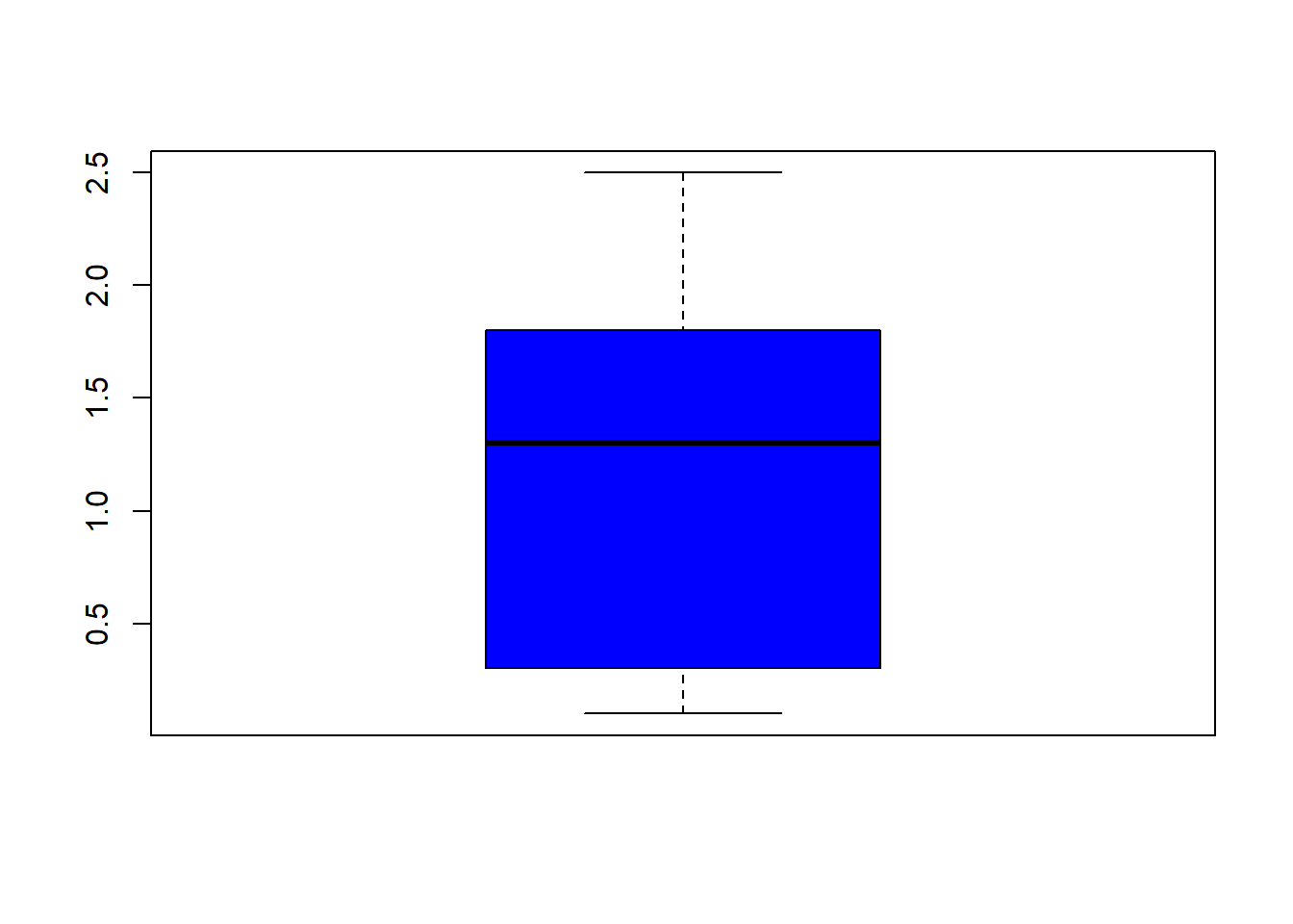
filter(iris, Sepal.Width > 4) #look at the points (dots) above 4## Sepal.Length Sepal.Width Petal.Length Petal.Width Species
## 1 5.7 4.4 1.5 0.4 setosa
## 2 5.2 4.1 1.5 0.1 setosa
## 3 5.5 4.2 1.4 0.2 setosahist(iris$Sepal.Length, col = "magenta")#look at distribution of the variable
rug(iris$Sepal.Length) #shows the data points at the bottom of the graph, darker is more clustered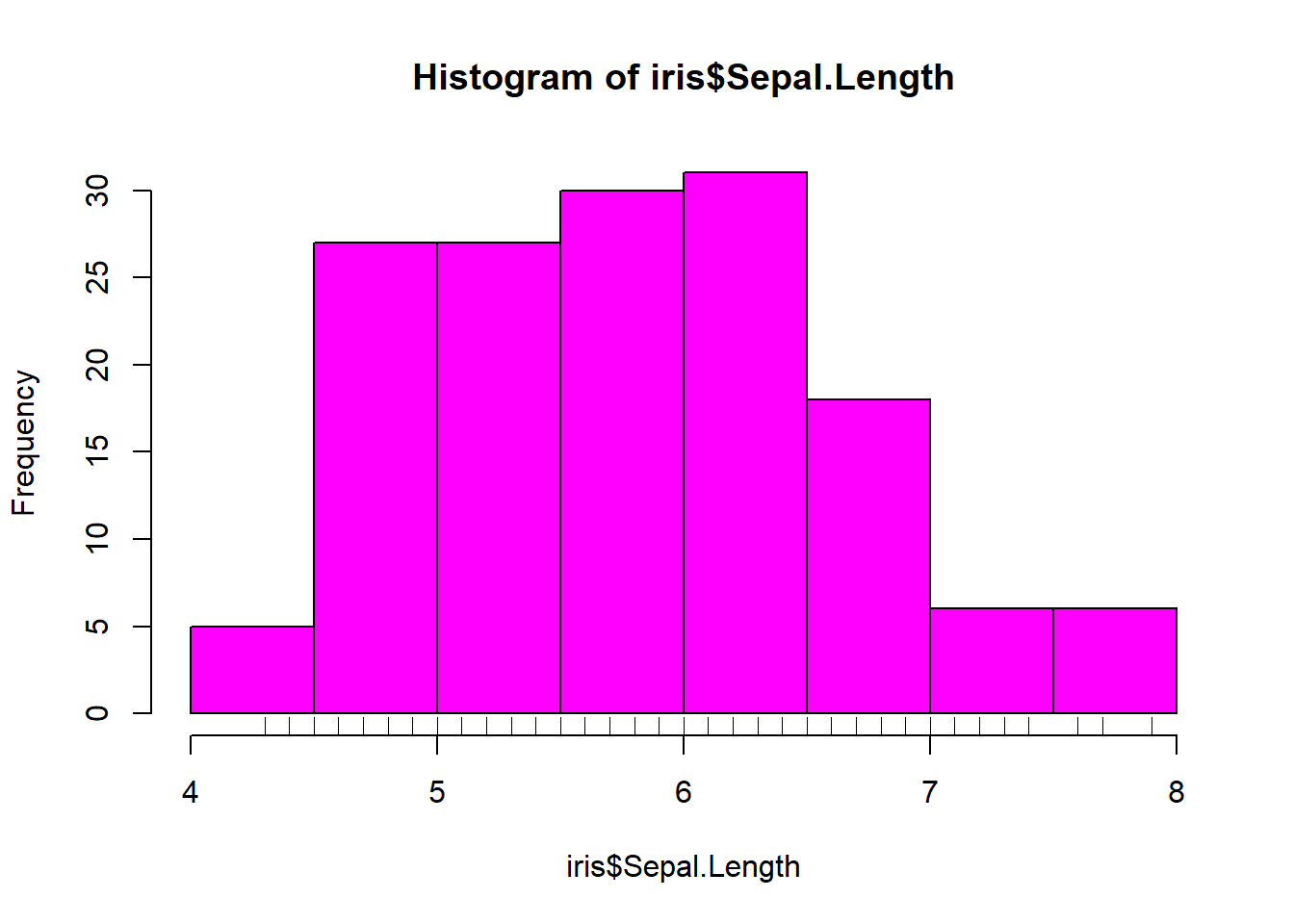
hist(iris$Sepal.Width, col = "green")#look at distribution of the variable
rug(iris$Sepal.Width) #shows the data points at the bottom of the graph, darker is more clustered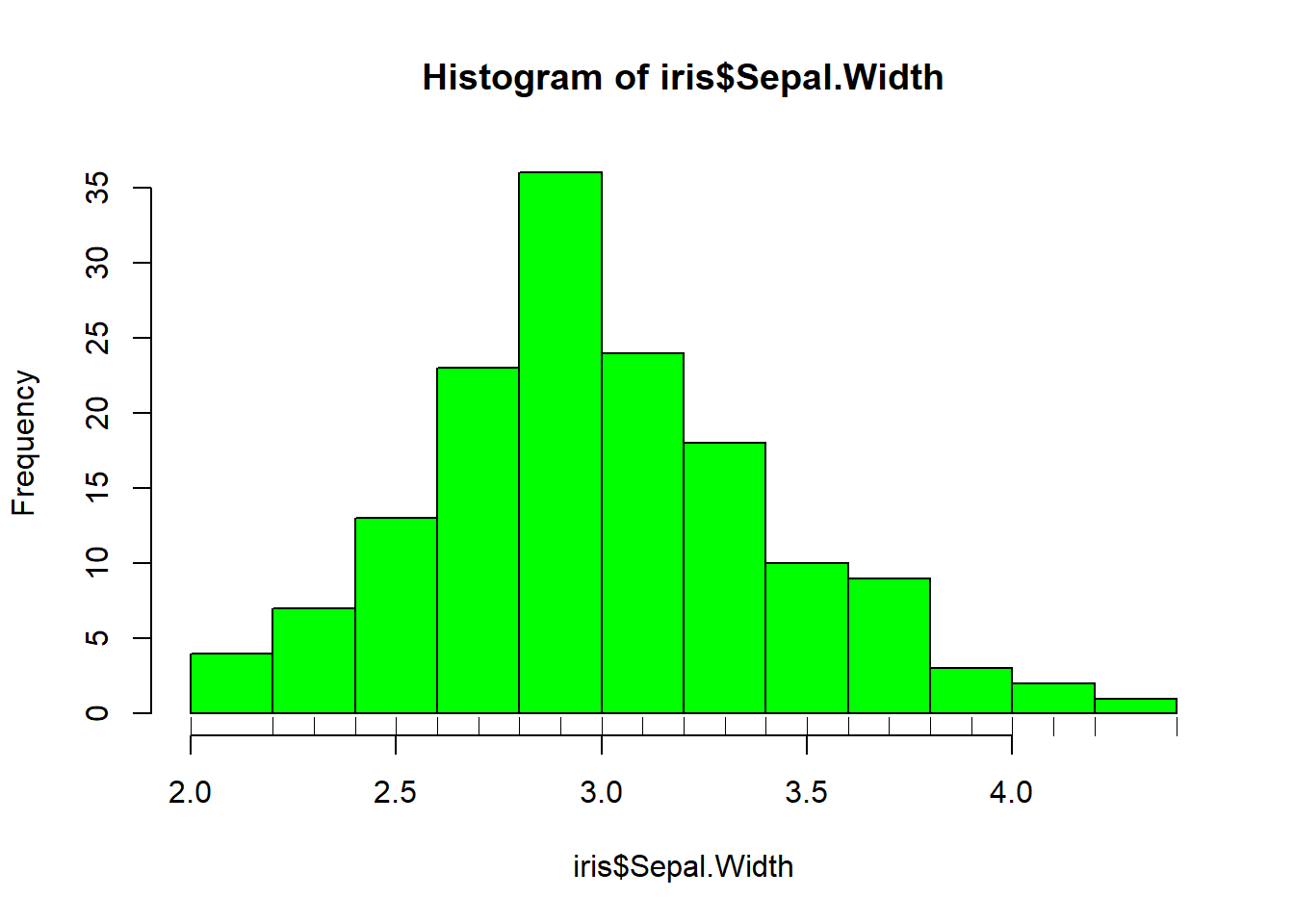
hist(iris$Petal.Length, col = "orange")#look at distribution of the variable
rug(iris$Petal.Length) #shows the data points at the bottom of the graph, darker is more clustered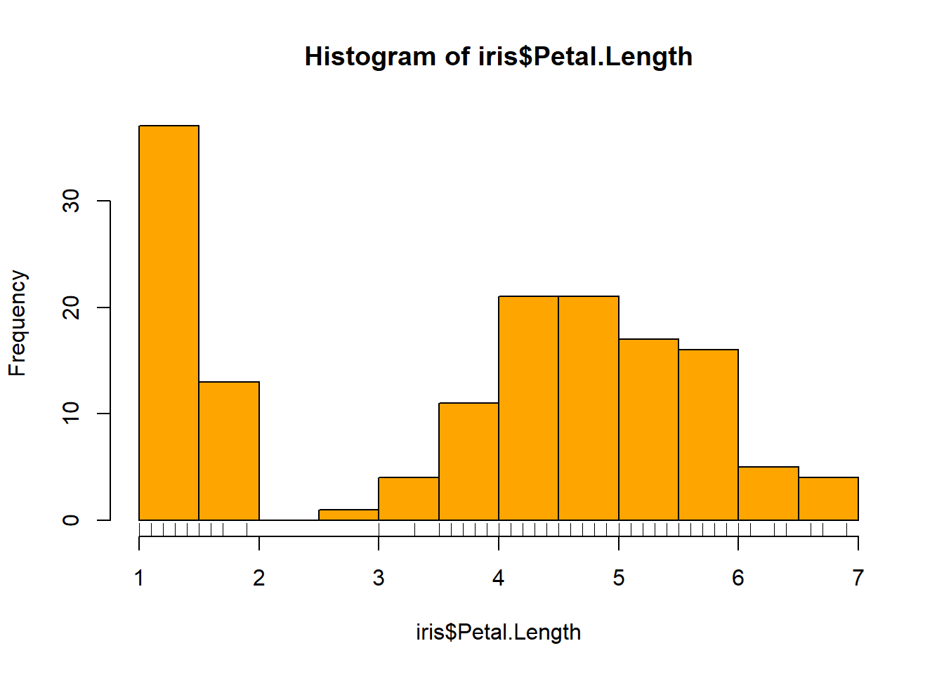
hist(iris$Petal.Width, col = "blue")#look at distribution of the variable
rug(iris$Petal.Width) #shows the data points at the bottom of the graph, darker is more clustered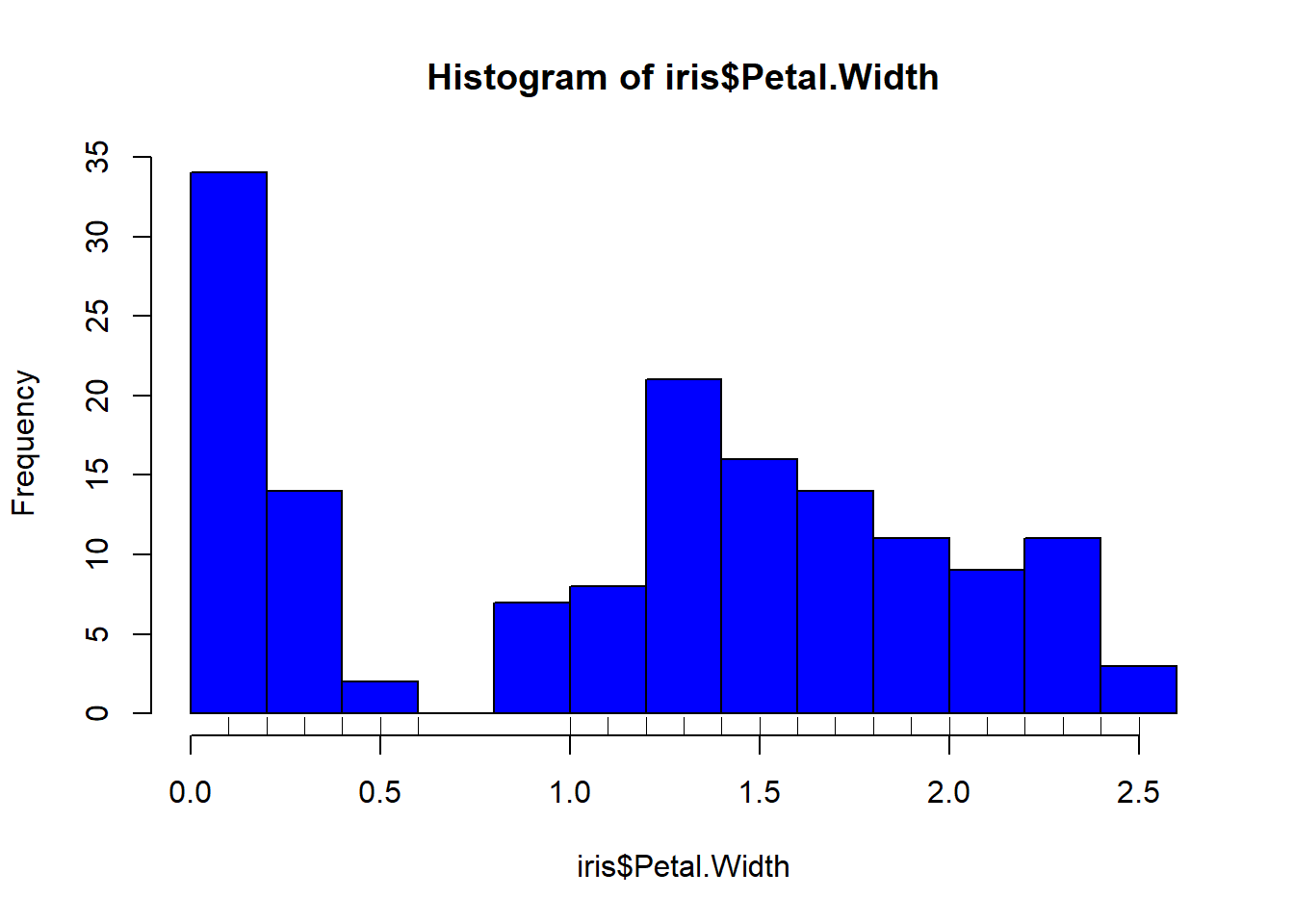
hist(iris$Sepal.Length, col="magenta", breaks=100)#add more detail to the bars to show data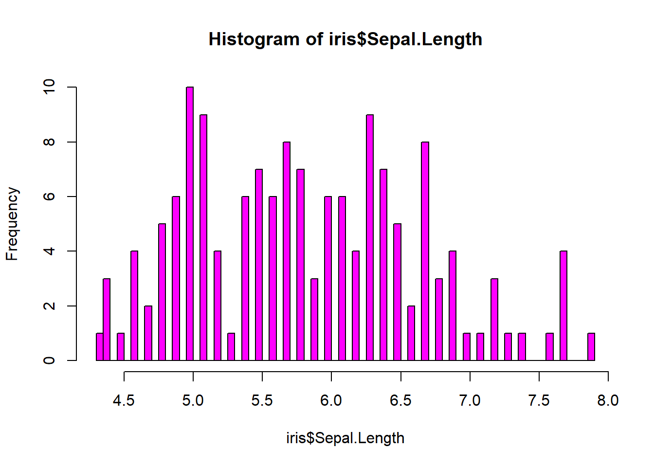
hist(iris$Sepal.Width, col="green", breaks=100)#add more detail to the bars to show data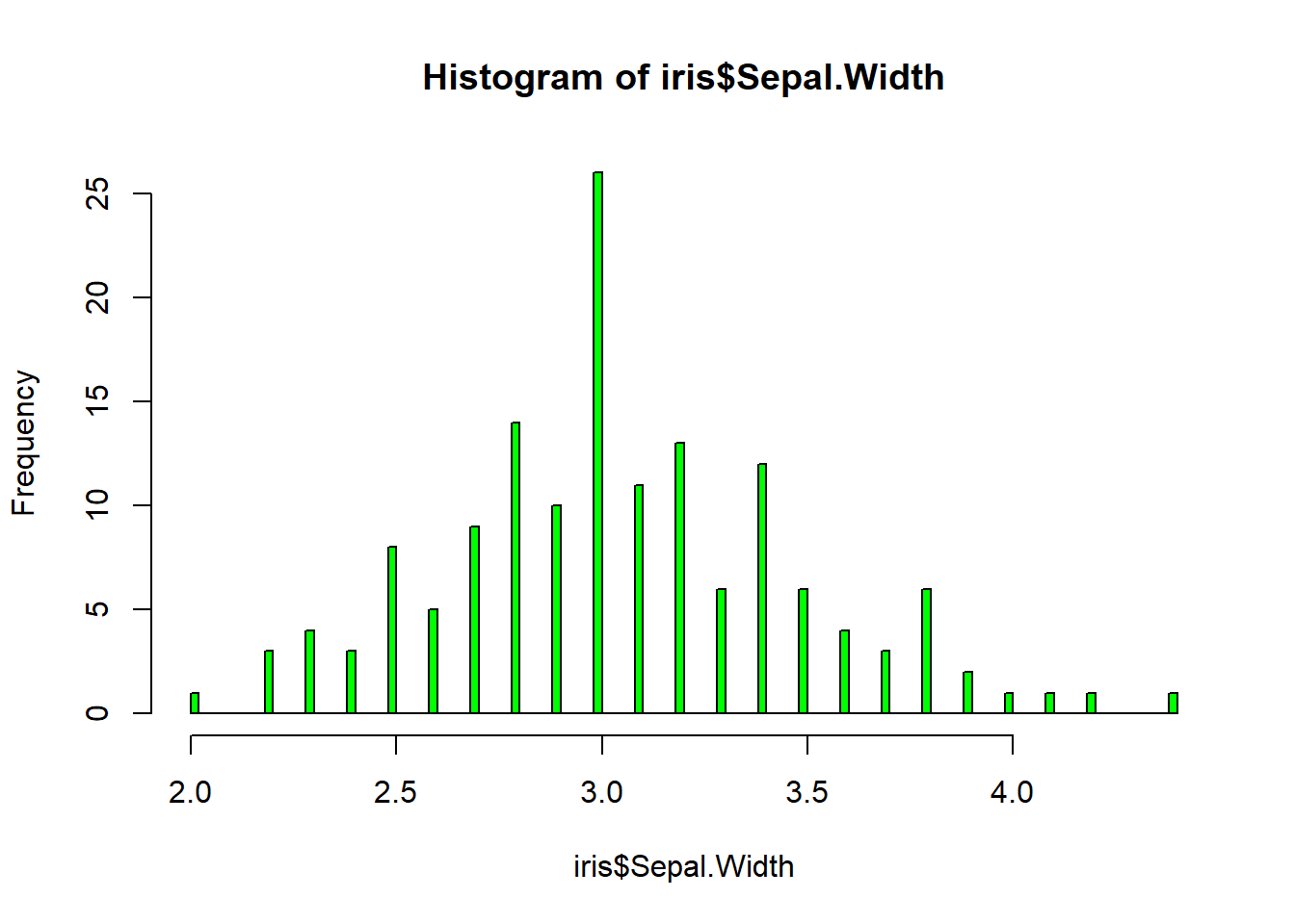
hist(iris$Petal.Length, col="orange", breaks=100)#add more detail to the bars to show data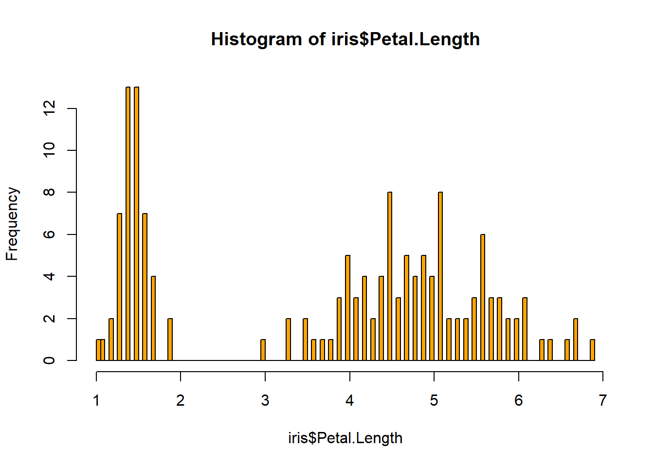
hist(iris$Petal.Width, col="blue", breaks=100)#add more detail to the bars to show data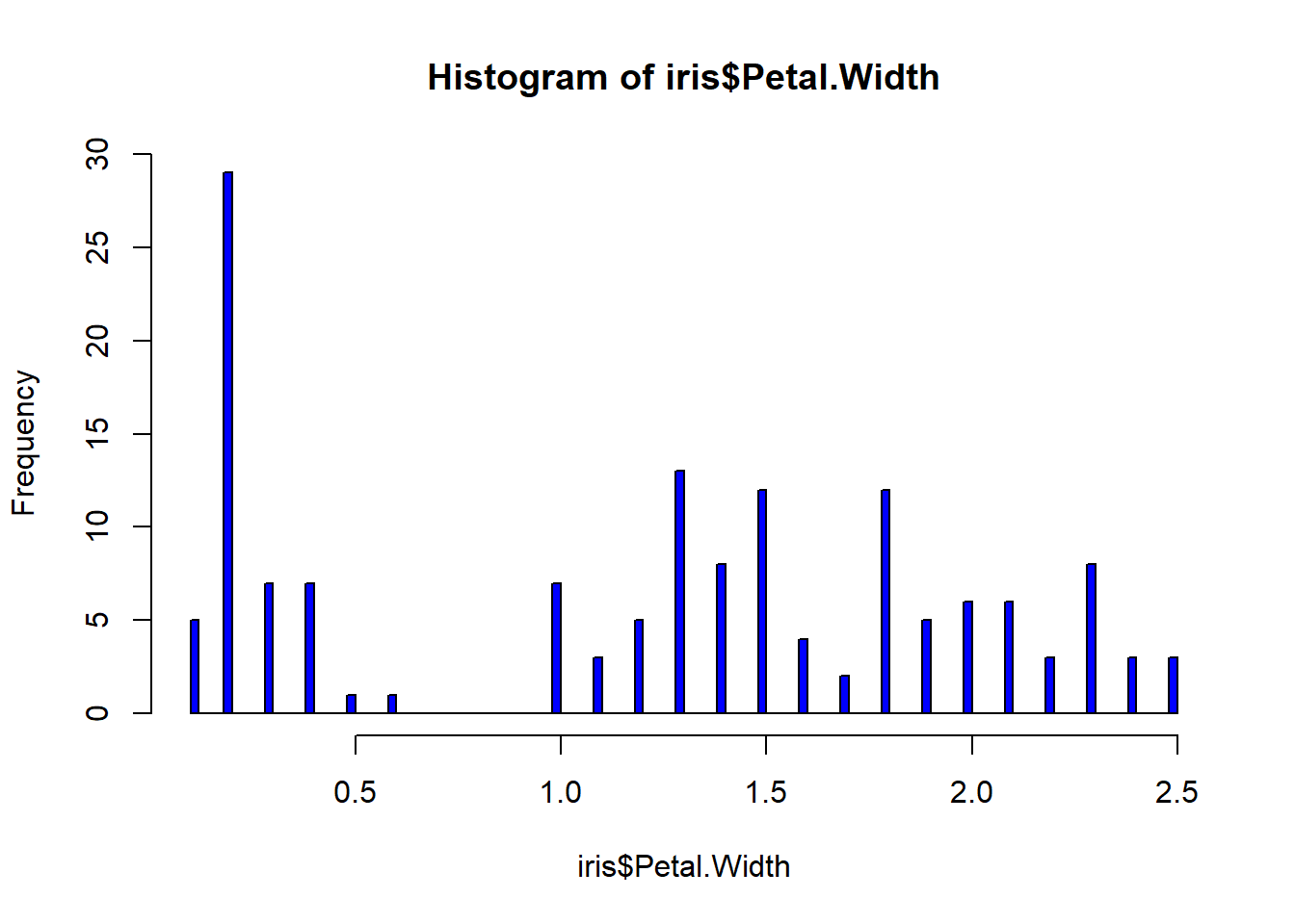
boxplot(iris$Sepal.Length, col="magenta") #back to the box plot
abline(h=6.5, lwd=4) #add a line at 12 were the 3rd quartile ends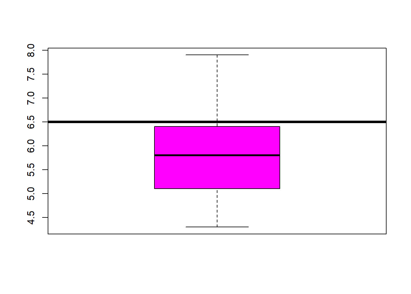
boxplot(iris$Sepal.Width, col="green") #back to the box plot
abline(h=3.5, lwd=4) #add a line at 12 were the 3rd quartile ends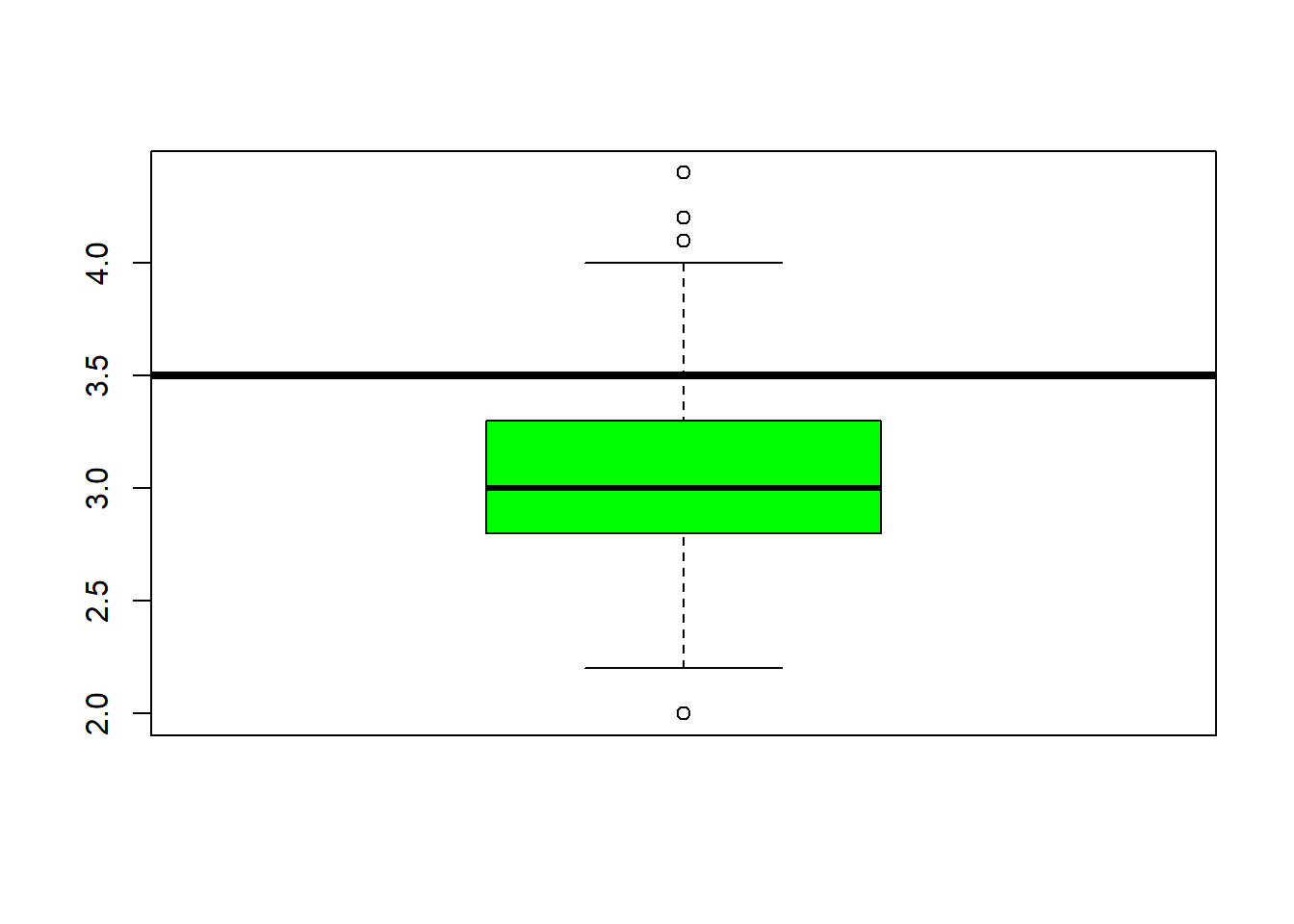
boxplot(iris$Petal.Length, col="orange") #back to the box plot
abline(h=5.1, lwd=4) #add a line at 12 were the 3rd quartile ends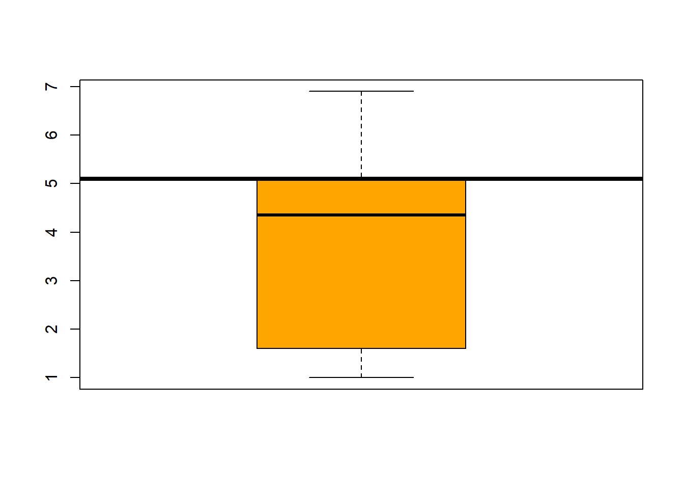
boxplot(iris$Petal.Width, col="blue") #back to the box plot
abline(h=1.8, lwd=4) #add a line at 12 were the 3rd quartile ends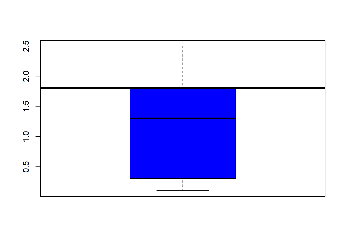
hist(iris$Sepal.Length, col="grey")# same kind of thing with the histogram
abline(v=6.5, lwd=3) #dark line added to show the end of the 75%.
abline(v=median(iris$Sepal.Length), col= "cyan", lwd=4) #lets see where the median is in relation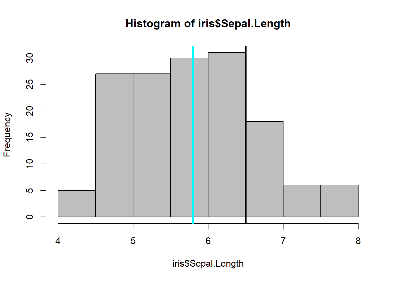
table(iris$Species) %>% #dplyr table with a new color showing the distribution between Species
  barplot(col= "wheat")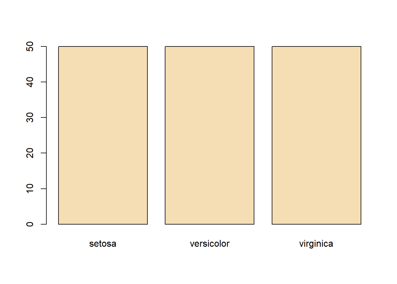
boxplot(Sepal.Length ~ Species, data=iris, col="magenta") #looking at the 5 numbers 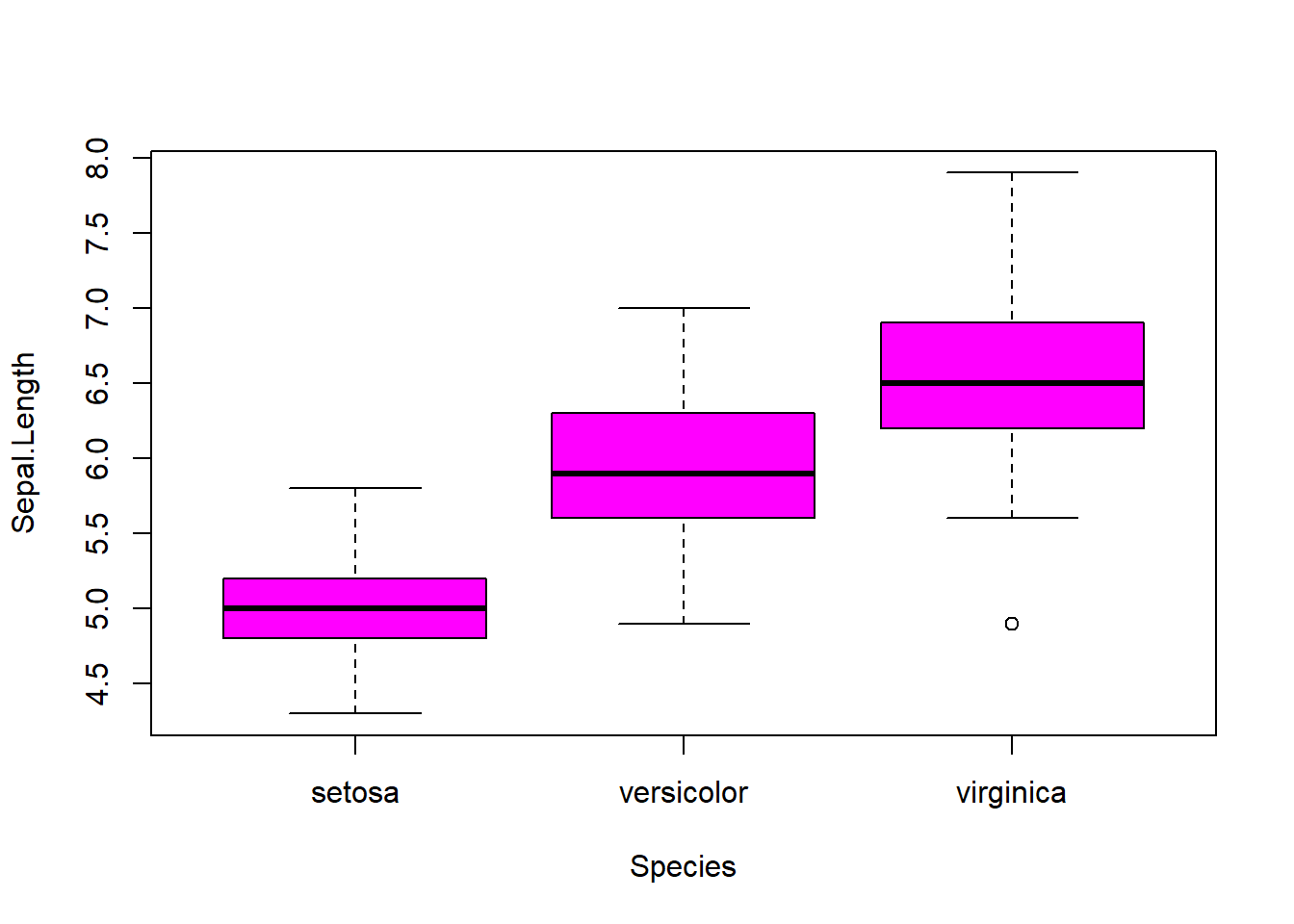
boxplot(Sepal.Width ~ Species, data=iris, col="green") #looking at the 5 numbers 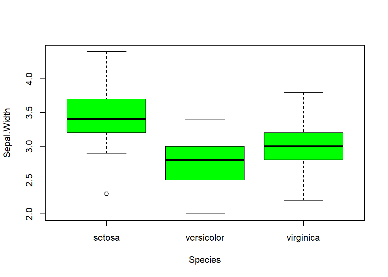
boxplot(Petal.Length ~ Species, data=iris, col="orange") #looking at the 5 numbers 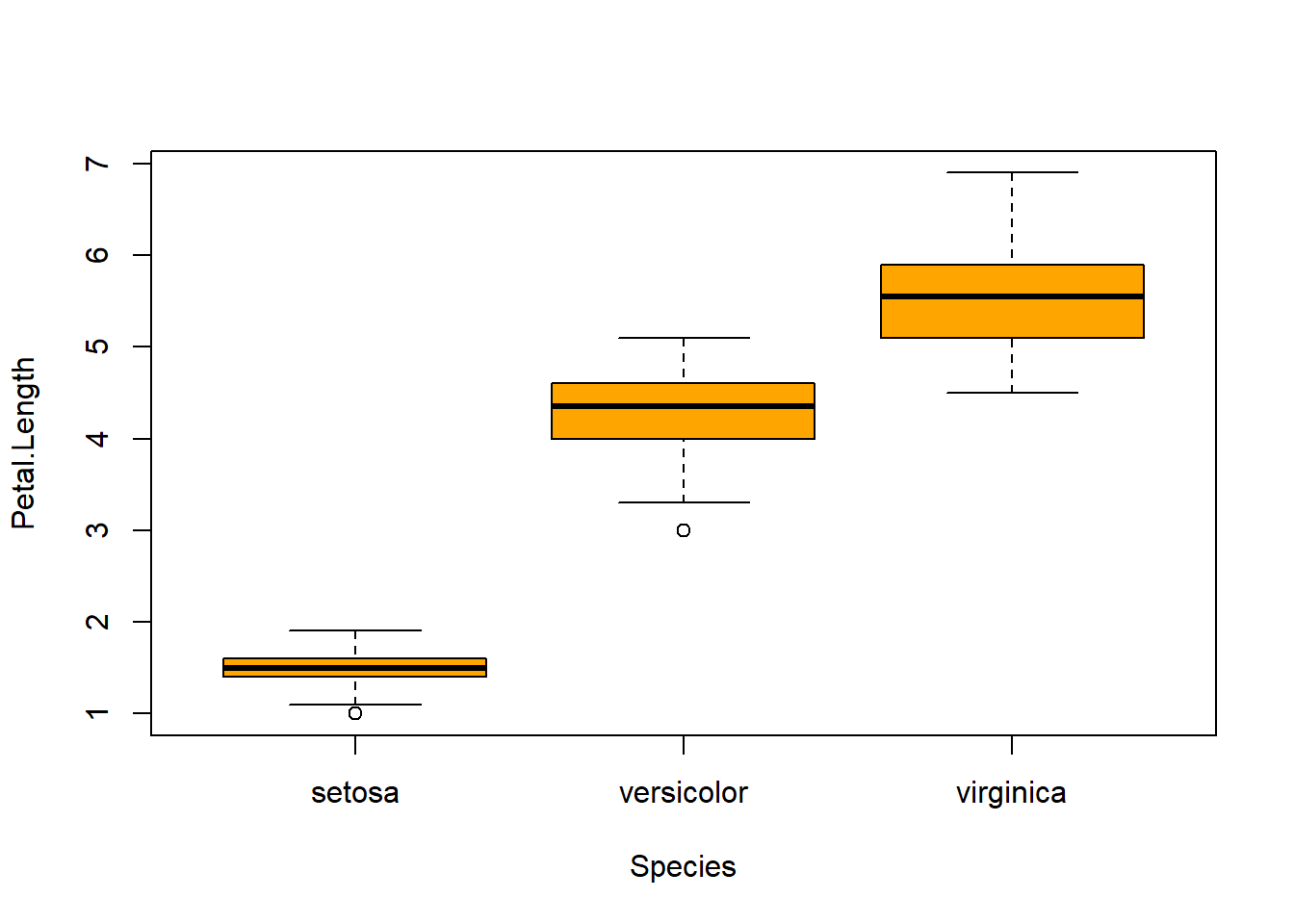
boxplot(Petal.Width ~ Species, data=iris, col="blue") #looking at the 5 numbers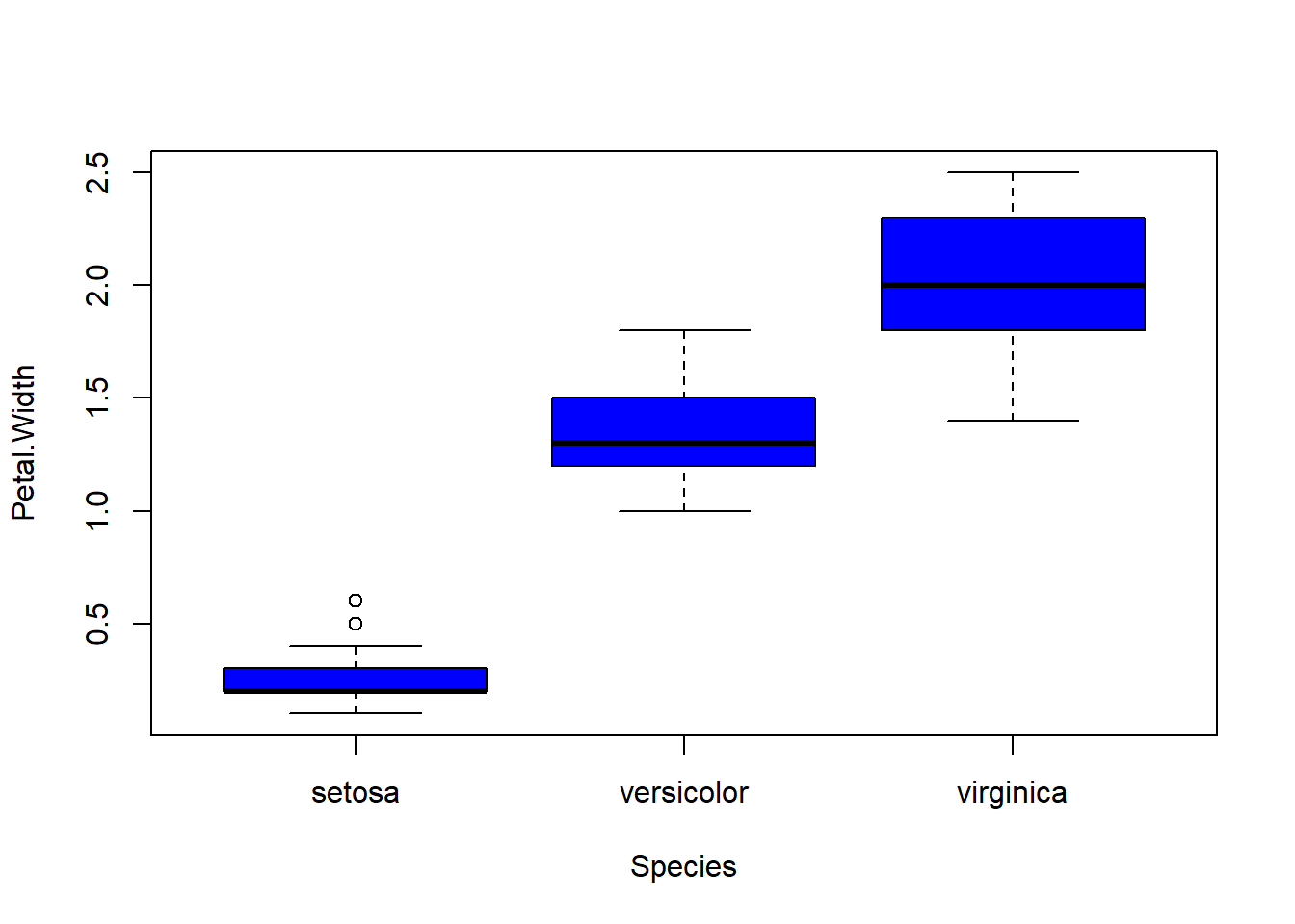
par(mfrow = c(2,2), mar = c(4,4,2,2)) #set to plot 1 columns 2 row of graphs.
hist(subset(iris, Species == "setosa")$Sepal.Length, col="magenta") #first histogram
hist(subset(iris, Species == "setosa")$Sepal.Width, col="green")
hist(subset(iris, Species == "setosa")$Petal.Length, col="orange")
hist(subset(iris, Species == "setosa")$Petal.Width, col="blue")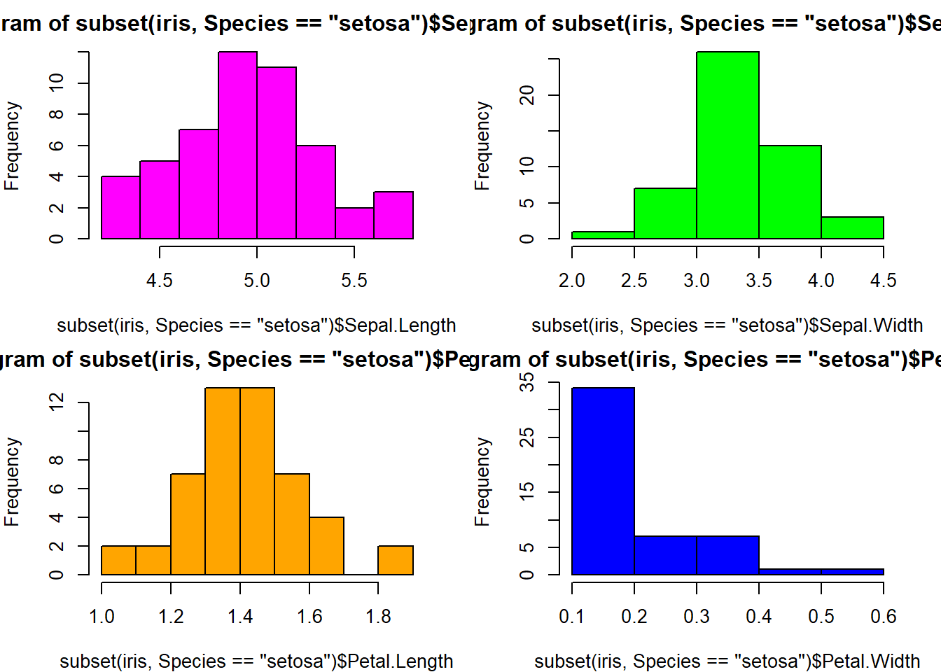
with(iris, plot(Sepal.Length, Sepal.Width, col = Sepal.Width)) #basic scatterplot
abline(h=3.5, lwd=2, lty=2) #adding the 3.5 for the end of 75% quartile
iris$Species <- as.factor(iris$Species)
levels(iris$Species) #checking the region levels same as before
## [1] "setosa" "versicolor" "virginica"table(iris$Species) #check the distribution in numeric form, maybe do this first before graphing.##
## setosa versicolor virginica
## 50 50 50par(mfrow=c(2,2), mar=c(5,4,2,1)) #setup plot format again differ margins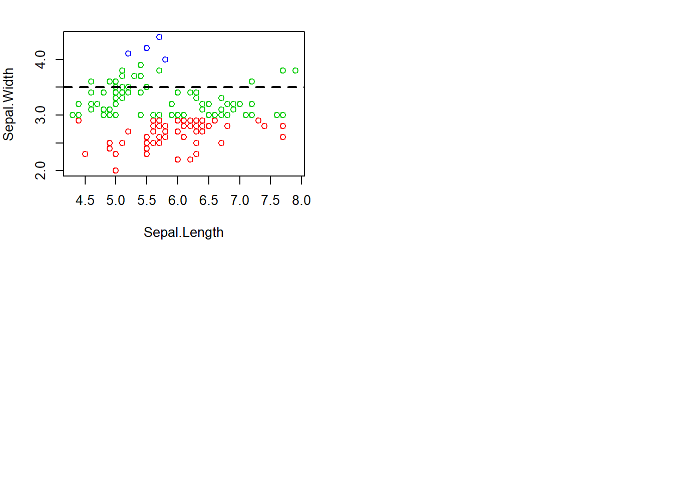
with(subset(iris, Species == "setosa"), plot(Sepal.Length, Sepal.Width, main="Setosa"))
with(subset(iris, Species == "versicolor"), plot(Sepal.Length, Sepal.Width, main="Versicolor")) #compare side by side scatter plots.
with(subset(iris, Species == "virginica"), plot(Sepal.Length, Sepal.Width, main="Virginica"))
with(subset(iris, Species == "setosa"), plot(Petal.Length, Petal.Width, main="Setosa"))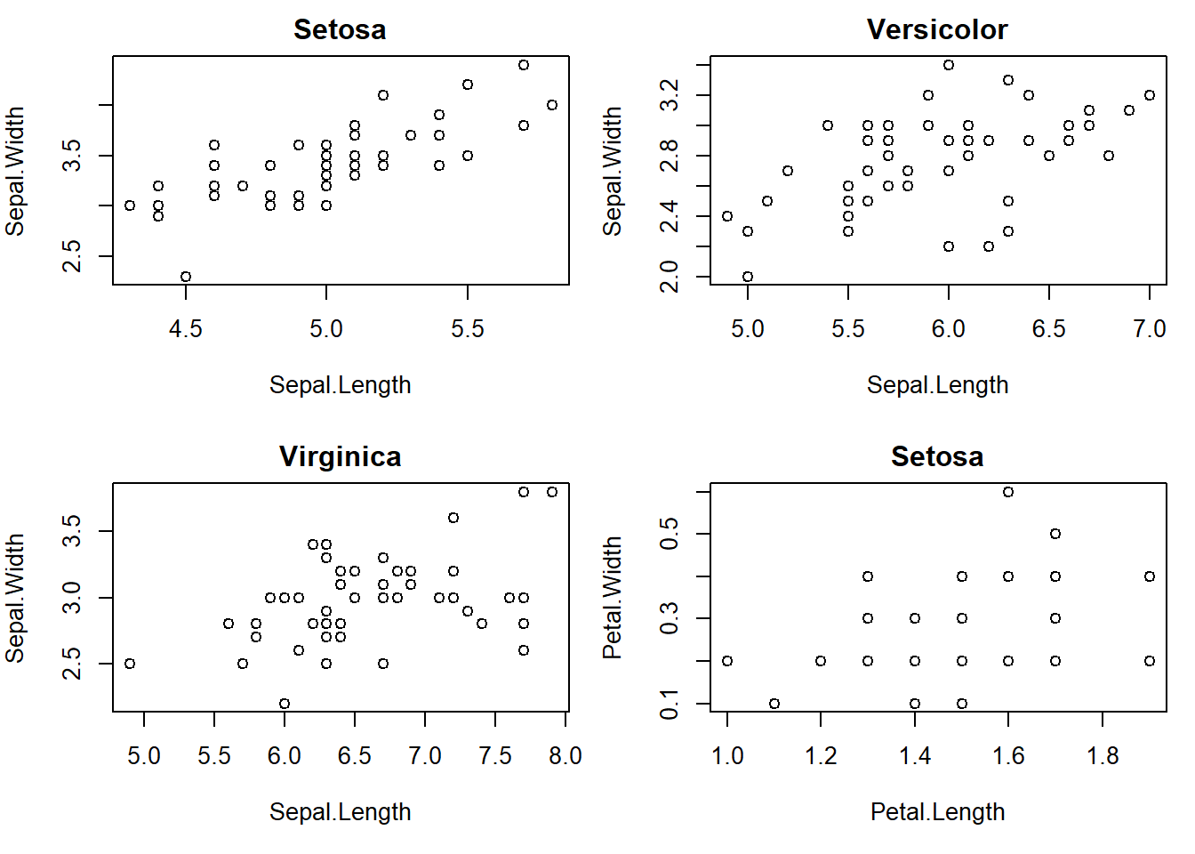
with(subset(iris, Species == "versicolor"), plot(Petal.Length, Petal.Width, main="Versicolor")) #compare side by side scatter plots.
with(subset(iris, Species == "virginica"), plot(Petal.Length, Petal.Width, main="Virginica"))
with(subset(iris, Species == "setosa"), plot(Sepal.Length, Petal.Width, main="Setosa"))
with(subset(iris, Species == "versicolor"), plot(Sepal.Length, Petal.Length, main="Versicolor")) #compare side by side scatter plots.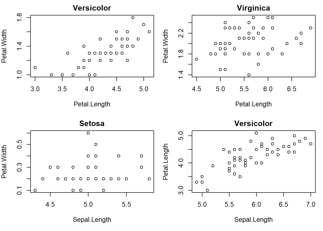
xyplot(Sepal.Width ~ Sepal.Length | Species, data=iris) #very fast plot to compare 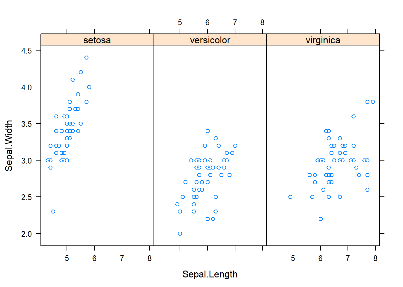
xyplot(Petal.Width ~ Petal.Length | Species, data=iris) #very fast plot to compare 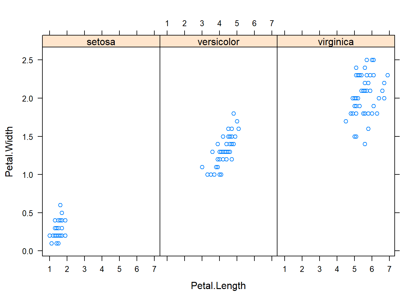
xyplot(Sepal.Width ~ Petal.Width | Species, data=iris)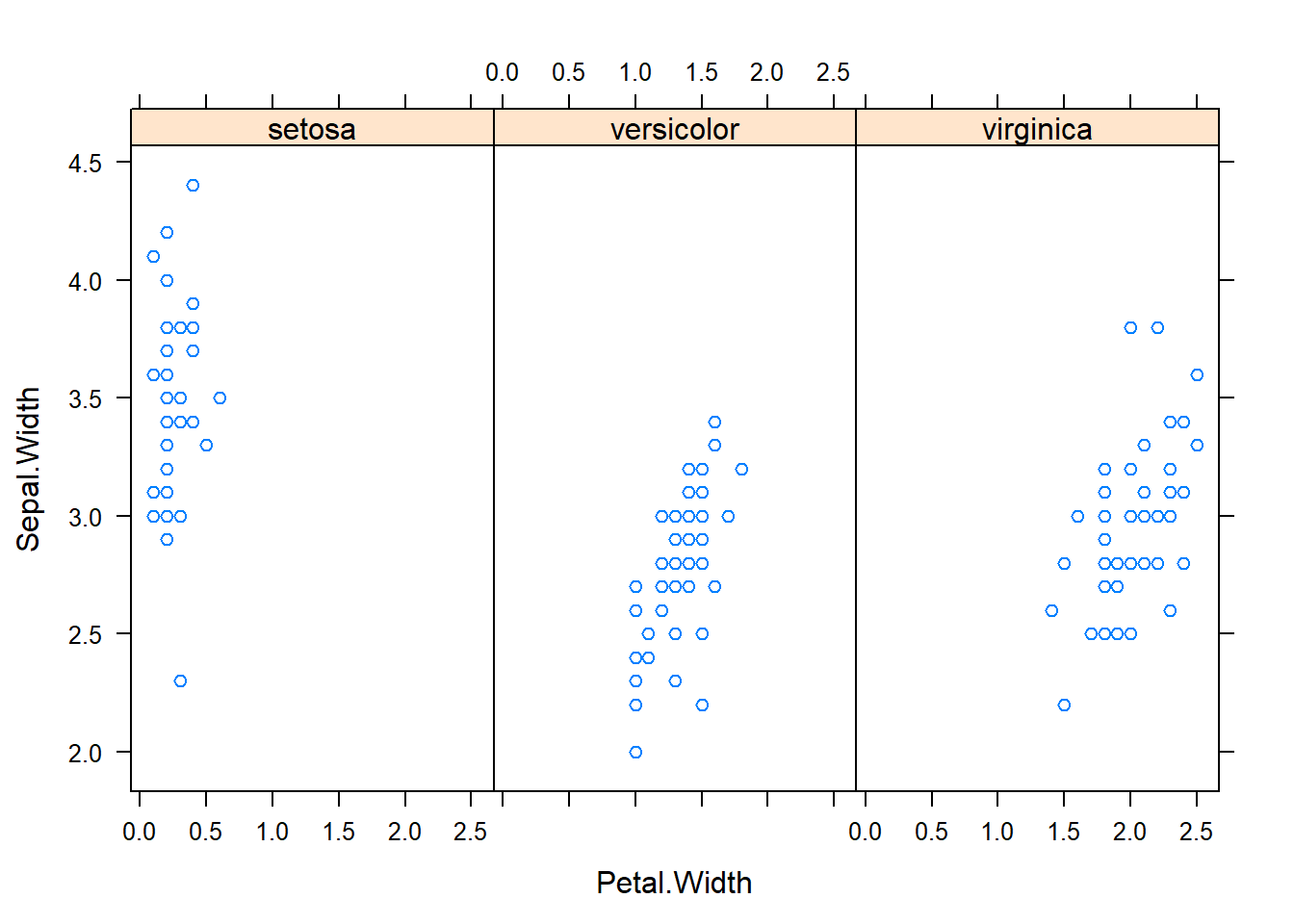
xyplot(Sepal.Length ~ Petal.Length | Species, data=iris)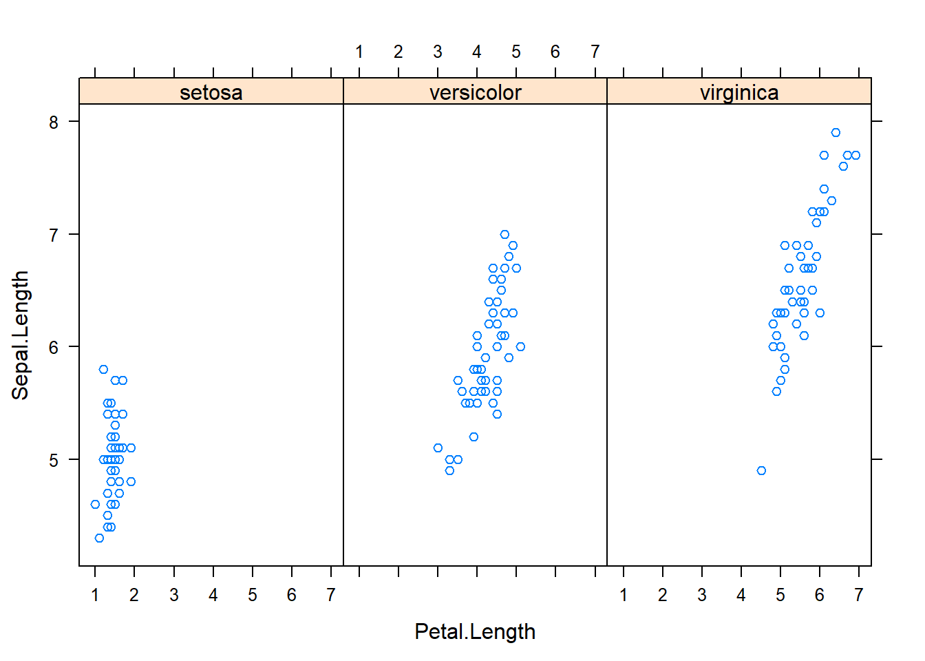
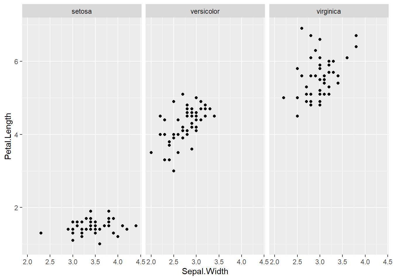
qplot(Sepal.Length, Sepal.Width, data=iris, facets= .~ Species)#a fast comparision plot of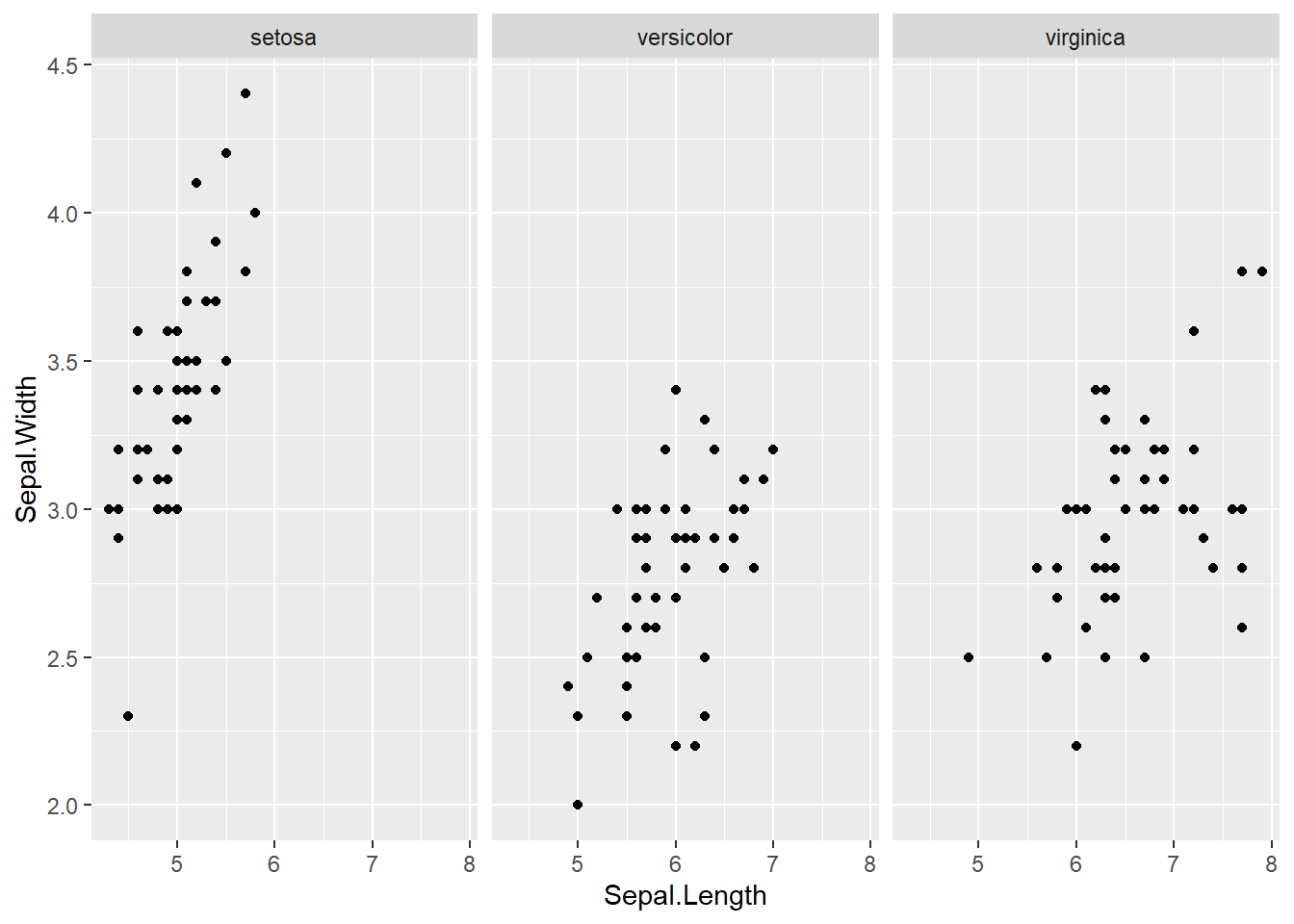
qplot(Petal.Length, Petal.Width, data=iris, facets= .~ Species)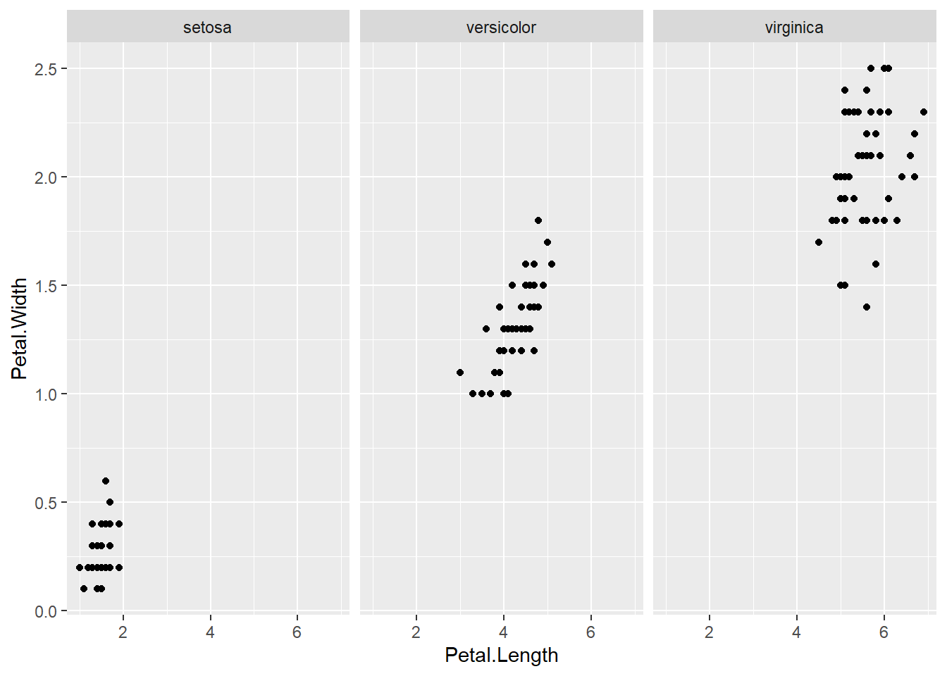
qplot(Sepal.Length, Petal.Width, data=iris, facets= .~ Species)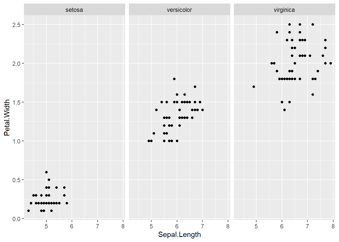
qplot(Sepal.Length, Petal.Length, data=iris, facets= .~ Species)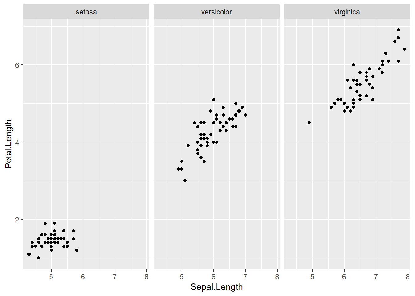
qplot(Sepal.Width, Petal.Width, data=iris, facets= .~ Species)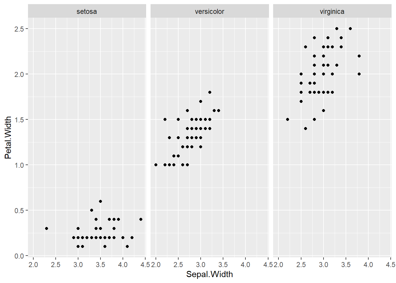
qplot(Sepal.Width, Petal.Length, data=iris, facets= .~ Species)