Hierarchical Clustering
The hierarchical agglomerative clustering starts with each observation as a cluster and pairs two at a time until all clusters are merged into one single cluster. The number of clusters is not known or specified in advance. The distance between all pairs of points in the data is recorded. There is a dendrogram (upside down tree structure) that is the output of the grouping of clusters. It represents and shows how many clusters were found in the data. The hierarchical method starts at the bottom of the dendrogram and starts creating clusters. Then paired clusters that are similar are merged together. It continues until there is only one cluster. Bottom up pairing. There are four merging methods: averaging, complete, single, centroidal, and Ward’s method. Hierarchical clustering finds the nested groups of clusters and uses a distance measurement like Hamming, Manhattan, or Euclidean that is defined in the parameters of the R function. The default popular distance is the Euclidean and measures the dissimilarity between each pair of observations. The single linkage merging method looks at the shortest point in one cluster to the point in another cluster. The complete method looks at the longest point between a point in one cluster and a point in another cluster. The average linkage takes the average mean distance between each point in one cluster and each point in another cluster. It combines some of the benefits from both single and complete methods.
Load Required Libraries
library(dendextend)
library(factoextra)
In the first part of this analysis, I build a random number x,y plot and store the vectors in a data frame. The first graph shows the plots of random vectors and I label them. The second table shows the Euclidean distance values for each point. The first dendrogram shows the clustered vectors.
set.seed(1234); par(mar=c(0,0,0,0)) #set graph margins
x <- rnorm(12, mean=rep(1:3, each=4), sd=0.2) #make random numbers 3 groups, 4 elements with means fo 1,2,3 standard dev=0.2
y <- rnorm(12, mean=rep(c(1,2,1), each=4),sd=0.2) #12 random numbers, 3 groups, 4 elements, means 1,2,1, standDev=0.2
plot(x,y, col="blue", pch=19, cex=2) #plot random numbers in a graph
text(x+0.05, y+0.05, label=as.character(1:12)) #label points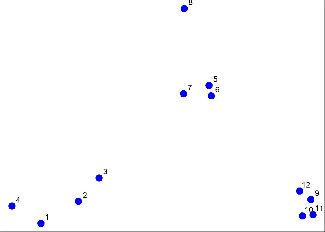
dataFrame <- data.frame(x=x, y=y) #store x,y info in a data frame.
dist(dataFrame, method="euclidean") #distance matrix default euclidean
## 1 2 3 4 5 6 7
## 2 0.34120511
## 3 0.57493739 0.24102750
## 4 0.26381786 0.52578819 0.71861759
## 5 1.69424700 1.35818182 1.11952883 1.80666768
## 6 1.65812902 1.31960442 1.08338841 1.78081321 0.08150268
## 7 1.49823399 1.16620981 0.92568723 1.60131659 0.21110433 0.21666557
## 8 1.99149025 1.69093111 1.45648906 2.02849490 0.61704200 0.69791931 0.65062566
## 9 2.13629539 1.83167669 1.67835968 2.35675598 1.18349654 1.11500116 1.28582631
## 10 2.06419586 1.76999236 1.63109790 2.29239480 1.23847877 1.16550201 1.32063059
## 11 2.14702468 1.85183204 1.71074417 2.37461984 1.28153948 1.21077373 1.37369662
## 12 2.05664233 1.74662555 1.58658782 2.27232243 1.07700974 1.00777231 1.17740375
## 8 9 10 11
## 2
## 3
## 4
## 5
## 6
## 7
## 8
## 9 1.76460709
## 10 1.83517785 0.14090406
## 11 1.86999431 0.11624471 0.08317570
## 12 1.66223814 0.10848966 0.19128645 0.20802789distxy <- dist(dataFrame)
hClustering <- hclust(distxy) #cluster the data
plot(hClustering) #plot to graph, see 3 main clusters
par(oma=c(2,2,2,2)) #reconfigure margins
par(mai=c(1,1,1,1))
plot(hClustering) #plot is more centered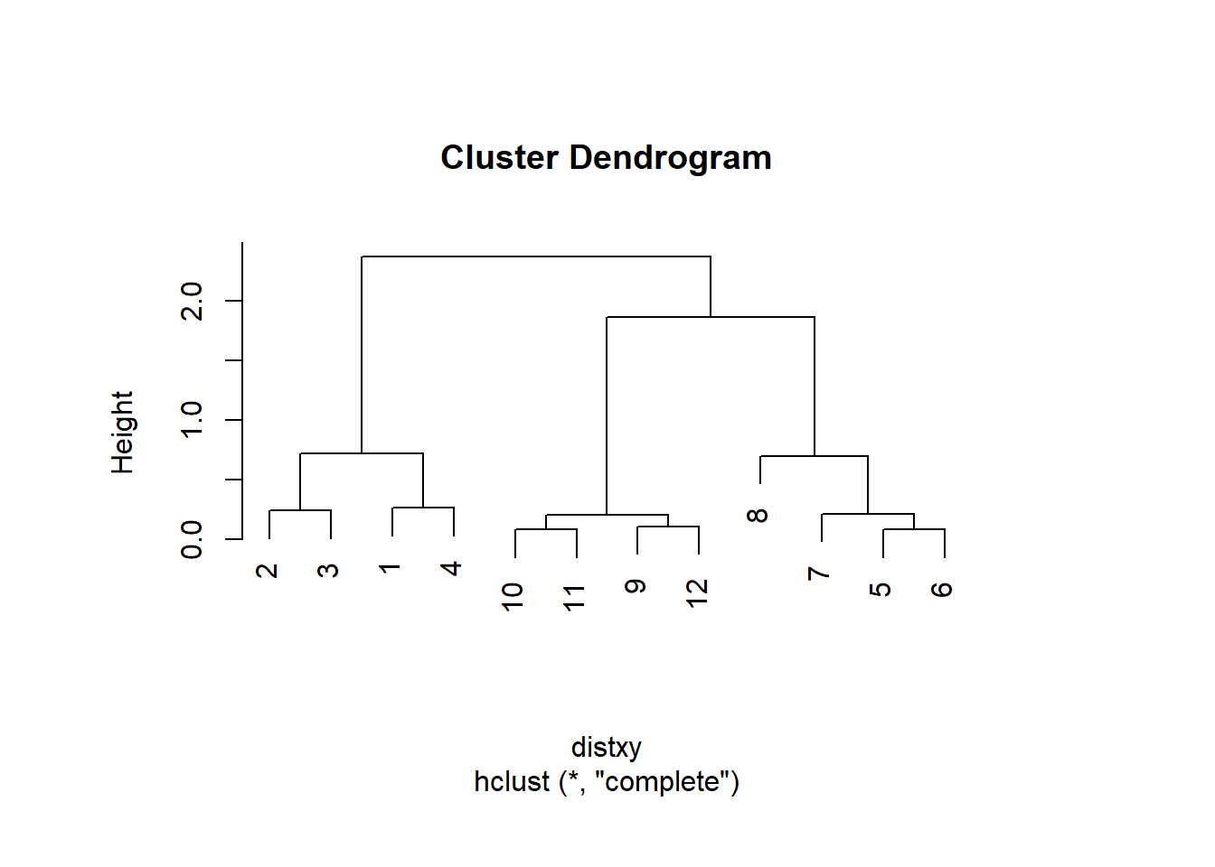
This next section shows basic coloring of the clusters and a rectangular box to enforce the three cluster regions.
#Add color Dendrogram

dend <- dataFrame %>%
  dist %>%
  hclust %>%
  as.dendrogram
dend %>%
  color_branches(k=3) %>%
  plot(horiz=FALSE, main="Horizontal Dendrogram")
dend %>%
  rect.dendrogram(k=3, horiz = FALSE)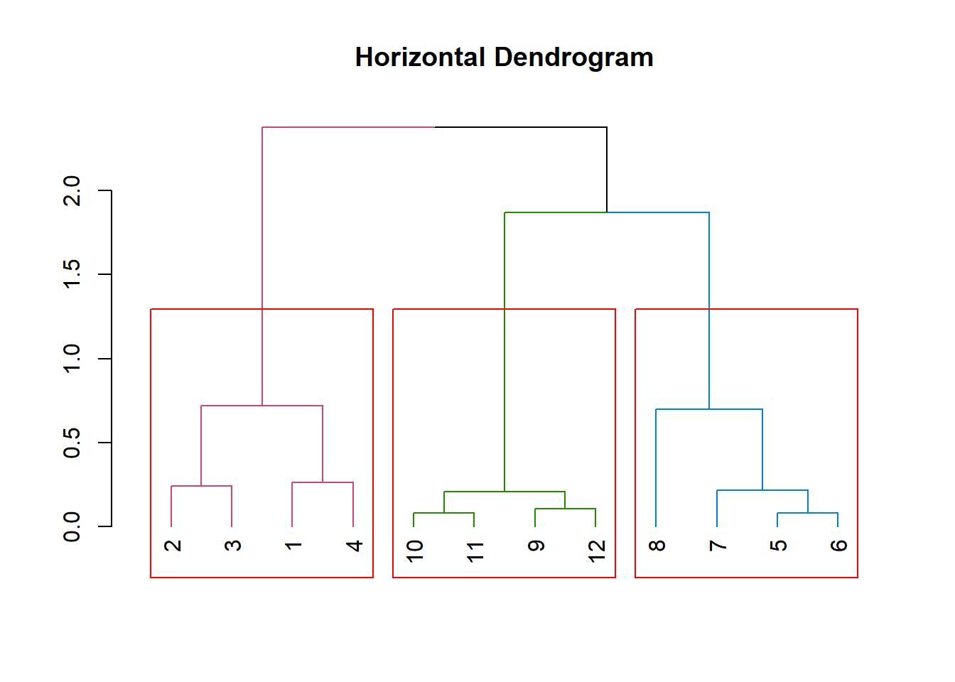
This graph shows a better visual for the three clusters with thicker lines and richer colors along with the outline rectangles around each cluster.
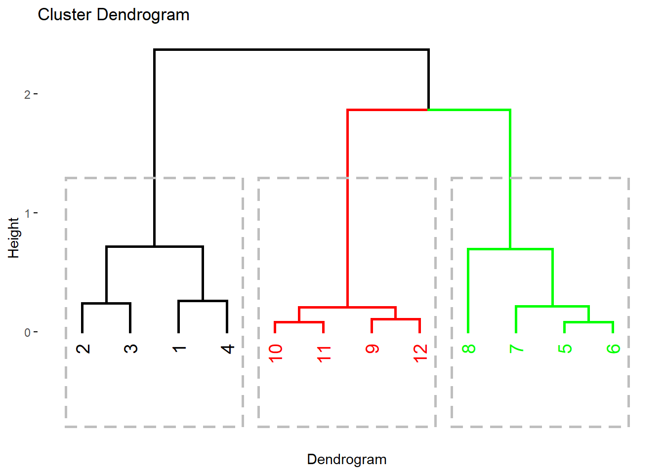
fviz_dend(dend, k=3,
          cex=1,
          k_colors=c("black", "red", "green"),
          color_labels_by_k = TRUE,
          lwd=1,
          rect =TRUE,
          xlab ="Dendrogram"
)
The code below becomes more complex and is the example from Exploratory Data Analysis. Here the dendrogram is only colored in the leaf labels 1,2,3. Great for grouping but vague because now we don’t know what cluster 1,2,3 mean regarding the variables.It just shows thee are 3 variables. The heat map was another example and in the graphic we can see what values are clustered together.
myplclust <- function( hclust, lab=hclust$labels, lab.col=rep(1,length(hclust$labels)), hang=0.1, ...){
  y <- rep(hclust$height, 2); x <- as.numeric(hclust$merge)
  y <- y[which(x<0)]; x <- x[which(x<0)]; x <- abs(x)
  y <- y[order(x)]; x <- x[order(x)]
  plot( hclust, labels=FALSE, hang=hang, ... )
  text( x=x, y=y[hclust$order] -(max(hclust$height)*hang),
        labels=lab[hclust$order], col=lab.col[hclust$order],
        srt=90, adj=c(1,0.5), xpd=NA, ... )
}

dataFrame <- data.frame(x=x, y=y)
distxy <- dist(dataFrame)
hClustering <- hclust(distxy)
myplclust(hClustering, lab=rep(1:3, each=4), lab.col=rep(1:3, each=4))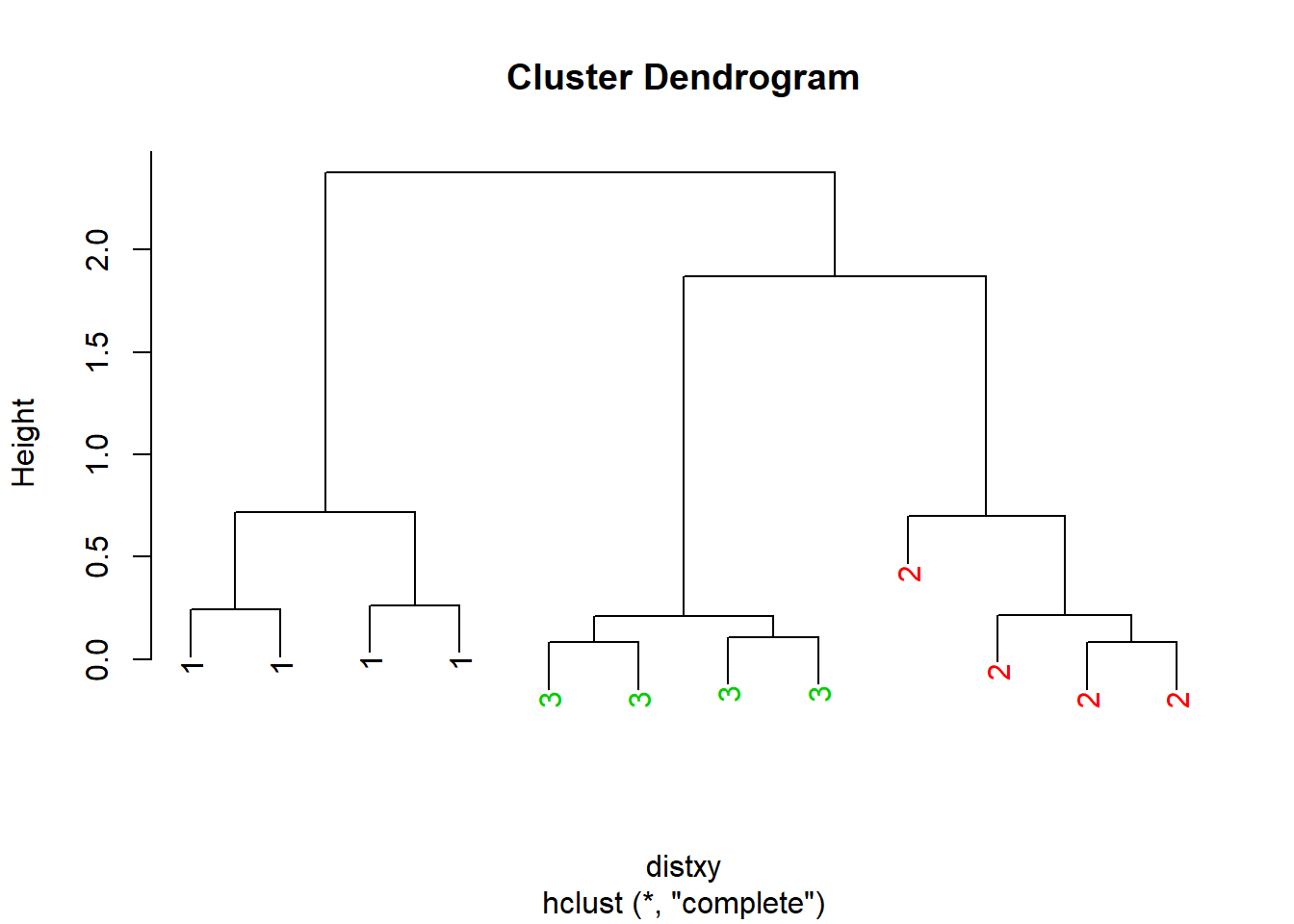
(143)## [1] 143dataMatrix <- as.matrix(dataFrame)[sample(1:12),]
heatmap(dataMatrix)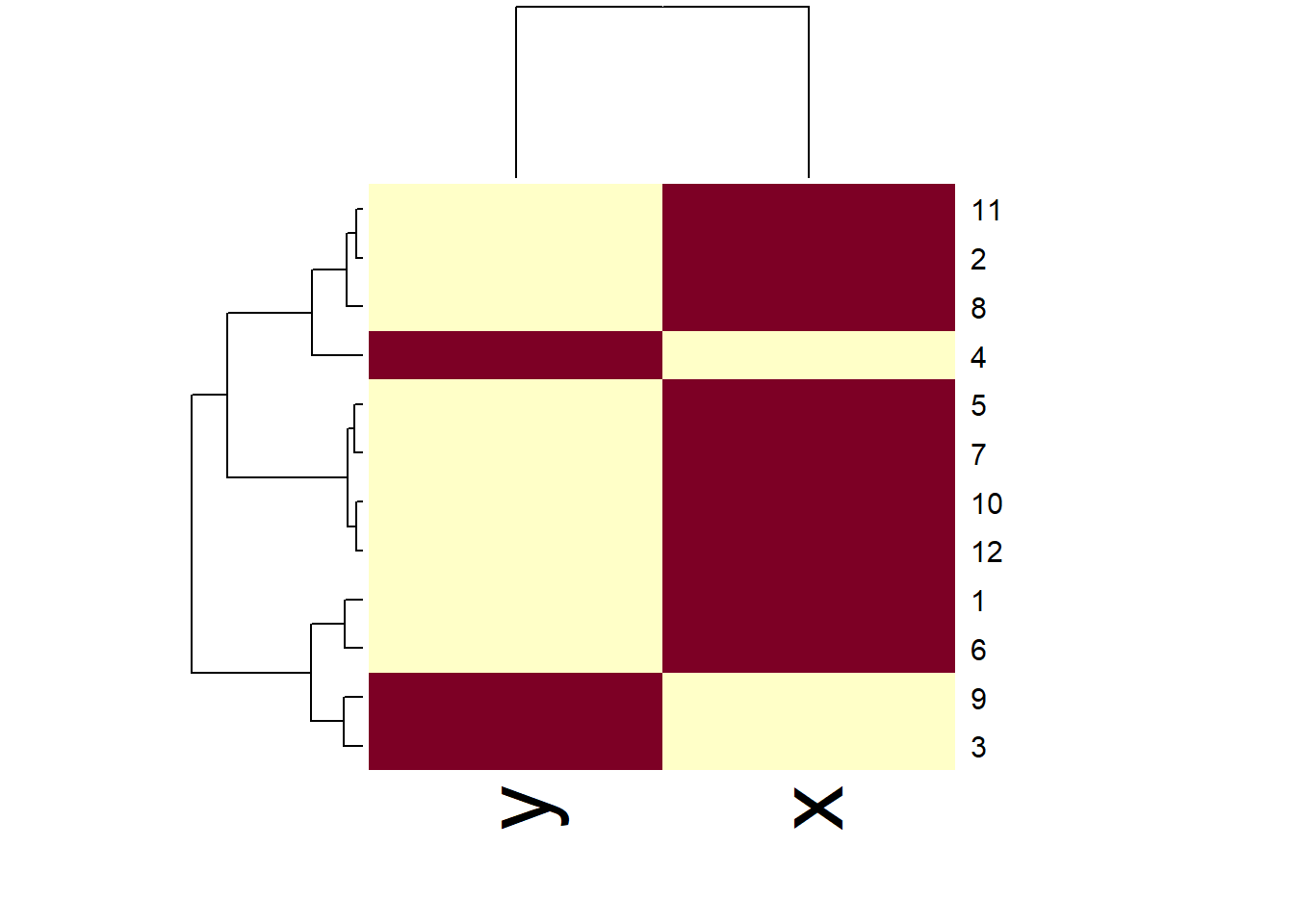
Below is the same dendrogram example from above and it was labeled on the x-axis and the leaves of each cluster are labeled 10,11,12 which again is not descriptive of the data points being represented. The color is set for each cluster again demonstrating a different color scheme. The parameters in the myplclust were adjusted to make these changes.
myplclust <- function( hclust, lab=hclust$labels, lab.col=rep(1,length(hclust$labels)), hang=0.1, ...){
  y <- rep(hclust$height, 2); x <- as.numeric(hclust$merge)
  y <- y[which(x<0)]; x <- x[which(x<0)]; x <- abs(x)
  y <- y[order(x)]; x <- x[order(x)]
  plot( hclust, labels=FALSE, hang=hang, ... )
  text( x=x, y=y[hclust$order] -(max(hclust$height)*hang),
        labels=lab[hclust$order], col=lab.col[hclust$order],
        srt=90, adj=c(1,0.5), xpd=NA, ... )
}
myplclust(hClustering, lab=rep(10:12, each=4), lab.col=rep(3:5, each=4), xlab="Dendrogram", sub="Example")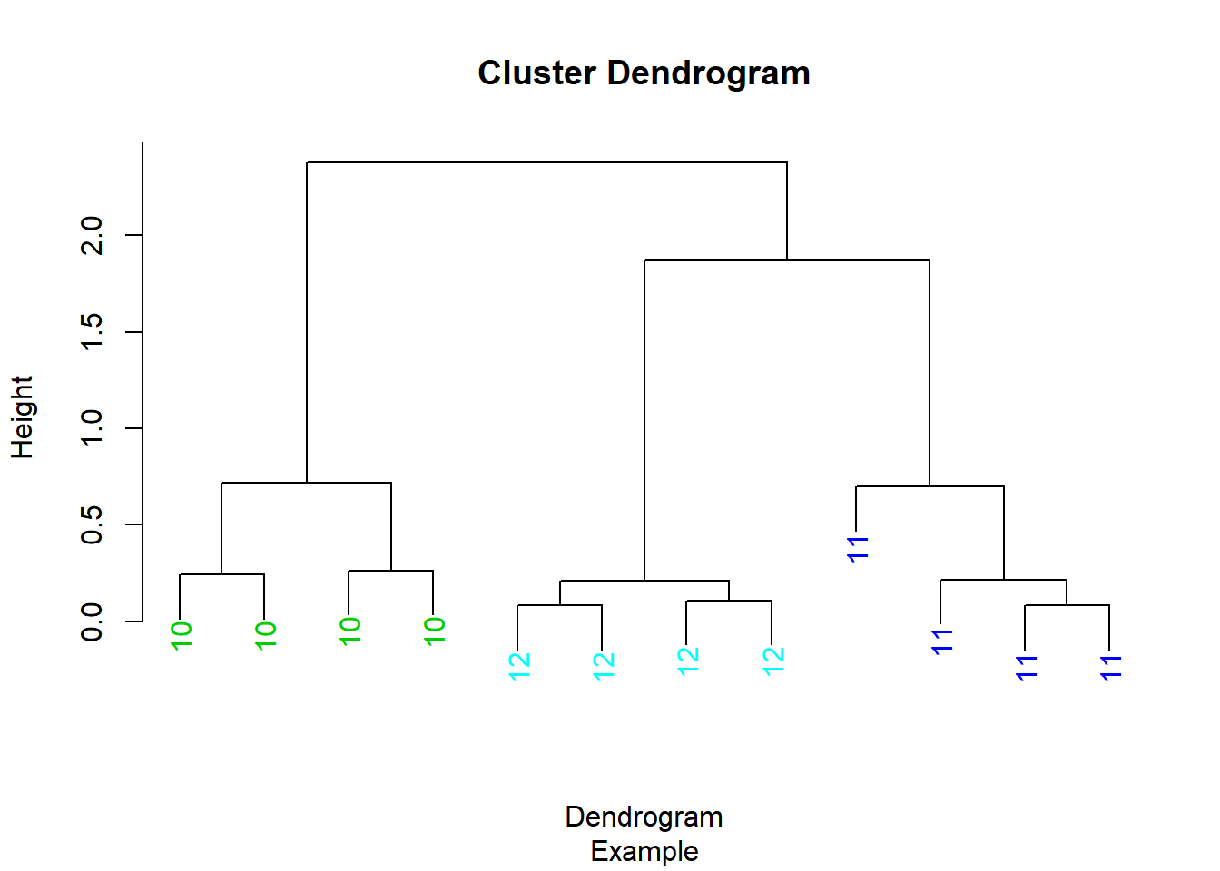
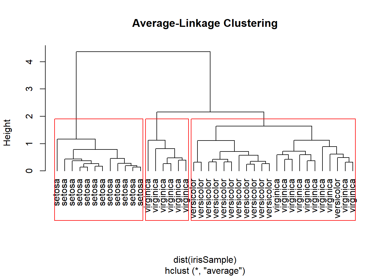
Avgerage Linkage Clustering Example
library(datasets)
set.seed(1234)
idx <- sample(1:dim(iris)[1],40)
irisSample <- iris[idx, ]
irisSample$Species <- NULL
hc <- hclust(dist(irisSample), method = "average")
plot(hc, hang=-1, labels=iris$Species[idx], main="Average-Linkage Clustering")
groups <- cutree(hc, k=3)
rect.hclust(hc, k=3)