R Graph Plotting System
This brief analysis demonstrates the quick ways to look at data by plotting the data points using R and ggplot2. There are four small datasets used in displaying the individual data characteristics. The point is fast and simplistic plot to reveal the represented data.
Load the Libraries
library(datasets)
library(tidyverse)
Air Quality Plot
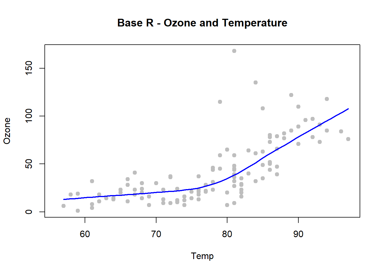
with(airquality, {
        plot(Temp, Ozone, pch=19, col="grey", main = "Base R - Ozone and Temperature")
        lines(loess.smooth(Temp, Ozone), col="blue", lwd=2)
})
ggplot(airquality, aes(Temp, Ozone)) +
  geom_point(color="red")+
  geom_smooth(method="loess", se=FALSE) +
  ggtitle("ggplot2 - Ozone and Temperature")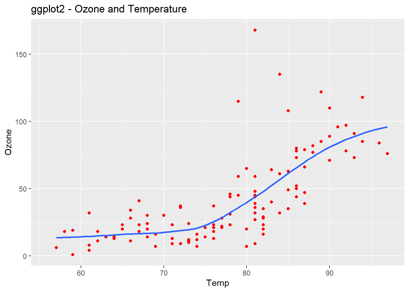
Cars Dataset Summary
str(mpg)## tibble [234 x 11] (S3: tbl_df/tbl/data.frame)
## $ manufacturer: chr [1:234] "audi" "audi" "audi" "audi" ...
## $ model : chr [1:234] "a4" "a4" "a4" "a4" ...
## $ displ : num [1:234] 1.8 1.8 2 2 2.8 2.8 3.1 1.8 1.8 2 ...
## $ year : int [1:234] 1999 1999 2008 2008 1999 1999 2008 1999 1999 2008 ...
## $ cyl : int [1:234] 4 4 4 4 6 6 6 4 4 4 ...
## $ trans : chr [1:234] "auto(l5)" "manual(m5)" "manual(m6)" "auto(av)" ...
## $ drv : chr [1:234] "f" "f" "f" "f" ...
## $ cty : int [1:234] 18 21 20 21 16 18 18 18 16 20 ...
## $ hwy : int [1:234] 29 29 31 30 26 26 27 26 25 28 ...
## $ fl : chr [1:234] "p" "p" "p" "p" ...
## $ class : chr [1:234] "compact" "compact" "compact" "compact" ...qplot(displ, hwy, data=mpg, color= hwy, main="Highway MPG and Engine Displacement")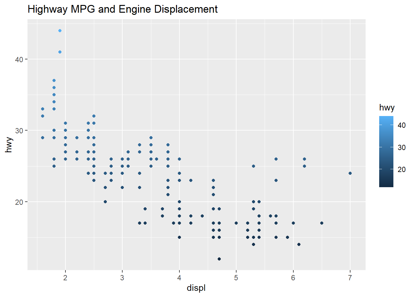
qplot(displ, hwy, data=mpg, color=drv, main="MPG, Displacement, and Drive")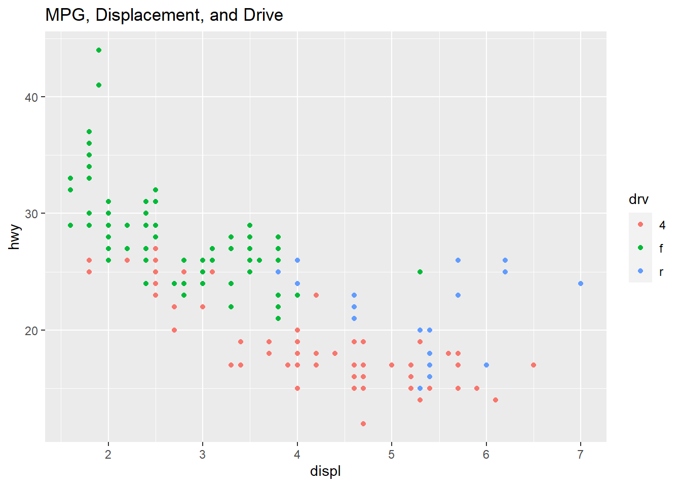
The plot below shows the two scatter plots from above, however this one adds a trend line to the plot. The previous plot shows a slight resemblance of the data moving from the upper left to lower right, this is not always the case with scatter plots. The line helps us to see patterns in a scatter plot environment and the relationship between variables and trends. The smoothing method is typically “loess” or locally weighted scatterplot smoothing. The grey area shows the alpha of +5%/-5% (or 95% confidence interval) for this regression line. The smooth adds a trend line that now clearly shows lower displacement engines have better highway miles per gallon. The 4.5 to 5.5 liter engines have the lowest group of highway mpg. Where the grey area is wider, this shows the data is sparse and an area to question why those data points are creating a wider interval.
qplot(displ, hwy, data=mpg,
      geom=c("point", "smooth"),
      main = "HWY and Displacement Loess Curve")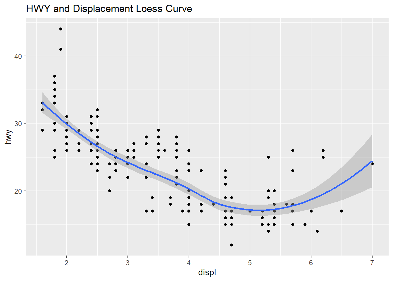
qplot(hwy, data=mpg, fill=drv, binwidth=1.5, main="Barplot of HWY and Drive")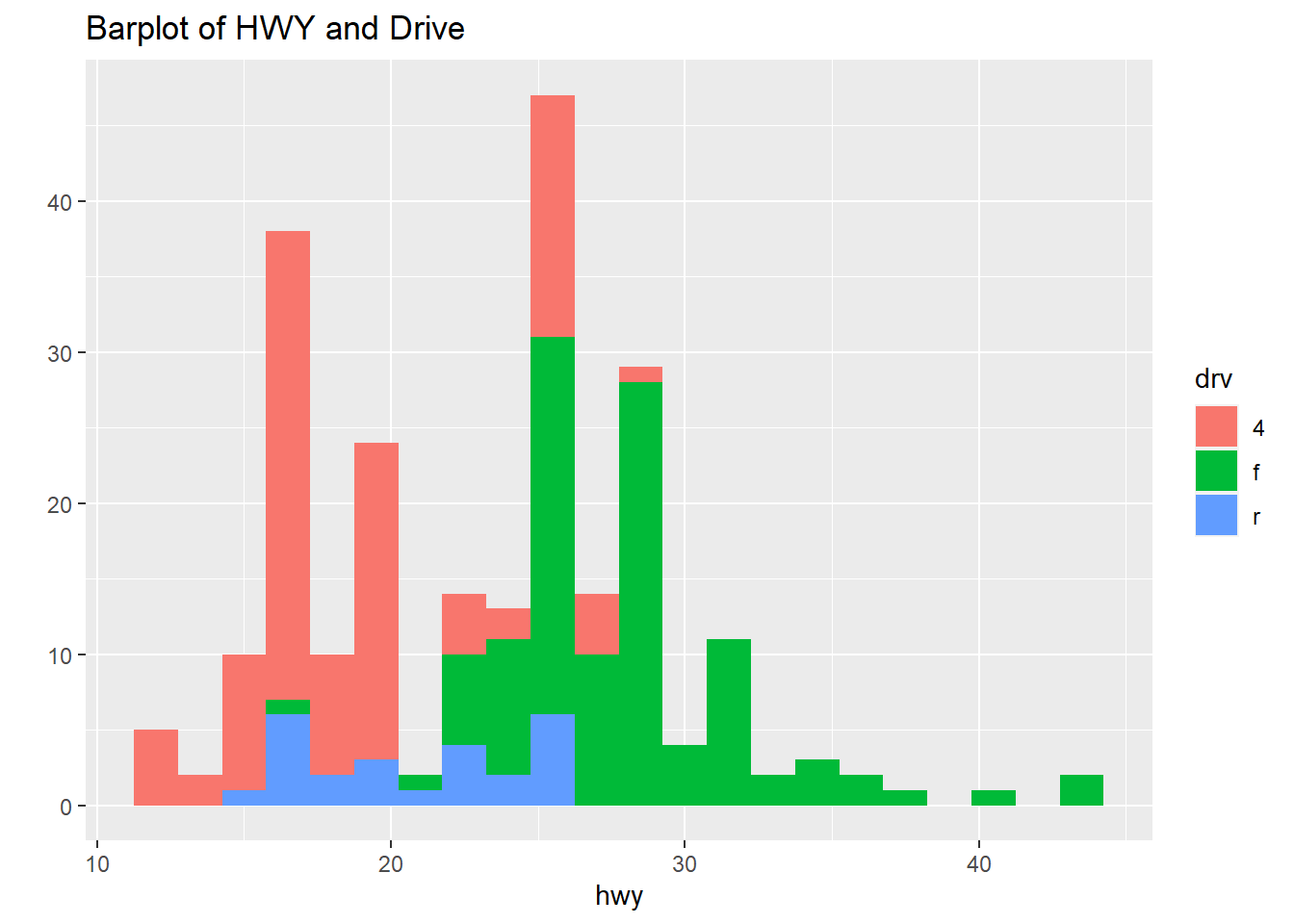
The plot shows the boxplots of the three Drive classes side by side: four-wheel drive, front-drive, rear-drive and the highway are miles per gallon (mpg).
qplot(drv, hwy, data=mpg, geom="boxplot", fill=drv, main = "Boxplot of Highway and Drive", outlier.color="red")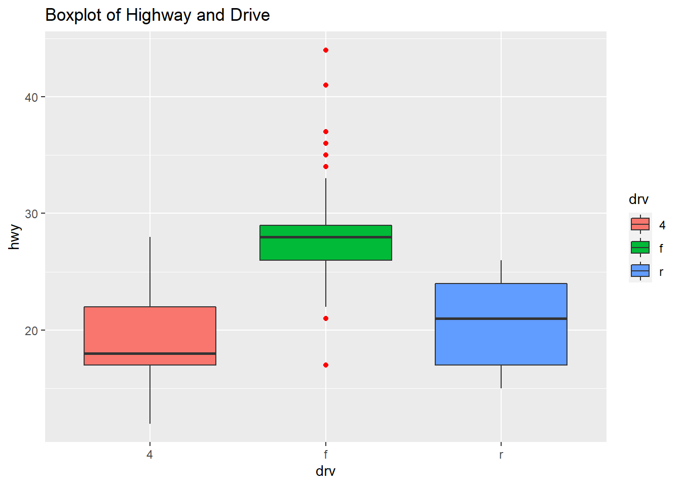
qplot(hwy, data=mpg, facets=drv~., binwidth=2, fill=drv, main="Facet Plot - Individual Distribution of the Drive Class")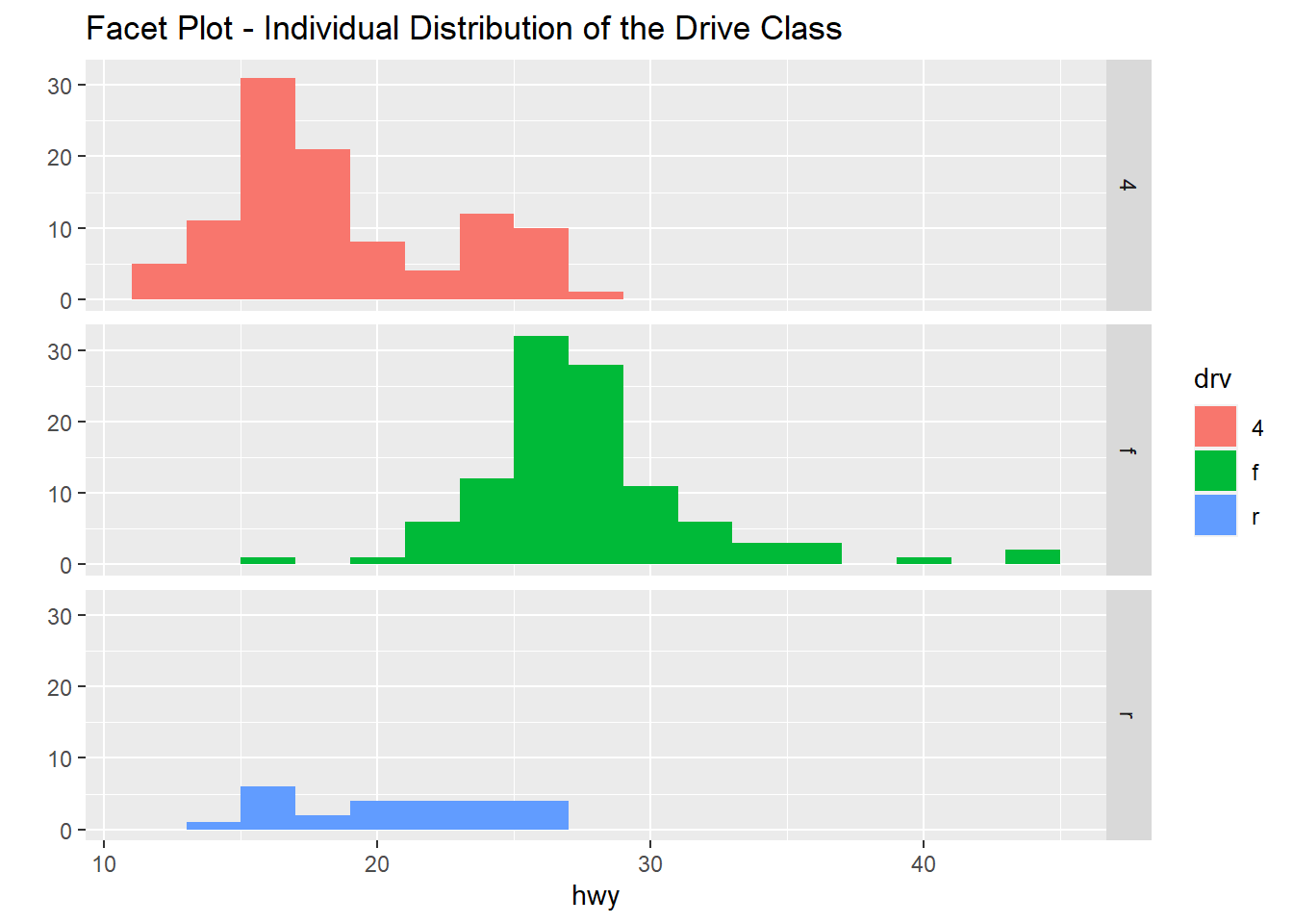
qplot(displ, hwy, data=mpg, facets=.~ drv, color=drv, main="Scatterplot of Individual Records")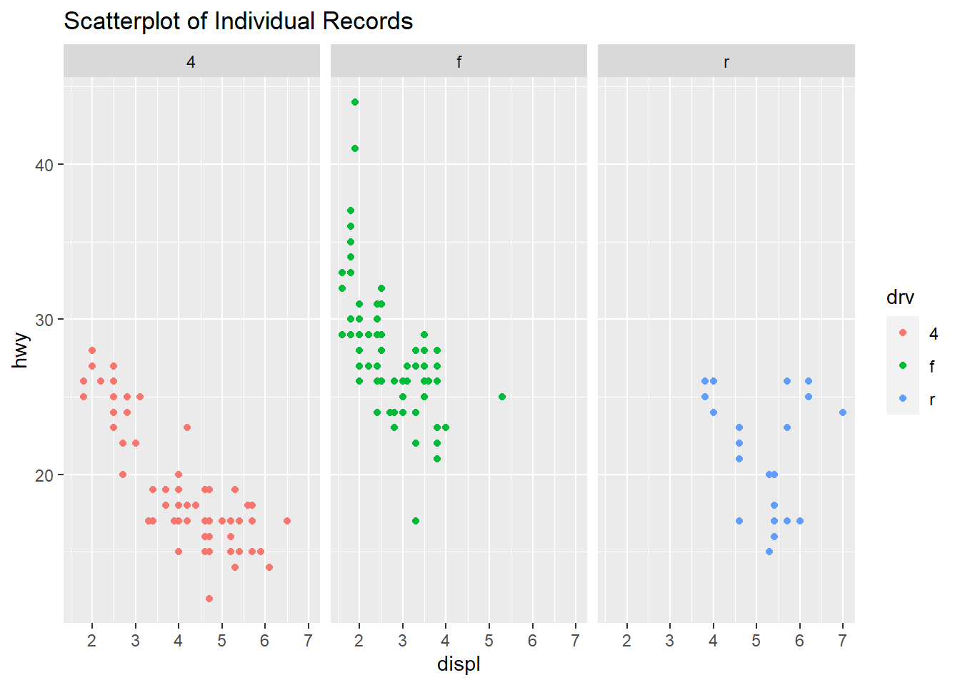
This next plot has three facets of scatterplot’s with the trend line and confidence interval as shading. Going from the boxplots to this further helps to understand the data. The engine displacement is now added to the three categories of vehicle drive train. Now we can easily compare the three engine displacements and how highway miles per gallon is related to the engine displacement. The four-wheel drive data looks clear and shows the lower displacement vehicles have better highway mpg. The front-wheel drive vehicles also show a similar trend and here we can see the outliers from the boxplot, the highest displacement engine in this category has a very wide confidence interval and could be something to look at further. The rear-wheel drive vehicles has an irregular looking line and the displacement is in the higher values, the highway miles per gallon in this category range from 15 to 25. Also a wide confidence interval due to the variation and lower number of data points available.
qplot(displ, hwy, data=mpg, facets= .~ drv, fill=drv, main = "Facet Scatterplot with LM Line and Confidence Interval Shading") +
  geom_smooth()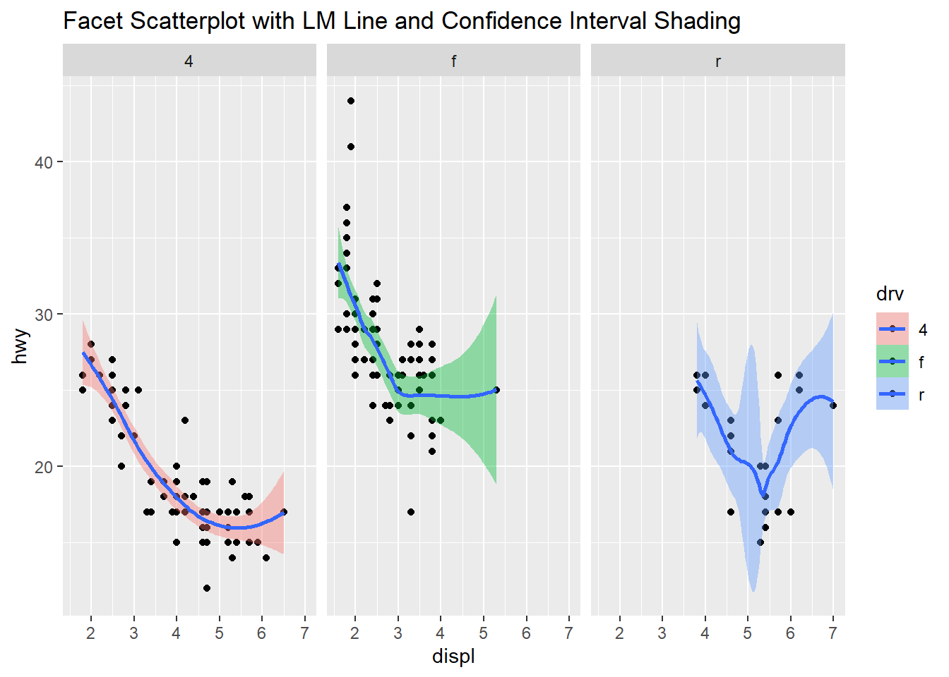
Mouse Allergen and Asthma Cohort Study (MAACS) Dataset
url = "https://raw.githubusercontent.com/lejarx/MAACS-dataset/master/maacs.rda"
destfile = tempfile(fileext = ".rda")
download.file(url, destfile, method = 'libcurl', mode = "wb", quiet=TRUE)
load(destfile)
unlink(destfile)
Summary of new dataset.
summary(maacs)## id eno duBedMusM pm25
## Min. : 1.0 Min. : 5.00 Min. : 0.01 Min. : 0.235
## 1st Qu.:188.2 1st Qu.: 17.00 1st Qu.: 308.00 1st Qu.: 12.688
## Median :375.5 Median : 31.50 Median : 1151.00 Median : 20.520
## Mean :375.5 Mean : 44.03 Mean : 4426.72 Mean : 28.088
## 3rd Qu.:562.8 3rd Qu.: 62.00 3rd Qu.: 3881.00 3rd Qu.: 34.284
## Max. :750.0 Max. :276.00 Max. :124919.00 Max. :300.281
## NA's :108 NA's :205 NA's :134
## mopos
## no :355
## yes:395
##
##
##
##
## qplot(log(eno),
data=maacs,
main = "log transform eno variable.")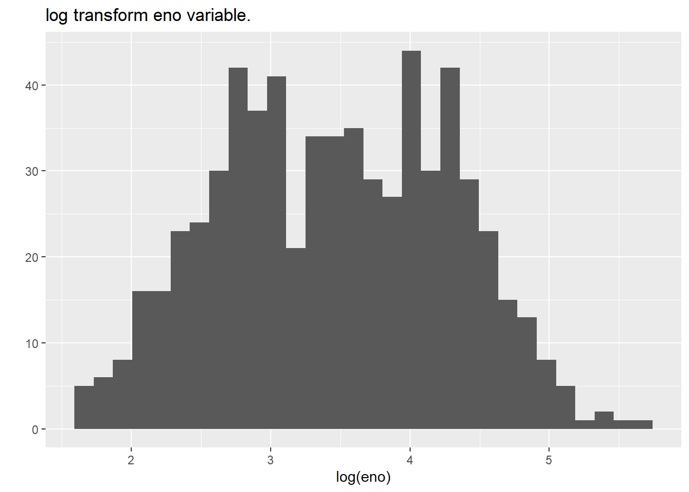
qplot(log(eno),
      data=maacs,
      fill=mopos,
      main = "log transform eno and and mopos variable")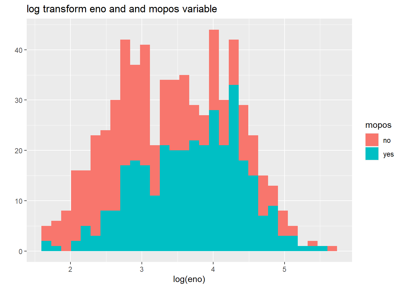
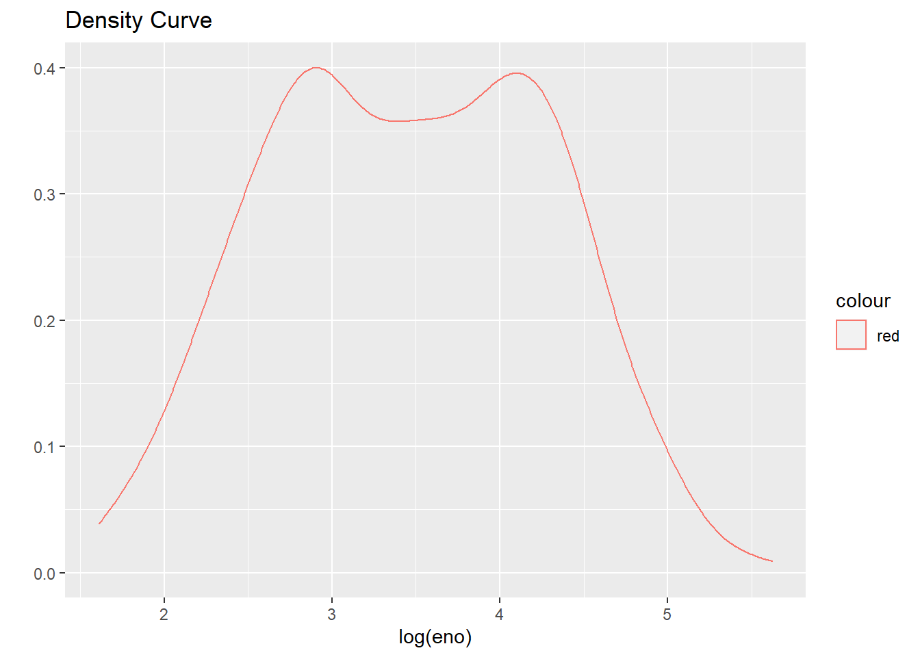
qplot(log(eno),
      data=maacs,
      geom="density",
      col="red",
      main = "Density Curve"
      )
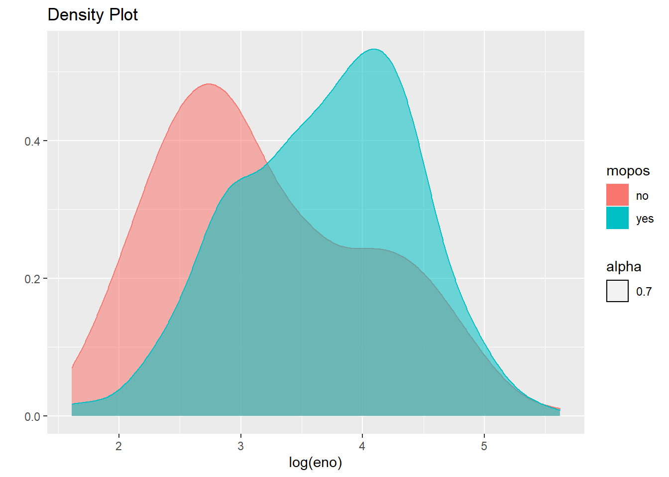
qplot(log(eno),
      data=maacs,
      geom="density",
      color=mopos,
      fill=mopos,
      alpha=.7, main="Density Plot"
      )
qplot(log(pm25),
      log(eno),
      data=maacs,
      geom=c("point", "smooth"),
      main="Scatterplot with Smoothing and Confidence Interval Shading")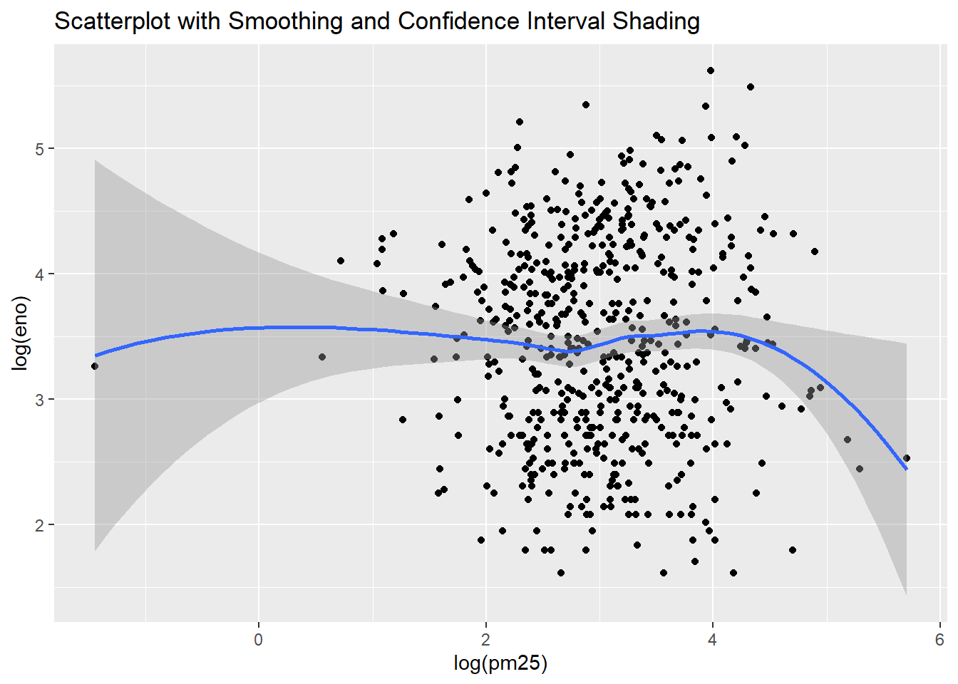
qplot(log(pm25),
      log(eno),
      data=maacs,
      shape=mopos,
      color=mopos,
      main="Scatterplot")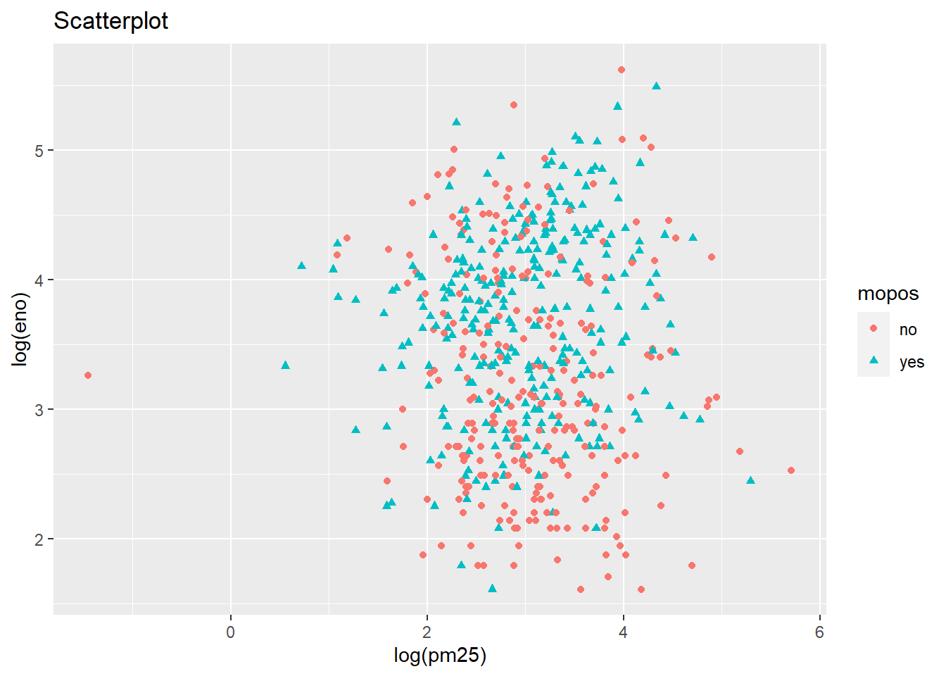
qplot(log(pm25),
      log(eno),
      data=maacs,
      shape=mopos,
      color=mopos,
      main="Scatterplot with Linear Estimate") +
  geom_smooth(method="lm")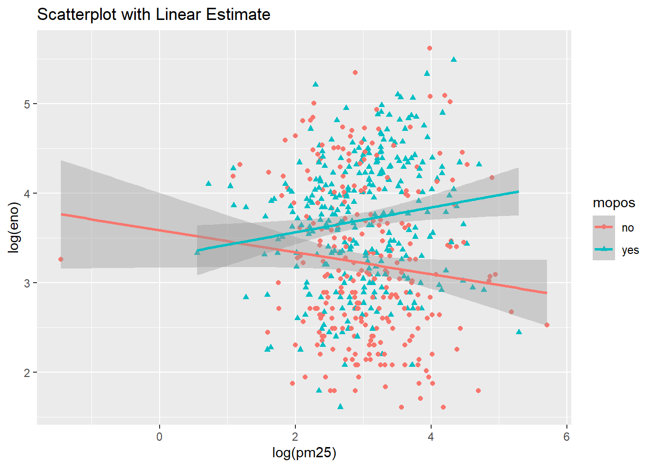
bmi <- read_csv("https://raw.githubusercontent.com/rdpeng/artofdatascience/master/manuscript/data/bmi_pm25_no2_sim.csv", col_types = "nnfi")summary(bmi)## logpm25 logno2_new bmicat NocturnalSympt
## Min. :0.5323 Min. :0.3419 normal weight:293 Min. :0.000
## 1st Qu.:1.1380 1st Qu.:1.1383 overweight :224 1st Qu.:0.000
## Median :1.3377 Median :1.3379 Median :1.000
## Mean :1.3448 Mean :1.3420 Mean :1.348
## 3rd Qu.:1.5330 3rd Qu.:1.5257 3rd Qu.:2.000
## Max. :2.2314 Max. :2.1695 Max. :6.000head(bmi)## # A tibble: 6 x 4
## logpm25 logno2_new bmicat NocturnalSympt
## <dbl> <dbl> <fct> <int>
## 1 1.25 1.18 normal weight 1
## 2 1.12 1.55 overweight 0
## 3 1.93 1.43 normal weight 0
## 4 1.37 1.77 overweight 2
## 5 0.775 0.765 normal weight 0
## 6 1.49 1.11 normal weight 0Nocturnal Symptoms and Log pm25 with Smoothing Line
g <- ggplot(bmi,
            aes(logpm25, NocturnalSympt))
Nocturnal Symptoms and Log pm25 with Linear Regression Line
g +
  geom_point() +
  geom_smooth()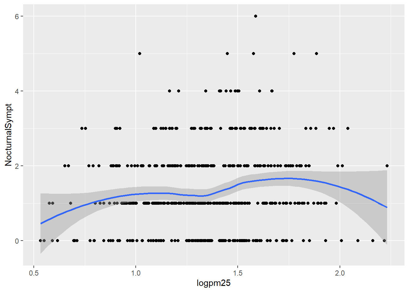
Normal Weight and Overweight Facet Plot with Lm line
g +
  geom_point() +
  geom_smooth(method = "lm")
## `geom_smooth()` using formula 'y ~ x'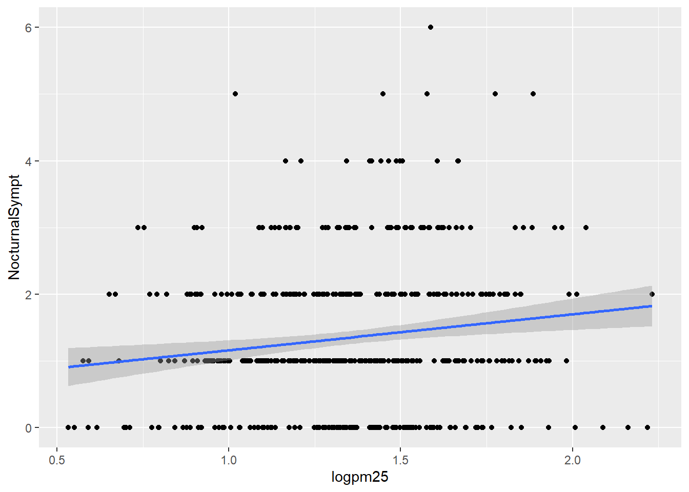
Nocturnal Symptoms and Log pm25 Scatterplot
g +
  geom_point() +
  geom_smooth(method = "lm") +
  facet_grid(. ~ bmicat)
## `geom_smooth()` using formula 'y ~ x'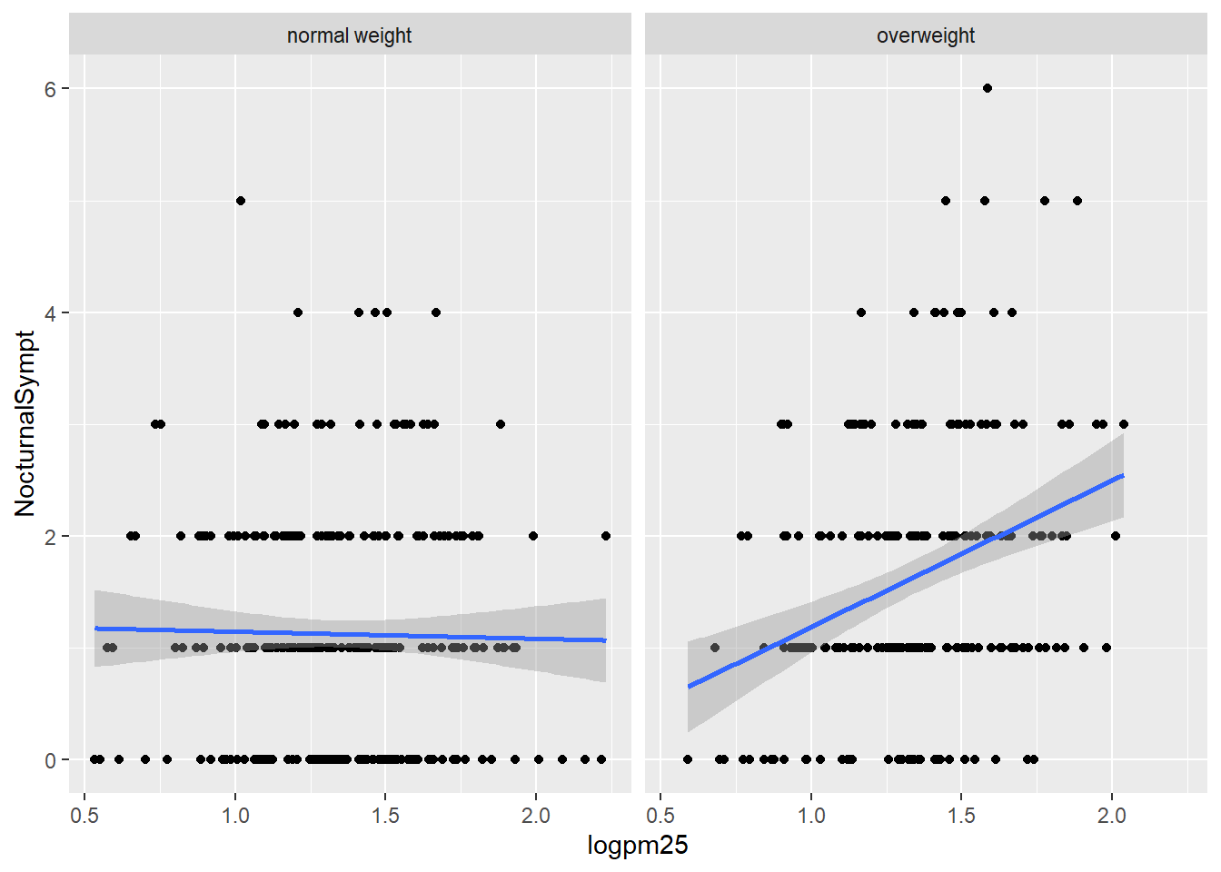
Normal Weight and Overweight Scattterplot
g +
  geom_point(color="steelblue",
             size=4,
             alpha=1/2)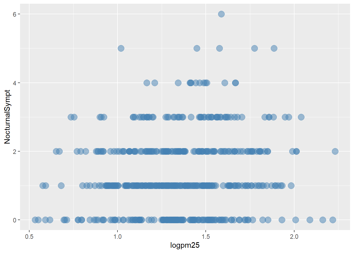
g +
  geom_point(aes(color=bmicat),
             size=4,
             alpha=1/2)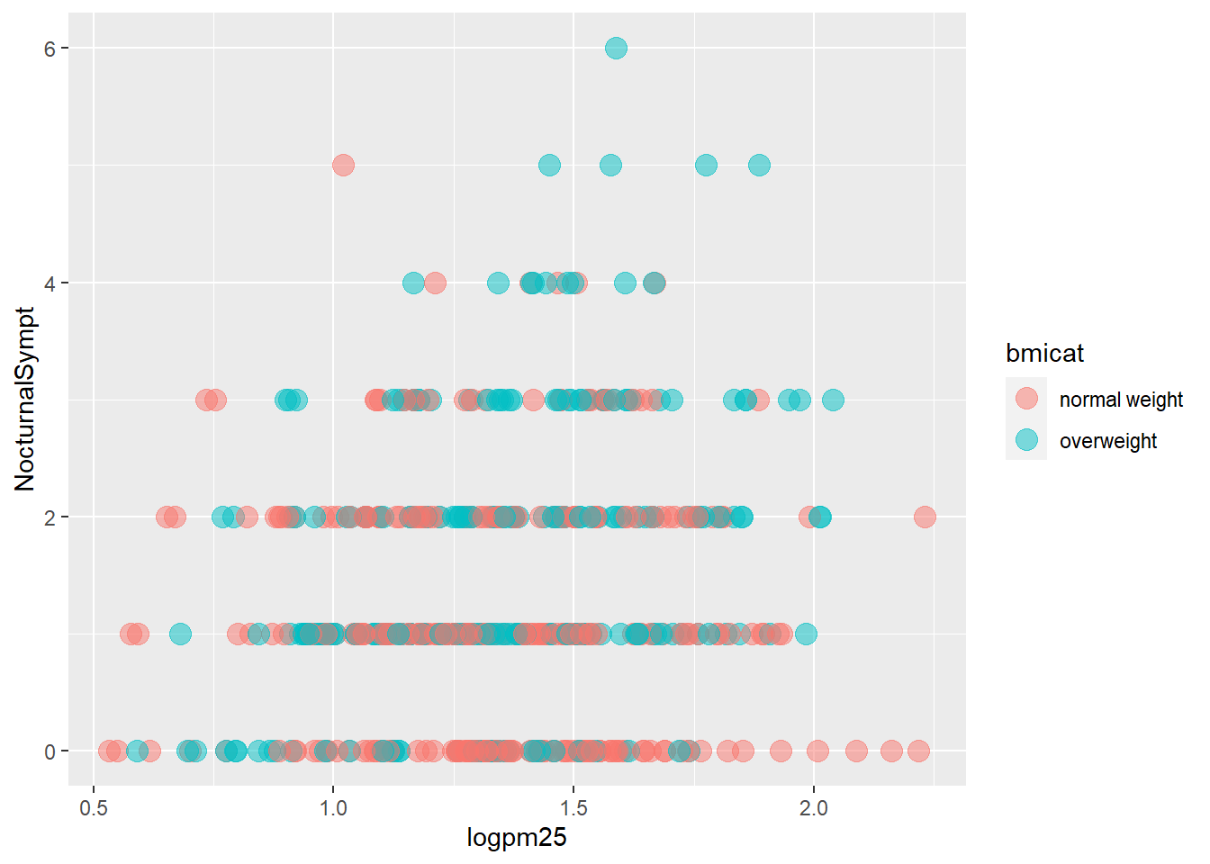
g +
  geom_point(aes(color= bmicat)) +
  labs(title="bmi") +
  labs(x = expression("log" * PM[2.5]),
       y= "Nocturnal Symptons")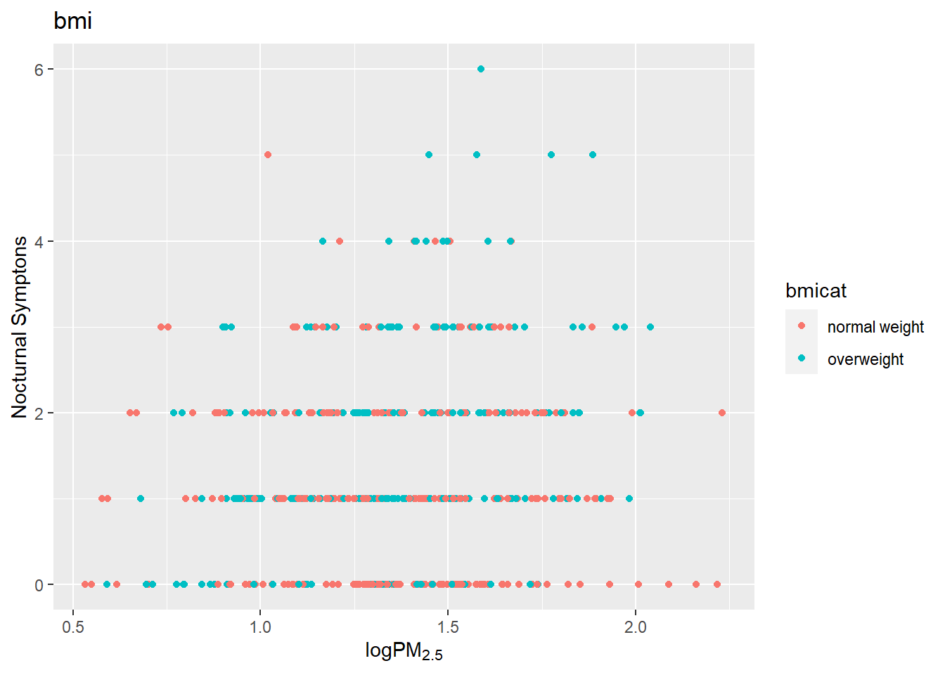
g +
  geom_point(aes(color=bmicat),
             size=2,
             alpha=1/2) +
  geom_smooth(size=4,
              linetype=3,
              method="lm",
              se=FALSE)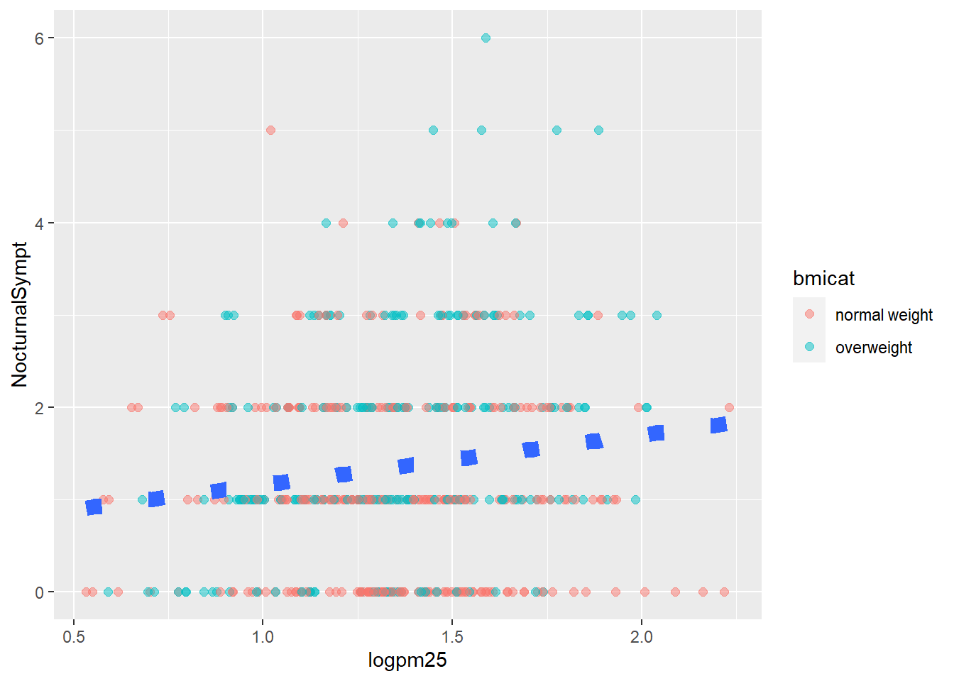
g +
  geom_point(aes(color=bmicat)) +
  theme_bw(base_family="Times")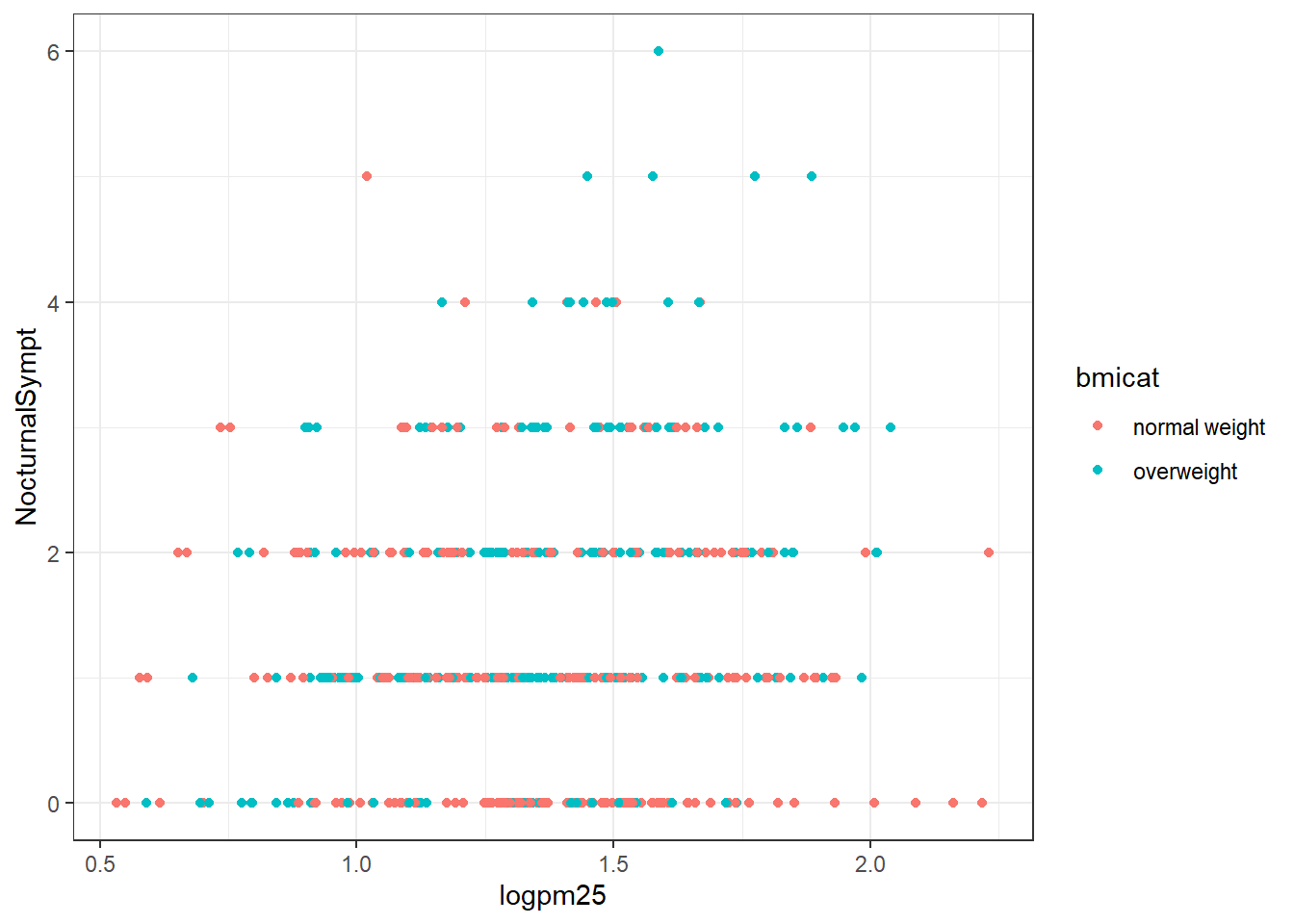
cutpoints <- quantile(bmi$logno2_new,
                      seq(0,1,
                          length=4),
                      na.rm=TRUE)

bmi$no2tert <- cut(bmi$logno2_new,
                      cutpoints)
levels(bmi$no2tert)
## [1] "(0.342,1.23]" "(1.23,1.47]" "(1.47,2.17]"The plot below for grid.Call are the plots that show seven panels (one NA) and the relationship between PM2.5 and nocturnal symptoms by the BMI and NO2 levels. The NO2 measurement was made into categorical data with three levels thus three columns (4th is NA) and two rows normal BMI and Overweight BMI. Measurements from the MAACS data set. The normal BMI in the first grid has a regression line about level, as the NO2 increases the nocturnal symptoms are high at first and then decline over the population. The overweight group is a much different contrast. The regression line starts low and increases over the increase in PM2.5 to about the same level of nocturnal symptoms for the three categories of NO2. Interesting is the middle category that starts a bit higher than the first and third graph for overweight population. Either way the overweight group is clearly effected by increases in NO2 and PM2.5 exposure compared to the normal BMI group.
g <- ggplot(bmi,
            aes(logpm25,
            NocturnalSympt))

g +
  geom_point(alpha=1/3) +
  facet_wrap(bmicat ~ no2tert,
             nrow=2,
             ncol=4) +
  geom_smooth(method="lm",
              se=FALSE,
              col="red") +
  theme_bw(base_family= "Avenir",
           base_size=10) +
  labs(x = expression("log" * PM[2.5])) +
  labs(y = "Nocturnal Sympt") +
  labs(title = "BMI Facet Plot")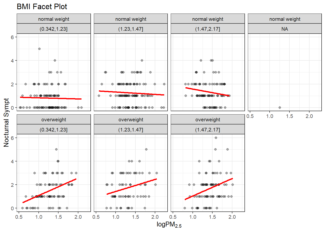
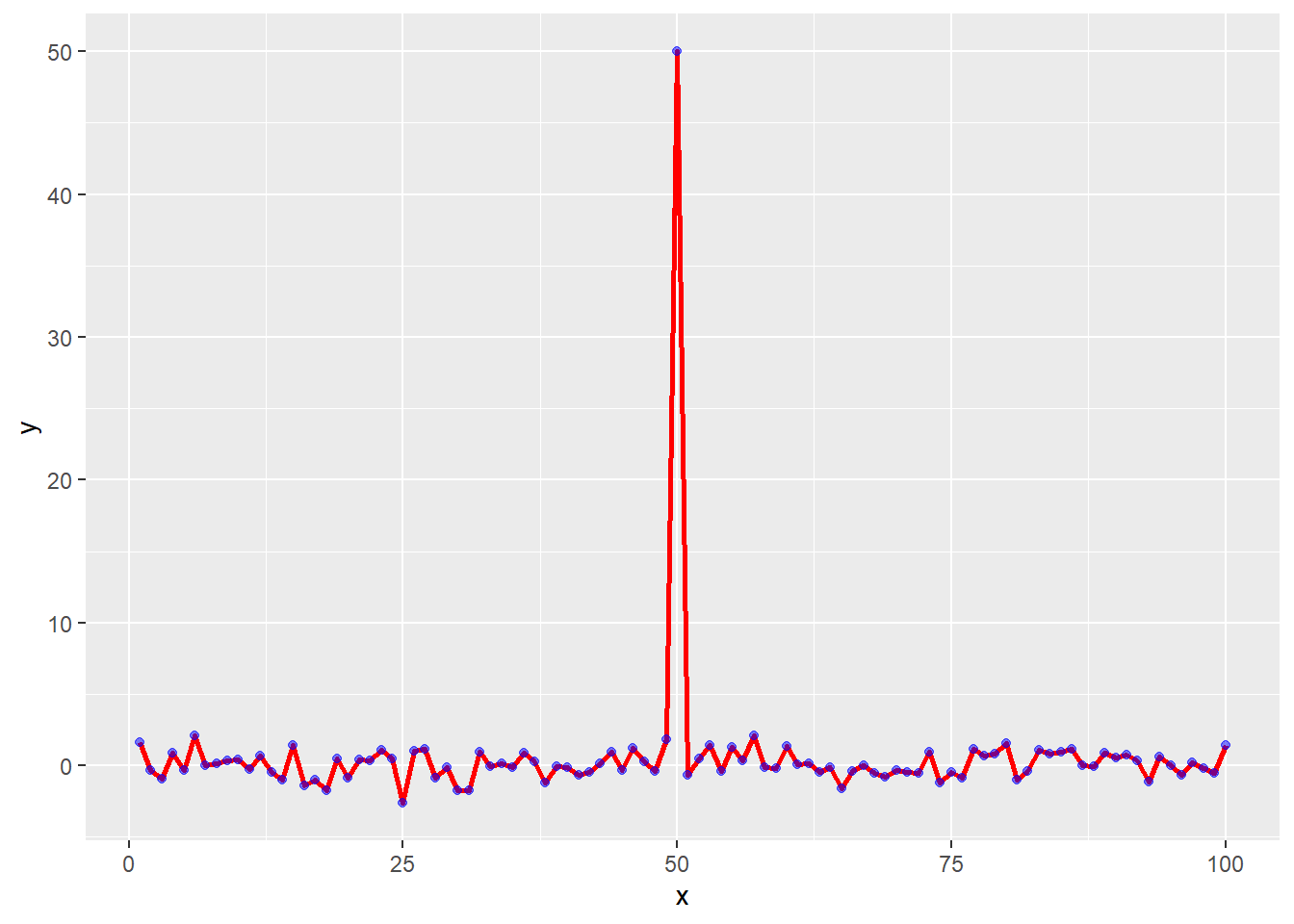
Part 4 - Scatterplot and Line Added
testdata <- data.frame(x=1:100, y=rnorm(100))

testdata[50,2] <- 50 # add an outlier
ggplot(testdata, aes(testdata$x,
testdata$y),
ylim=c(-2,2)) +
geom_point(col="blue")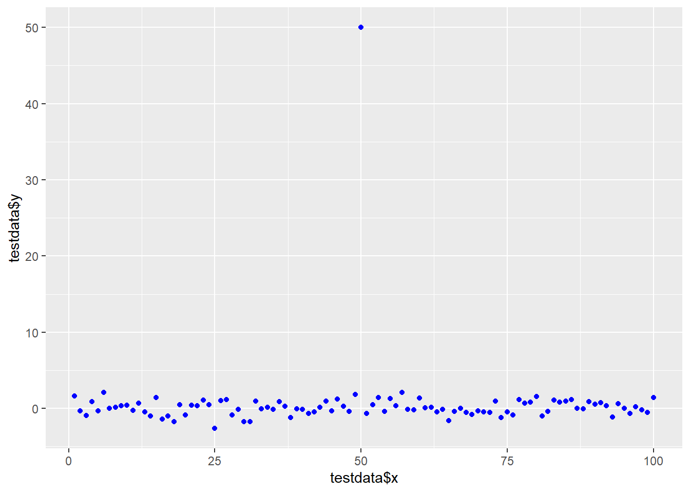
g <- ggplot(testdata, aes(x=x, y=y))g +
geom_line(lwd=1, col="red") +
geom_point(col="blue", alpha=0.5)