Case Study
Can a mobile phone application identify a species of a plant by photo analysis?
This analysis is hypothetical and analyzes the feasibility of developing a mobile application for mobile phones (that photograph and store pictures) and identify flower pictures stored in memory. This exercise is a small part of a project and will only focus on the exploratory elements of a sample dataset called iris.
For a successful application, the algorithm shall correctly identify a flower species from a photo on the user’s phone using an image recognition model. Success depends on measuring two flower parts (petal and sepal). There shall be two measurements (length and width) of each flower part. This problem is a classification example, and I will use accuracy of 90% with a 10% error rate. To get these success metrics, we will need to run a larger number of data to compare and calculate the correctly identified ratio to incorrectly identified classified flower species.
This example is a smaller development of the application and takes the measurements made by other imaging technologies in the application, and the accuracy of measurements is determined elsewhere. To explore and test the viability of a phone application that can identify a flower species from a stored photo, we have available a data set of three species of iris flowers with the prerecorded manual measurements mentioned above (length and width of the flower petal and sepal). I’m not expecting that I can answer the experimental design question with only three species of iris data. This experiment will be a start for more research. Here the data needs to be confirmed usable by checking for errors and anomalies in the provided data.
Load Libraries
library(tidyverse)The data set is read into a data frame in RStudio. And we look at the data. The first issue that we see is there are more than three levels to the class variable. There is also missing data. This data is not ready to be used and will need some cleaning, however we will continue to look at the data and it will be obvious were the data need to be cleaned.
iris <- read_csv("https://archive.ics.uci.edu/ml/machine-learning-databases/iris/iris.data", col_types = "nnnnf", col_names = c("sepal_length_cm", "sepal_width_cm", "petal_length_cm", "petal_width_cm", "class"))glimpse(iris)## Rows: 150
## Columns: 5
## $ sepal_length_cm <dbl> 5.1, 4.9, 4.7, 4.6, 5.0, 5.4, 4.6, 5.0, 4.4, 4.9, 5...
## $ sepal_width_cm <dbl> 3.5, 3.0, 3.2, 3.1, 3.6, 3.9, 3.4, 3.4, 2.9, 3.1, 3...
## $ petal_length_cm <dbl> 1.4, 1.4, 1.3, 1.5, 1.4, 1.7, 1.4, 1.5, 1.4, 1.5, 1...
## $ petal_width_cm <dbl> 0.2, 0.2, 0.2, 0.2, 0.2, 0.4, 0.3, 0.2, 0.2, 0.1, 0...
## $ class <fct> Iris-setosa, Iris-setosa, Iris-setosa, Iris-setosa,...summary(iris)## sepal_length_cm sepal_width_cm petal_length_cm petal_width_cm
## Min. :4.300 Min. :2.000 Min. :1.000 Min. :0.100
## 1st Qu.:5.100 1st Qu.:2.800 1st Qu.:1.600 1st Qu.:0.300
## Median :5.800 Median :3.000 Median :4.350 Median :1.300
## Mean :5.843 Mean :3.054 Mean :3.759 Mean :1.199
## 3rd Qu.:6.400 3rd Qu.:3.300 3rd Qu.:5.100 3rd Qu.:1.800
## Max. :7.900 Max. :4.400 Max. :6.900 Max. :2.500
## class
## Iris-setosa :50
## Iris-versicolor:50
## Iris-virginica :50
##
##
## In the box plot below we see the two extra levels and we can see some cases of outliers.
boxplot(sepal_length_cm ~ class,
        data=iris,
        ylab="Sepal Length",
        xlab="Class",
        main="Sepal Length vs Class",
        cex.lab=1.5,
        col="green4")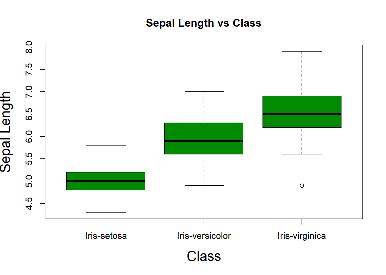
boxplot(sepal_width_cm ~ class,
        data=iris,
        ylab="Sepal Width",
        xlab="Class",
        main="Sepal Width vs Class",
        col="red")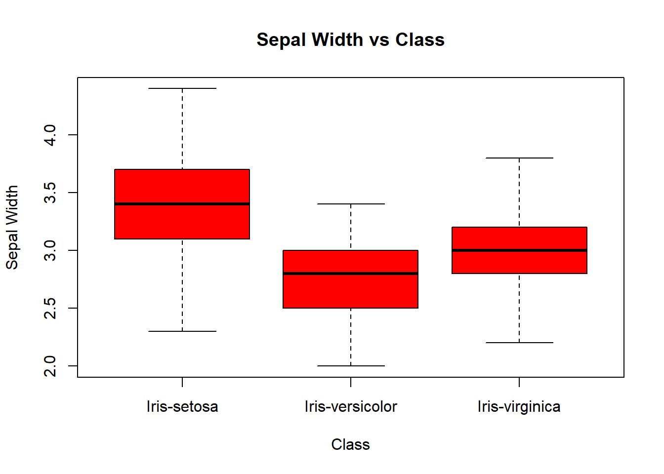
boxplot(petal_length_cm ~ class,
        data=iris,
        ylab="Petal Length",
        xlab="Class",
        main="Sepal Length vs Class",
        col="orange")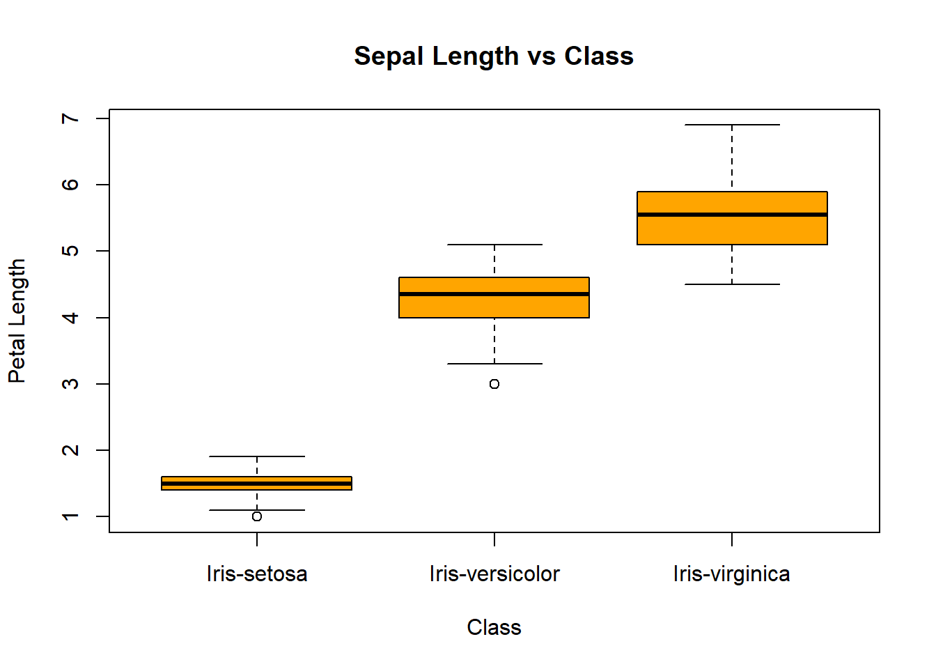
boxplot(petal_width_cm ~ class,
        data=iris,
        ylab="Petal Width",
        xlab="Class",
        main="Sepal Width vs Class",
        col="cornflowerblue")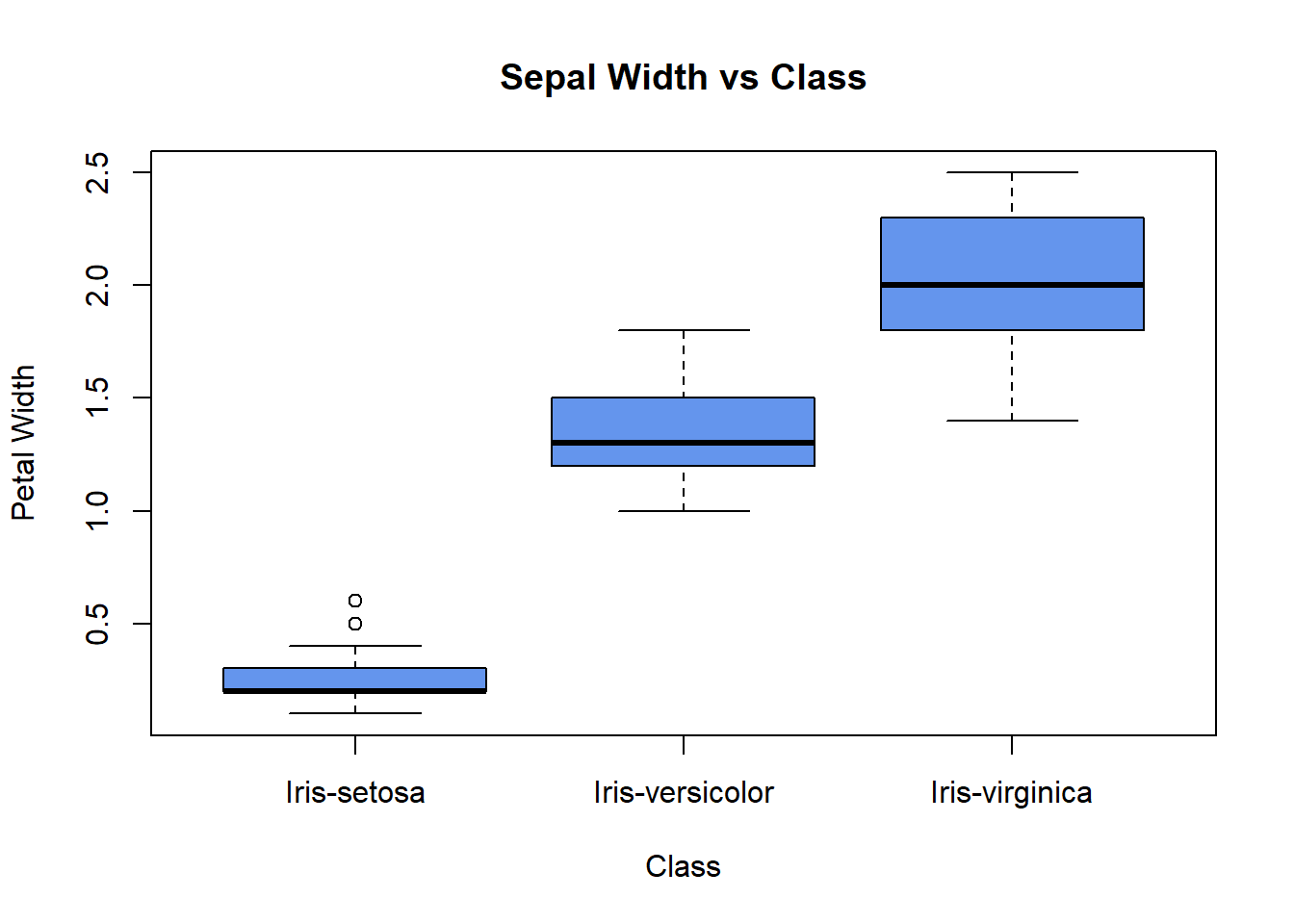
We identify those points that are mentioned above. The iris-versicolor variable contains the outliers. At the same time, the versicolor level falls within the iris-versicolor point group. This could indicate a possible mislabeling of the data. Also, we can see the iris-setosa point falling close to the iris-setosa cluster—another possible mislabeling.
pairs(iris,
      col=iris$class,
      pch=19,
      cex=0.5)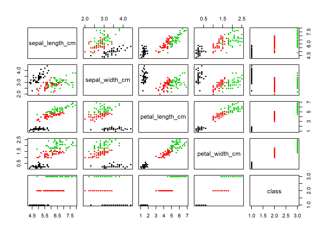
We identify those points that are mentioned above. The iris-versicolor variable contains the outliers. The versicolor level falls within the iris-versicolor point group. This could indicate a possible mis-labeling. of the data. Also we can see the iris-setossa point falling close to the iris-setosa cluster. Another possible mis-labeling.
ggplot(iris, aes(x=sepal_length_cm,
                 y=sepal_width_cm,
                 color=class,
                 shape=class)) +
  geom_point()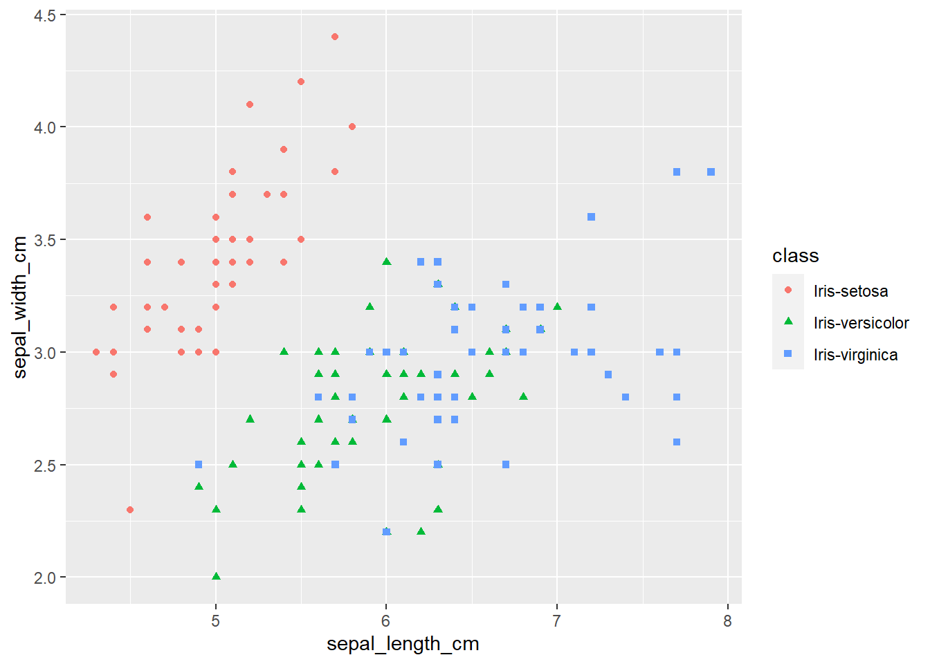
ggplot(iris, aes(x=petal_length_cm,
                 y=petal_width_cm,
                 color=class,
                 shape=class)) +
  geom_point()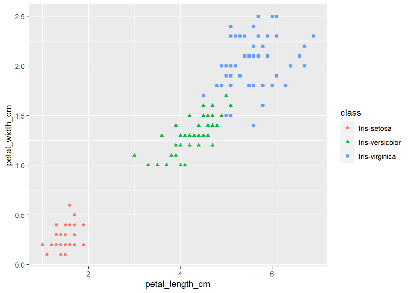
ggplot(iris, aes(x=petal_width_cm,
                 y=sepal_width_cm,
                 color=class,
                 shape=class)) +
  geom_point()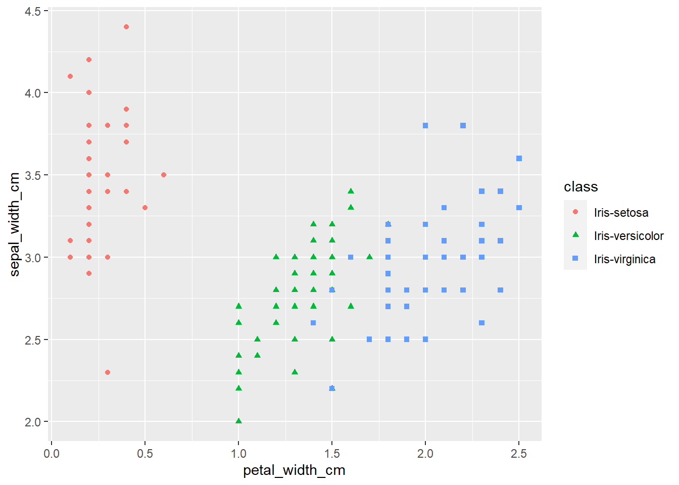
ggplot(iris, aes(x=sepal_length_cm,
                 y=petal_length_cm,
                 color=class,
                 shape=class)) +
  geom_point()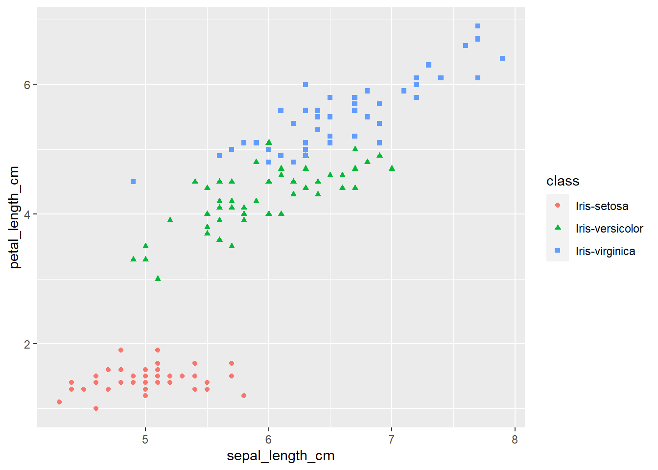
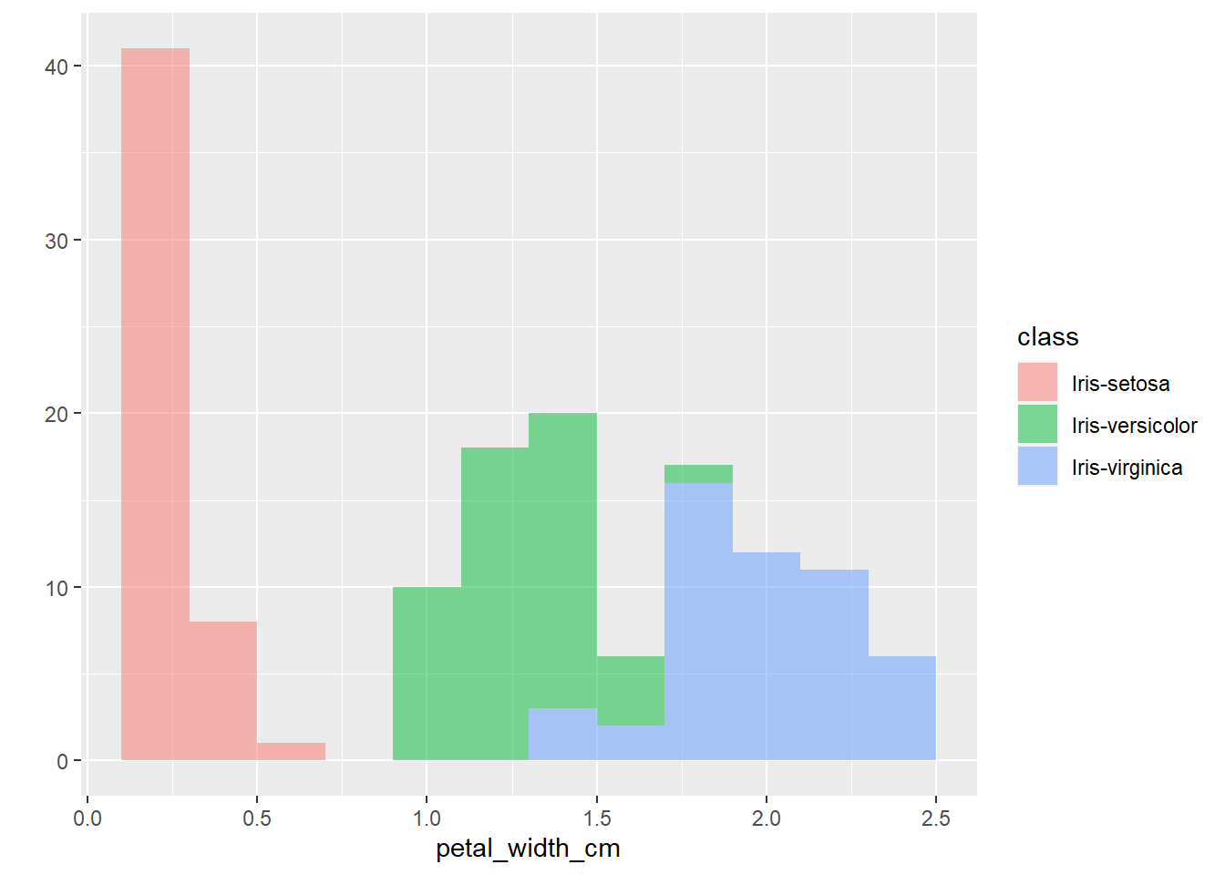
The plots thus far are sufficient for the exploratory analysis of the data set. The data needs to be cleaned up by fixing the NA’s and consolidating the class levels to three. And removing or imputing outliers; once that is accomplished, another interesting way to view the data is to make a scatter plot with a regression line that helps pull together the spread-out points to start to see a trend to the data variables. We may better know the sepal width and sepal length having a relationship or the sepal and petal variables having some ties, such as the plot of petal width versus petal length. The regression trends upward for four levels. The same can be said for the sepal width and petal length. Another plotting method is the histogram and shows the relationship between variables in color comparison.
To conclude, this data set needs to be cleaned up first, and then we can rerun the graphs to gain a bit more useful information to apply to the application project. It would be recommended that we obtain more data from several more different varieties of flowers to start developing patterns between groups of flowers. This will further develop the flower recognition application and help narrow down rules to apply to the image recognition model.
qplot(sepal_length_cm,
      sepal_width_cm,
      data=iris,
      color=class) +
  geom_smooth(method="lm")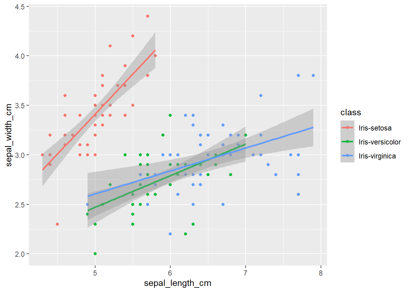
qplot(petal_length_cm,
      petal_width_cm,
      data=iris,
      color=class) +
  geom_smooth(method="lm")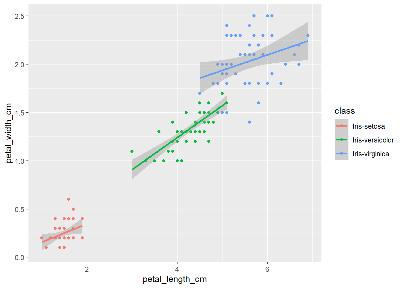
qplot(sepal_length_cm,
      petal_width_cm,
      data=iris,
      color=class) +
  geom_smooth(method="lm")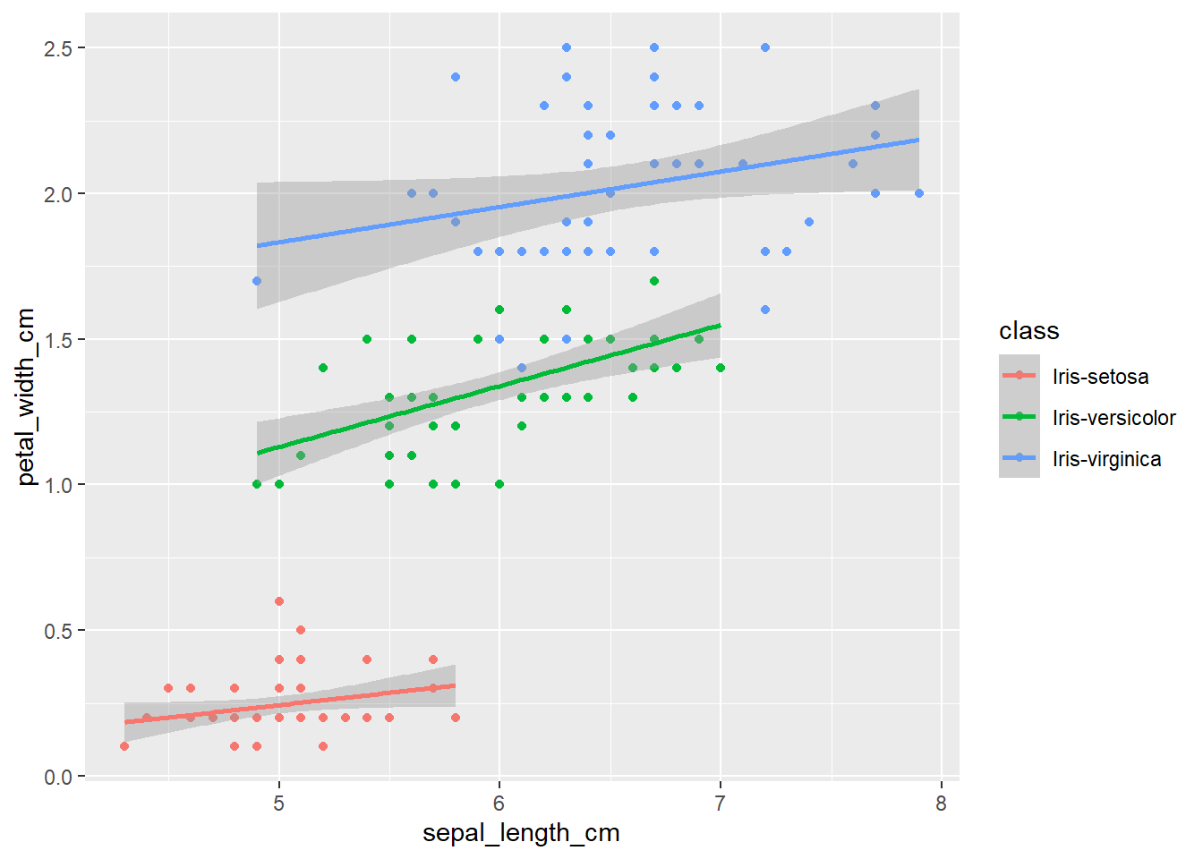
qplot(petal_length_cm,
      sepal_width_cm,
      data=iris,
      color=class) +
  geom_smooth(method="lm")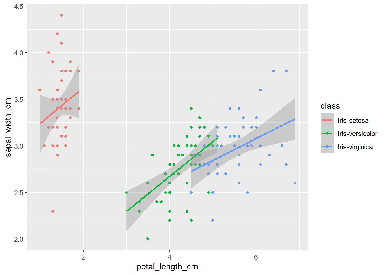
qplot(sepal_length_cm,
      data=iris,
      fill=class,
      binwidth=0.1,
      alpha= I(0.5))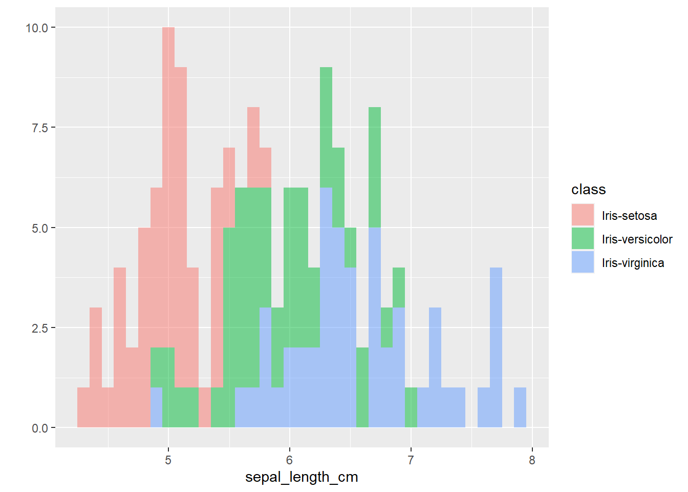
qplot(sepal_width_cm,
      data=iris,
      fill=class,
      binwidth=0.1,
      alpha= I(0.5))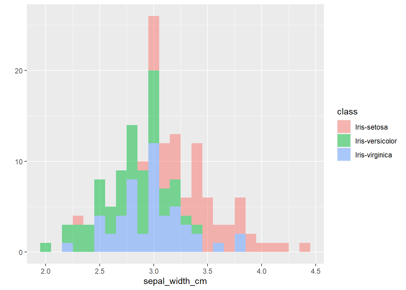
qplot(petal_length_cm,
      data=iris,
      fill=class,
      binwidth=0.3,
      alpha= I(0.5))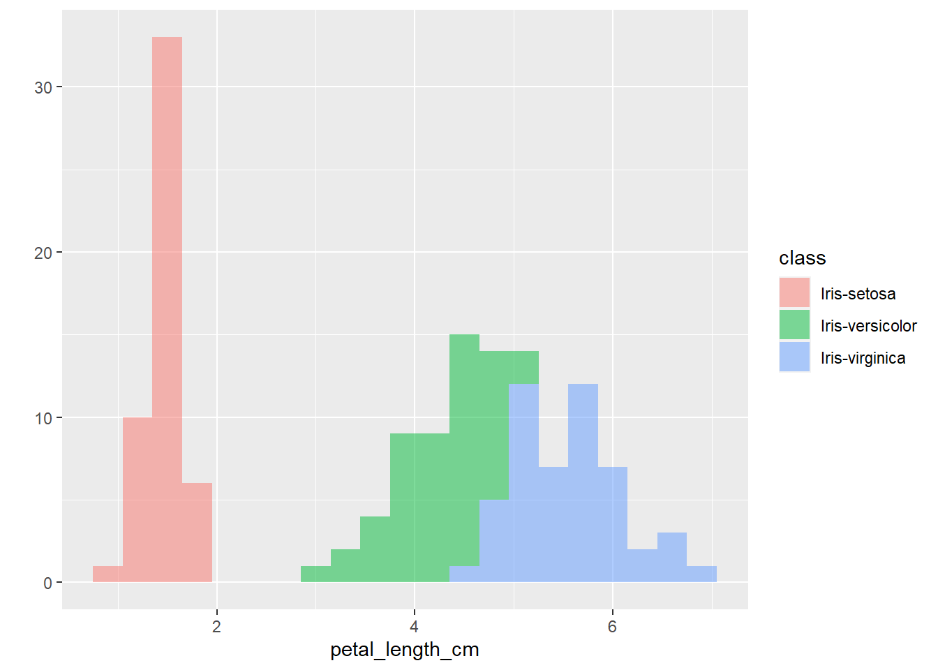
qplot(petal_width_cm,
      data=iris,
      fill=class,
      binwidth=0.2,
      alpha= I(0.5))